Give your project a visual direction you can explain and use: a compact collection of images, colors, type, and textures that points toward the same idea. A well-edited board helps you make the first design decisions with purpose.
You can assemble it on paper or in a visual-board editor. The tool holds the material; your selection and arrangement explain what the project should feel like and why.
Mood Board Creator: Begin With a Brief
Before gathering images, write down the audience, the design’s purpose, and three qualities it should express. Make those qualities specific enough to guide a choice. “Warm, neighborly, and practical” gives you more direction than “nice.”
Imagine a neighborhood bakery launching a simple website. Its audience is local customers who want to see the menu and find the shop. The desired impression is warm and approachable, but the pages must also be easy to scan on a phone. That brief gives you a standard for evaluating every reference.
Deciding how to create a mood board starts with that standard. You are not trying to collect every attractive bakery image. You are choosing material that helps the team agree on a visual direction for this particular site. Record the practical limits too: the bakery’s existing logo, required information, and any colors that must remain.
Gather references with different jobs
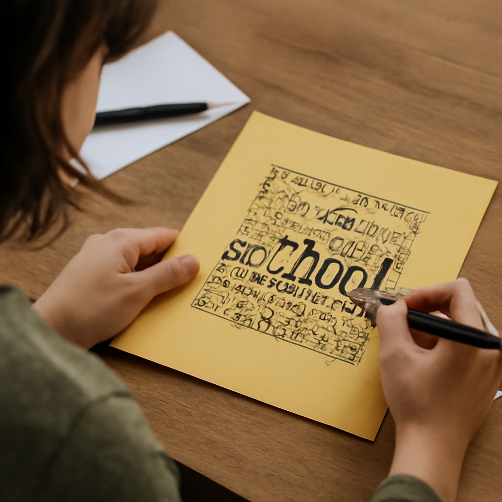
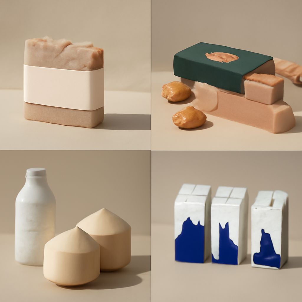
Collect more material than you expect to keep. Look for photography, illustration, type, color, layouts, and physical textures. For the bakery, you might find close-up photos of bread, a cream-colored paper sample, hand-lettered signage, and a page with a clear menu hierarchy.
Next to each item, write what you want to learn from it. A photograph might suggest natural window light; a menu might demonstrate how to group prices. This makes a reference useful even when you have no intention of reproducing its subject or layout. Keep the source and a link with each item so you can return to it and check permission before using any asset in the final work.
Use a mood board creator if you need to move images, add notes, and share the collection with others. A simple slide or graphics document can also work. Choose a board-making tool that lets you preserve image credits, arrange elements freely, and export or share a version your collaborators can open.
Edit for a coherent point of view
Put the candidates side by side and remove anything that pulls the project in an unintended direction. A glossy luxury food photograph may be beautiful, but it could conflict with the bakery’s neighborly brief. Keep it only if the contrast serves a reason you can explain.
Creating a mood board involves comparing relationships, not only judging images one at a time. Place the lettering near the photographs. Does it feel inviting or overly formal? Put a pale paper texture behind a dark color swatch. Is the combination calm and readable? Replace an item when its role is already covered more clearly elsewhere.
Limit the palette to a few colors with named roles: perhaps cream for backgrounds, dark brown for text, and muted rust for accents. These are provisional choices. Record the selected color values if you have them, then test contrast in the actual design. A small color chip cannot tell you whether body text will be legible on a full page.
Arrange the evidence
Give the most important reference the most space. Group related items and leave gaps between groups so the eye can move easily. A short label such as “natural light,” “friendly type,” or “simple navigation” tells a viewer what to notice. Avoid covering every surface with material; white space helps reveal which decisions matter.
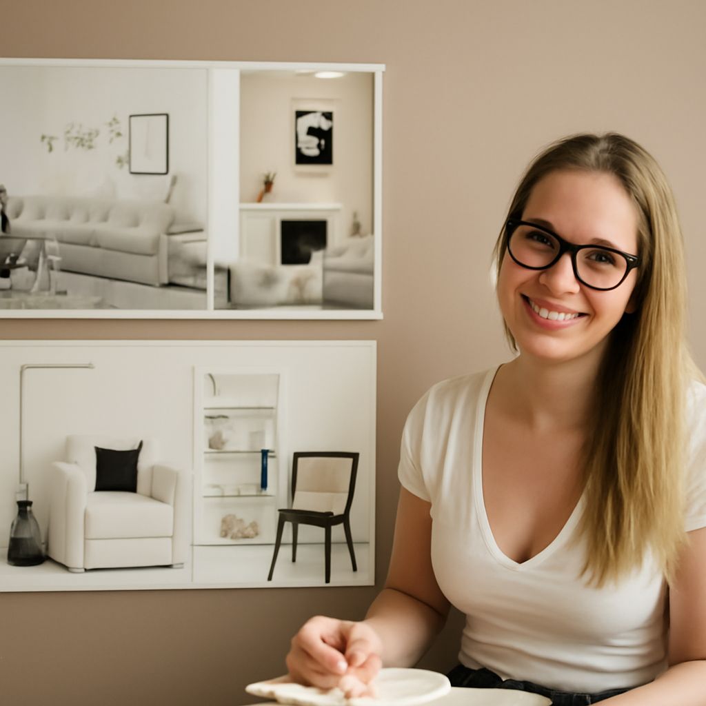
A mood board design can show both atmosphere and function. For the bakery, place the largest photograph beside a type sample, then arrange the palette and menu references below. Add one sentence: “A welcoming local shop, expressed through natural light and simple, readable pages.” The sentence ties the separate elements back to the brief.
You can make a moodboard in a physical format with clippings and paper samples, or work digitally when the team is remote. A moodboard creator that supports comments can make feedback easier to collect. Either way, photograph or export a dated version before review so everyone responds to the same selection.
Agree on the direction
Show the mood board alongside the original brief. Ask reviewers which three qualities they see, what feels out of place, and whether the direction suits the intended customer. Point to individual references when discussing feedback: “Is this texture too rustic for the site?” produces a more useful answer than “Do you like it?”
Separate a disagreement about the goal from a disagreement about one image. If the client wants a more contemporary bakery, revise the brief before replacing the whole collection. If the direction is right but one photograph feels too dark, replace that reference and keep the rest. Mark the agreed version and note any unresolved constraints.
Use the approved board to make a first page or layout: apply its type direction, palette, image treatment, and hierarchy to real content. Compare the draft with the brief and adjust the choices where readability or the actual material demands it.