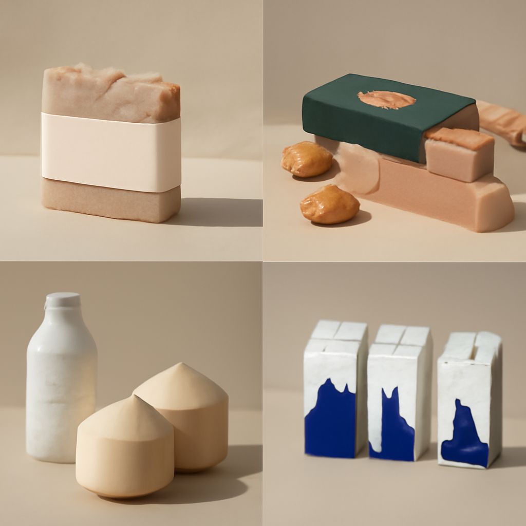
You have a small box to design and a table covered with references. One has a striking illustration; another makes the product name easy to find. To choose the strongest package designs for your reference set, first decide what your own box must do. A creative approach to package design begins with that task, whether the box must stand out on a crowded shelf or make a gift feel personal.
Start with the job, then collect examples
Write a short brief before you browse: name the product, its audience, where it will appear, and the information a buyer needs first. Add practical limits such as the size of the container, the available print surface, and the budget for production. These constraints give you a way to judge examples that look impressive in isolation. The best designs for a package address those conditions before adding visual detail.
Seek packaging design inspiration across a few relevant contexts. A carton photographed from the front can teach you about hierarchy, while a package shown in use can reveal how a flap opens or how a label wraps around a curve. Save different views when available. Record what you can actually see, and mark any construction detail you would need to test in a prototype. Sources of inspiration for package design can include ordinary containers you can hold and open.
The best packaging design makes its priorities visible. Look for the first element your eye reaches, then trace the path to the product name, variant, and supporting information. Ask whether that order would still work when the package is reduced to a thumbnail or viewed from several feet away. A decorative detail can be beautiful at full size and disappear at a practical viewing distance.
Creative Packaging Design: Compare the Decisions
Choose three references and describe each in the same terms. This makes creative package designs easier to compare without reducing them to a list of trends. For each example, note the dominant shape, the position of the name, the number of prominent colors, and the role of any image. Creative designs for packaging may share a principle even when their visual styles differ.
Pay attention to the difference between emphasis and scale. A small mark surrounded by empty space can attract attention; a large block of text can recede if it shares its weight and color with everything around it.
When you study the best packaging design, consider the whole object. A pattern that looks balanced on a flat dieline may break at a fold. A side panel can carry instructions, leaving the front clear, but only if people are likely to see that panel at the point of choice. Draw the front, side, and top as separate rectangles and mark where each piece of information belongs. The best package design for your brief will account for those connected surfaces.
Test color, form, and material together
Color does several jobs at once. It can group a product family, distinguish a variant, or create contrast behind a name. Compare a reference in color and grayscale: if the name disappears in grayscale, its separation may depend heavily on hue. That is a reason to test the design under the intended lighting and at the intended size, with the actual text in place.
A creative packaging design can also come from a structural choice. Imagine a sleeve that slides over a plain inner box: the sleeve provides a broad surface for a graphic, while the exposed end offers a glimpse of the material beneath. Creative packaging design often depends on this relationship between the graphic and the object. Then make a paper mockup to see whether the graphic remains visible when the box is held.
Material changes the decision. A textured surface may soften fine lines; a transparent container lets its contents become part of the composition. Ask the printer for a sample or proof on the intended stock, then check small type, solid areas, and folds. The strongest design for a package must survive those conditions as well as look good on screen.
Turn observations into your own brief
Translate a reference into a principle before you borrow its surface. For example, write “use a large quiet area around the product name,” rather than copying a particular layout. You can then apply that principle to a different shape, palette, and illustration. Keep the reference beside your draft and identify which decision you adapted and what you changed to suit your product. Designing packaging creatively means making those changes with a clear reason.
For fresh inspiration in package design, combine observations from separate sources: perhaps one example has a clear type hierarchy, while another uses a restrained palette. A creative design for packaging can then be judged against the same practical demands as its alternative. This turns invention into a series of choices you can explain.
Place the mockups at the size and distance at which someone will encounter them. Ask a viewer to point to the product name and variant, then observe where their eyes go. If they miss the variant, adjust its contrast or position and test again.
The best designs for packaging earn their place in your reference set because they solve a problem you share. Use them as inspiration for designing packaging with purpose: keep an idea only if it makes the information, handling, or character of your particular product clearer.