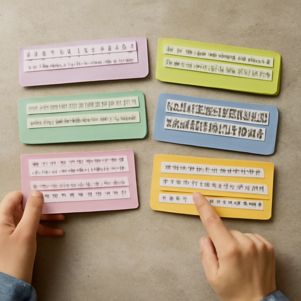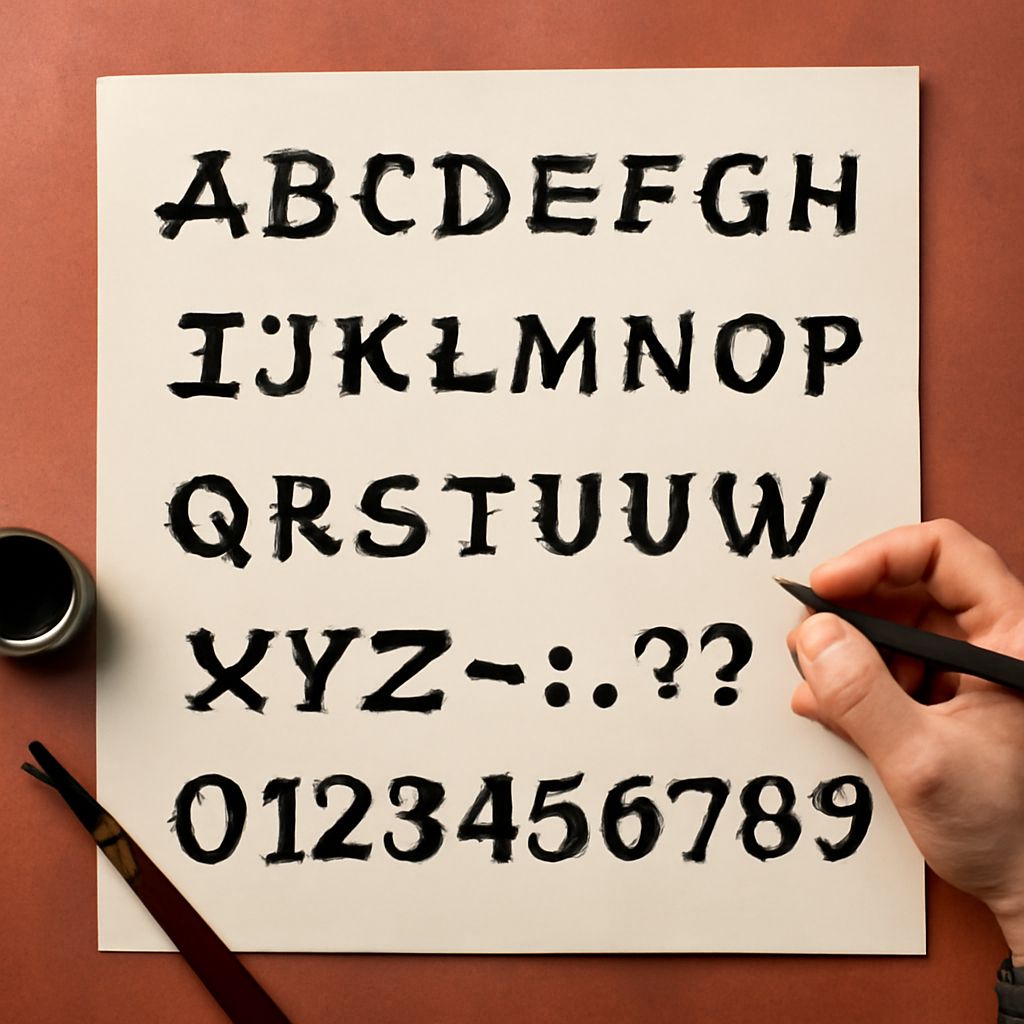
Have you ever noticed the distinctive typography used in the transportation industry, especially in trains? From the classic serif styles to the bold, modern lines of sans-serif designs, railroad fonts have a rich history and unique charm that captivate both designers and enthusiasts. Whether you’re a train font aficionado or simply curious about the nostalgia they evoke, exploring the world of railroad fonts offers fascinating insights into typography’s role in transportation. These train fonts have influenced modern design trends and continue to inspire creative projects across various fields.
The allure of railroad fonts goes beyond mere aesthetics. They represent an era of robust industrial design and carry historical significance, making them a treasure trove for typography enthusiasts. As you delve into the nuances of railroad font and train track font designs, you’ll discover the perfect blend of functionality and style that characterizes these unique typefaces. Let’s embark on this journey to understand what makes railroad fonts so distinctive and how you can incorporate them into your design projects.
The History of Railroad Fonts
Railroad fonts have been an integral part of the transportation industry since the early days of train travel. Originally designed for legibility and durability, these fonts needed to withstand harsh weather conditions and be easily readable from a distance. The history of railroad fonts reflects a blend of practicality and artistry, as designers crafted typefaces that were both functional and visually appealing.
One of the key characteristics of early railroad fonts was their boldness and simplicity. This made them ideal for use on signage, timetables, and other essential communication tools. Over time, the evolution of train fonts mirrored technological advancements and changing aesthetic preferences, with more ornate and varied styles emerging as printing and production techniques improved.
Unique Features of Train Fonts
Train fonts are characterized by their strong lines, bold strokes, and clear legibility. These features ensure that the typography stands out in diverse environments. Whether you’re looking at a vintage railroad font or a contemporary train track font, the emphasis on clarity and impact remains a constant theme.
Another unique aspect of train fonts is their ability to convey a sense of nostalgia. Many train fonts incorporate elements of classic sign painting and hand-lettering techniques, which give them a timeless quality. This blend of historical and modern elements makes train fonts versatile tools for designers seeking to evoke specific moods or aesthetics in their work.
Popular Railroad Font Styles
Several styles have gained popularity within the realm of railroad fonts, each bringing its own flavor and historical context to the table. Among the most cherished are serif styles, reminiscent of the 19th-century train timetables, and slab-serif designs that offer a bold, industrial aesthetic.
Sans-serif train fonts have also made their mark, offering a cleaner, more contemporary look that remains easy to read. These styles are often used in modern design projects where simplicity and minimalism are key. Whether you’re drawn to the ornate detail of vintage typefaces or the crisp lines of modern ones, there’s a railroad font to suit every taste.
How to Use Train Track Fonts in Design
Incorporating train track fonts into your design projects can add an element of classic charm or industrial edge, depending on the style you choose. When using these fonts, consider the message and mood you wish to convey. A vintage railroad font can lend authenticity and warmth to historical projects or branding that seeks to capture the essence of a bygone era.
On the other hand, a modern train track font can infuse your design with a sense of movement and progress, making it ideal for technology or transportation-related projects. Pairing these fonts with complementary colors and graphics can further enhance their impact, creating a cohesive and compelling visual narrative.
Where to Find and Download Railroad Fonts
With the growing interest in niche typography, there are numerous resources where you can find and download railroad fonts. Online font libraries and marketplaces are treasure troves for discovering both free and premium options. Websites like Google Fonts, Font Squirrel, and MyFonts offer a wide selection of train fonts, allowing you to experiment and find the perfect match for your projects.
When selecting a railroad font, it’s essential to consider licensing agreements, especially if you plan to use the font for commercial purposes. Many online platforms provide clear guidelines regarding usage rights, ensuring that you can incorporate these fonts into your designs legally and ethically.
Inspiration for Projects Using Train Fonts
Train fonts can be a rich source of inspiration for various creative projects. From branding and logo design to packaging and print materials, the versatility of these fonts allows them to fit seamlessly into numerous applications. For instance, a vintage railroad font can be the perfect choice for a retro-themed café or a heritage railway promotional poster.
In digital design, train track fonts can add a unique twist to website headers, app interfaces, or digital advertisements. Their distinct appearance can help your content stand out, creating a memorable impression on your audience. By blending historical elements with modern design trends, train fonts provide endless possibilities for creative expression.
Bottom line: Railroad fonts offer a unique blend of history, style, and functionality. By understanding their unique features and exploring various styles, you can effectively incorporate train fonts into your design projects and create impactful, memorable visuals that capture the spirit of the railways.