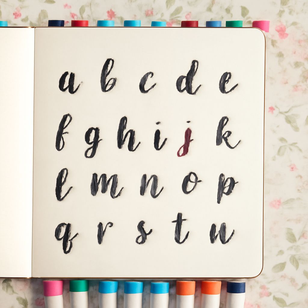
Are you tired of the same old styles in your bullet journal? Have you ever considered how the right bullet journal font can transform your pages from ordinary to extraordinary? Fonts can significantly enhance the aesthetic and functionality of your bullet journal, and choosing unique styles like occult font, crusader font, and championship font can add a personal flair that resonates with your individual style.
In today’s digital age, where each stroke of a pen can blend tradition with modernity, exploring diverse bullet journal font ideas can be both exciting and daunting. Whether you’re seeking the mystical allure of an occult font or the bold, historical impact of a crusader font, this guide will help you navigate the world of fonts to enhance your bullet journaling experience.
Introduction to Bullet Journal Fonts
Bullet journaling is more than just a method for keeping track of tasks; it’s a creative outlet that allows you to express your personality while organizing your life. The choice of font in your bullet journal serves not only as a decorative element but also as a means to convey mood and tone. By using different font styles, you can highlight important information or create visual interest on your pages.
With a vast array of bullet journal font ideas available, it’s easy to find a style that suits your aesthetic. From whimsical to sophisticated, the right font can make your journal pages stand out and keep you motivated. Let’s explore some unique font styles that can revitalize your bullet journaling experience.
Exploring Bullet Journal Font Ideas
One of the joys of bullet journaling is the freedom to experiment with various styles. Whether you’re inclined towards elegant scripts or bold block letters, the possibilities are endless. Using a combination of fonts can further personalize your journal, making it a true reflection of your artistic sensibilities.
To begin experimenting, you might want to try mixing different fonts within the same page to create contrast and highlight specific sections. This way, your bullet journal becomes not just a planner, but a canvas for creative expression.
Occult Font: Mystical and Enigmatic
The occult font is perfect for those who are drawn to the mysterious and the supernatural. This style often features intricate details like stars, moons, and other mystical symbols, lending an otherworldly feel to your journal pages. By incorporating an occult font, you can create a sense of mystery and intrigue, making it ideal for sections that involve personal reflections or creative writing.
To use an occult font effectively, consider pairing it with dark inks or metallic markers to enhance its mystical appearance. This approach not only highlights the font’s unique features but also adds an enchanting touch to your bullet journal.
Crusader Font: Historical and Bold
Looking to evoke a sense of history and grandeur? The crusader font is an excellent choice. Characterized by its bold, medieval appearance, the crusader font can lend an authoritative air to your journal entries. It’s perfect for headings or sections where you want to convey strength and determination.
For a truly immersive experience, complement your crusader font with thematic elements like shields, swords, or knights. This not only reinforces the historical theme but also adds a cohesive narrative to your bullet journal.
Championship Font: Sporty and Dynamic
If you’re a fan of sports or looking to add a dynamic edge to your bullet journal, the championship font might be just what you need. Known for its energetic and bold style, this font is often used in sports branding and can inject a sense of enthusiasm and movement into your pages.
Incorporating a championship font can be particularly effective for tracking fitness goals or highlighting achievements. Pair it with vibrant colors or dynamic graphics to emphasize the theme of vitality and success.
Choosing the Right Font for Your Journal
When selecting the right font for your bullet journal, consider the purpose and tone of the content. Different fonts evoke different emotions and can affect the readability of your entries. It’s important to choose fonts that align with the themes of each section in your journal while ensuring they remain legible.
Experiment with different combinations and placements to find what resonates best with you. Remember, the key to effective journaling is balance — too many fonts can clutter your pages, while too few can make them seem monotonous. Strive for harmony between creativity and functionality.
Next steps: As you continue to develop your bullet journaling style, keep exploring new fonts and combinations that inspire you. Regularly update your font choices to reflect changes in your interests or goals. This practice not only keeps your journal engaging but also ensures it remains a true reflection of your evolving journey.