Does font choice really matter in a business letter? More than most people realize. The typography of a formal business letter communicates professionalism, attention to detail, and respect for the reader before a single word is read. Choosing the best font for business letters is not about finding something decorative or distinctive — it is about selecting a typeface that gets out of the way of your message while signaling competence and care. The best font for letters in a business context prioritizes legibility at standard letter sizes, appropriate weight that reads well at both screen and print resolution, and a tone that matches the formality of your correspondence. Understanding what constitutes a good business letter font choice, finding the best font for a letter for your specific industry and audience, and knowing the conventional font for business letter standards used across professional fields gives you confidence in every correspondence you send.
This guide covers the typefaces that consistently perform best in business correspondence contexts, the principles behind choosing among them, and the formatting standards that complement good font selection.
What Makes a Font Work for Business Letters
The best font for business letters shares several qualities: high legibility at 10 to 12 point sizes (standard body text for letters), clear differentiation between similar characters (1 and l, 0 and O, rn and m), appropriate weight that reads well in print without appearing too light or too heavy, and a tone that reads as professional rather than casual, decorative, or quirky.
Serif typefaces have traditionally dominated business correspondence because their horizontal serifs guide the eye along lines of text, reducing fatigue during extended reading. However, clean sans-serif typefaces have become increasingly acceptable in digital business communication, and many contemporary organizations prefer sans-serifs for their clarity on screen.
Top Business Letter Font Recommendations
The most consistently recommended business letter font options span both serif and sans-serif categories:
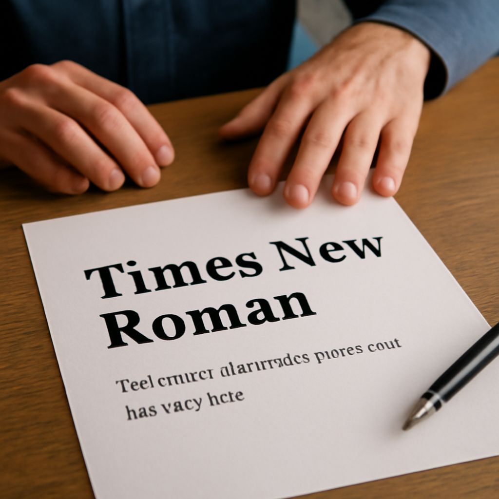
- Times New Roman: The default choice that remains widely recognized as standard for formal business correspondence. Its ubiquity in legal and academic contexts gives it an authority association that more distinctive typefaces lack.
- Georgia: A serif designed for screen legibility with a larger x-height than Times New Roman. Reads more warmly and clearly on digital screens while remaining professional in print.
- Garamond: A classic old-style serif with a more refined, less mechanical quality than Times New Roman. Appropriate for industries where elegance matters — finance, law, luxury services.
- Calibri: Microsoft’s sans-serif default since 2007. Clean, modern, and highly legible. Now widely accepted in business correspondence, particularly in industries that send primarily digital communications.
- Arial: A reliable sans-serif that is universally available across operating systems and email clients, making it a safe choice for email-based business correspondence.
Best Font for a Letter by Industry Context
The best font for a letter varies by industry context. Legal correspondence benefits from the traditional authority of Times New Roman or Garamond. Financial services often use Garamond or Georgia for formal client communications. Technology companies frequently favor clean sans-serifs like Calibri or a corporate sans-serif from their brand guidelines. Healthcare correspondence prioritizes clarity and accessibility — Georgia or Arial at 11 to 12 points serves these priorities well.
For international business correspondence, ensure your best font for a letter supports the full character set required for your recipient’s language, including diacritical marks for European languages or extended Latin characters for other scripts. Many widely used business fonts are only partially compliant with international character requirements, which can cause display problems in correspondence sent across linguistic regions.
Font Formatting Standards for Business Letters
The best font for business letter choices work within established formatting standards: 10 to 12 points for body text, 14 to 16 points for the recipient address block and your name at the signature, consistent margins of at least one inch on all sides, and single or 1.15 line spacing within paragraphs with a full line break between paragraphs.
Avoid decorative or script fonts for any part of a formal business letter. The signature line may use a scanned or digital signature image in a handwriting style, but the typed name beneath it should use the same best font for business letters body typeface for consistency. Bold and italic should be used sparingly for emphasis — overuse dilutes their effectiveness and makes the letter appear less controlled and professional.