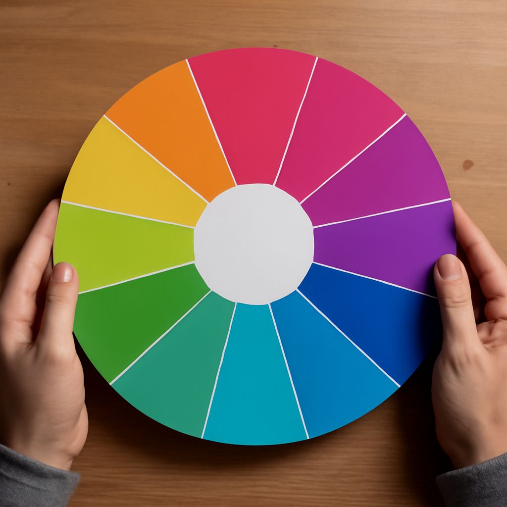
Choose a dark blue, a warm accent, and a light background, then record each color as a hex code. You can apply those same values in a mockup and a CSS stylesheet without guessing which shade you used.
A color wheel with hexadecimal values helps you explore relationships between hues. The wheel suggests candidates; the codes identify the precise colors you select. Check those candidates in the actual design, especially where text sits on a colored background.
Color Wheel Hex Codes and RGB Values
A digital color wheel arranges hues around a circle. Move around it to change hue, then use the tool’s controls to adjust saturation and lightness. Neighboring hues can feel related; hues across the wheel create stronger contrast in hue. The relationship is a starting point, not a complete palette: the relative lightness and intended use of each color matter too.
A six-digit hex code records red, green, and blue channels in hexadecimal notation. In #003366, the pairs are 00, 33, and 66, equivalent to RGB values of 0, 51, and 102. Hexadecimal uses digits 0–9 and letters A–F; each pair can represent a channel value from 0 to 255. The MDN reference explains the notation and its optional alpha component.
A hex color wheel combines a visual picker with a numeric value. When you move a selector, read the displayed code after settling on the color. Copy color wheel hex values into a palette record with their intended roles. A small movement can change several digits, so copy the value rather than trying to reconstruct it by eye.
Choose a small palette
Imagine a site for a local arts workshop. Begin with a dark blue, #003366, for headings and navigation. A web color wheel can help you find a warm hue across from blue for emphasis. Choose a golden yellow, #FFCC00, then add white, #FFFFFF, for the main background and black, #000000, for text on yellow.
These four values have distinct jobs. Blue anchors the page, white provides open space, yellow draws attention to an action, and black makes the action’s label readable. The colors do not need equal amounts of space. Try a mostly white page with a blue heading and one yellow registration button. That proportion gives the accent a reason to attract the eye.
A hexadecimal color wheel makes it easy to save variations. If the blue feels too heavy, create a lighter candidate and compare it in the actual layout. Keep the original code until you have checked the new one against text, icons, and any existing brand colors. A neighboring hue alone does not tell you whether a pairing is readable.
Carry the choices into a design
In a graphics app, enter the six-digit values into the color picker and name the swatches by role: heading, surface, accent, and accent text. A CSS color wheel can help you explore another candidate, but the final record should include the exact code and its intended use. If two tools show the same hex value, confirm that both are working in sRGB when color matching matters.
For a simple page, keep the values together as CSS custom properties:
:root {
  --heading: #003366;
  --surface: #ffffff;
  --accent: #ffcc00;
  --accent-text: #000000;
}
Apply var(--heading) to headings and var(--surface) to the page background. Use the accent and accent text together for the button. Keeping the pairs visible in your stylesheet makes future changes easier to review.
If you build an interactive rbg color wheel, keep the selected value visible next to the control. For a color wheel, HTML can provide the label and input, while a script updates the displayed value. For a color wheel, CSS can style the control and the swatch; the two jobs are easier to maintain when the markup and appearance remain distinct.
Check contrast in context
A pleasing wheel relationship does not establish text contrast. Enter each actual foreground and background pair into a contrast checker. For ordinary text, WCAG 2.2 specifies at least 4.5:1 at level AA; large text has a 3:1 minimum. Check other applicable requirements for interface components as well.
For this example, white text on dark blue has a contrast ratio of about 12.6:1, and black text on yellow about 13.9:1. Those pairs exceed the ordinary-text threshold. Yellow text on white is a different pairing and needs its own test; do not assume the accent will work as text everywhere.
Check hover and focus states, too. If an overlay or image sits behind text, measure against the actual resulting background, including the lightest and darkest areas. Color should support a label or other visual cue, so a reader does not need hue alone to understand an action.
Record each selected hex value with its role, copy it into the design and stylesheet, and check every foreground-background pair at its intended size. Recheck contrast whenever you change a value or place it over a different surface.