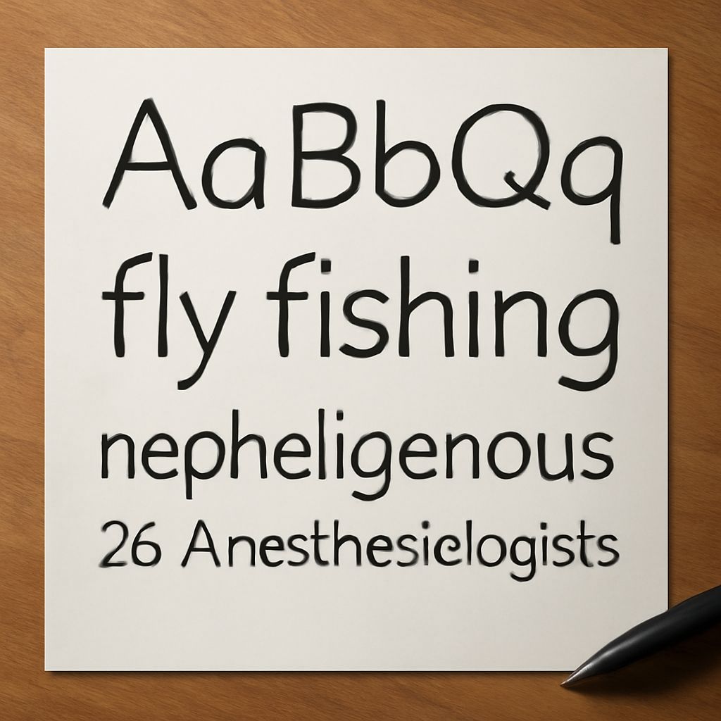
Have you ever wondered why certain architectural designs captivate your attention at first glance? The secret often lies in the architectural font styles used throughout the design projects. The right font can transform a simple structure into an iconic masterpiece. In the world of architecture and design, understanding the influence of architecture fonts can elevate your creative work to new heights.
You might be curious about the types of fonts that are most effective for architectural design. Are there high-quality free architectural fonts available that can match the creativity and precision required for such projects? Whether you’re an established designer or a student exploring options, recognizing the power of the best architect fonts can enhance the visual impact of your work.
Introduction to Architectural Fonts
Architectural fonts are more than just letters; they are instruments of expression that reflect the essence of a building or a design project. These fonts are crafted to maintain a balance between aesthetic appeal and readability, which is crucial in conveying design ideas effectively. As you delve into this world, you’ll find that using the right architectural font can be as important as the structural elements themselves.
The Importance of Architectural Font in Design
Choosing the right architectural font is integral to your design process. It influences how your audience perceives the final output, impacting everything from readability to emotional response. In design projects, a well-chosen architectural font can create a seamless blend of creativity and professionalism. By aligning your font choice with the overall design intent, you ensure that all elements complement each other, providing a cohesive visual narrative.
Moreover, architecture fonts play a crucial role in branding and identity. For a firm or a designer, they become a signature style that sets them apart from others. The typeface you select can communicate the values and ethos of your work, making your designs memorable and impactful. It’s about more than just aesthetics; it’s about establishing a visual language that speaks to your audience.
Exploring Popular Architecture Fonts
There are several architectural fonts that have gained popularity among designers for their elegance and versatility. Fonts like Helvetica, Futura, and Arial are classic choices due to their clean lines and modern appeal. These fonts are often preferred for their simplicity and ability to complement a wide range of architectural styles.
On the more artistic side, fonts like Bauhaus and Avenir bring a touch of innovation and creativity. These fonts offer a unique flair that can enhance the visual appeal of more avant-garde projects. By experimenting with these popular architecture fonts, you can find the perfect fit for your design vision.
Finding Free Architectural Fonts Online
In today’s digital age, accessing free architectural fonts has never been easier. Numerous online resources offer high-quality fonts that can be used in both personal and commercial projects. Websites such as Google Fonts and Font Squirrel provide a wide array of options that cater to different stylistic needs.
When searching for free fonts, it’s essential to consider the licensing agreements and ensure that the fonts meet your project’s requirements. Many free architectural fonts offer open-source licenses, giving you the flexibility to use them in various ways. By exploring these resources, you can expand your font library without breaking the bank, all while maintaining design integrity.
Tips for Choosing the Right Architect Fonts
Selecting the right architect fonts involves more than just picking a style that looks good. Consider the context of your design and the message you want to convey. A minimalist project might benefit from clean and simple fonts, while a more elaborate design could be enhanced by a bold, decorative typeface.
It’s also crucial to think about the medium where your design will appear. Some fonts work better in print than on digital screens, and vice versa. Testing your font choices in different scenarios can help you determine the best fit. Additionally, consider the scalability of the font, especially if your design involves large displays or signage.
Conclusion: Elevate Your Designs with Architectural Fonts
Understanding and selecting the right architectural fonts can significantly impact the success of your design projects. By embracing the versatility of architecture fonts, you ensure that your designs are not only visually appealing but also effectively communicate your creative vision. Whether you are using free architectural fonts or investing in premium options, the key is to align your font choices with your design goals.
Let your designs stand out by choosing architectural fonts that speak volumes. Your creativity, combined with the right typographic choices, can transform ordinary designs into extraordinary works of art.