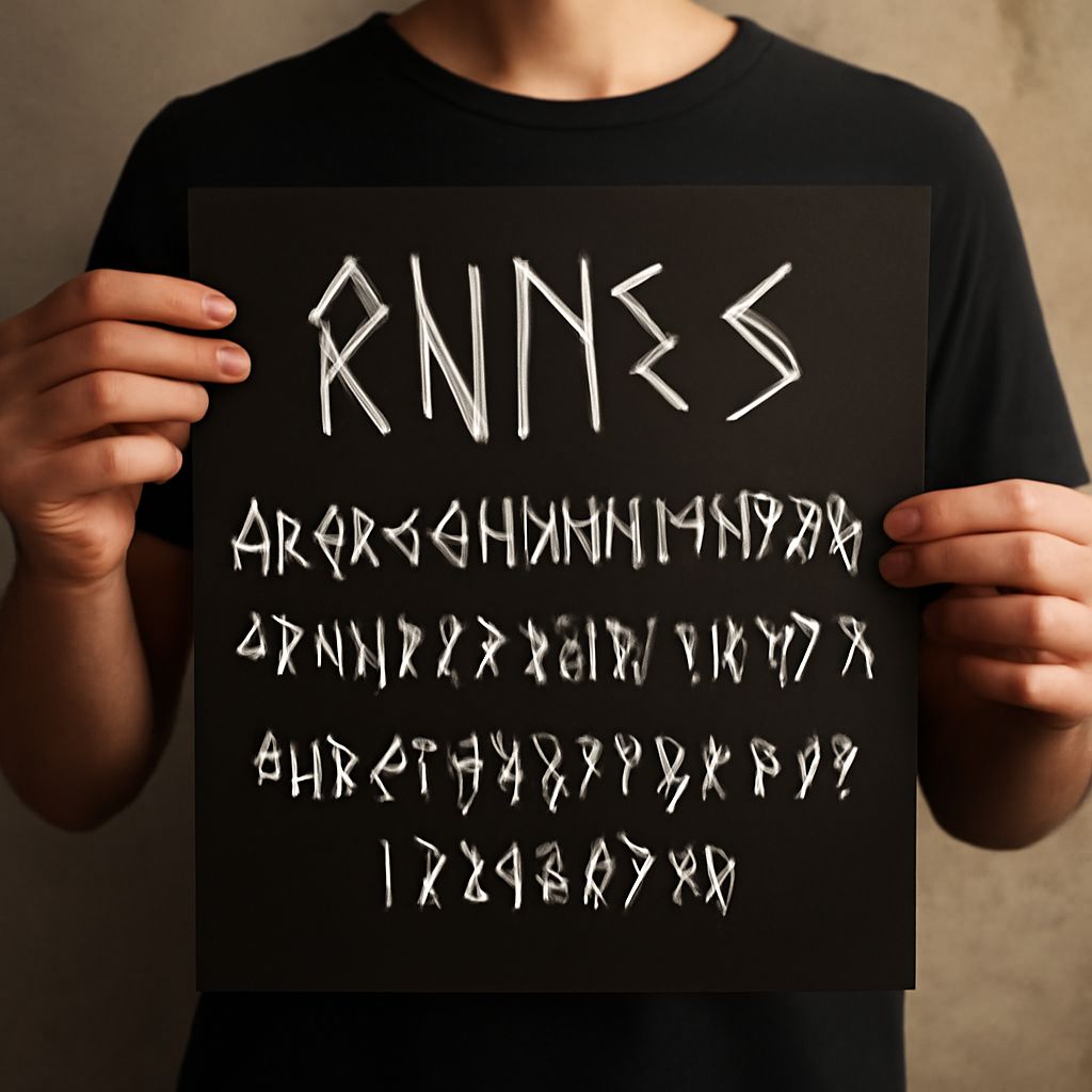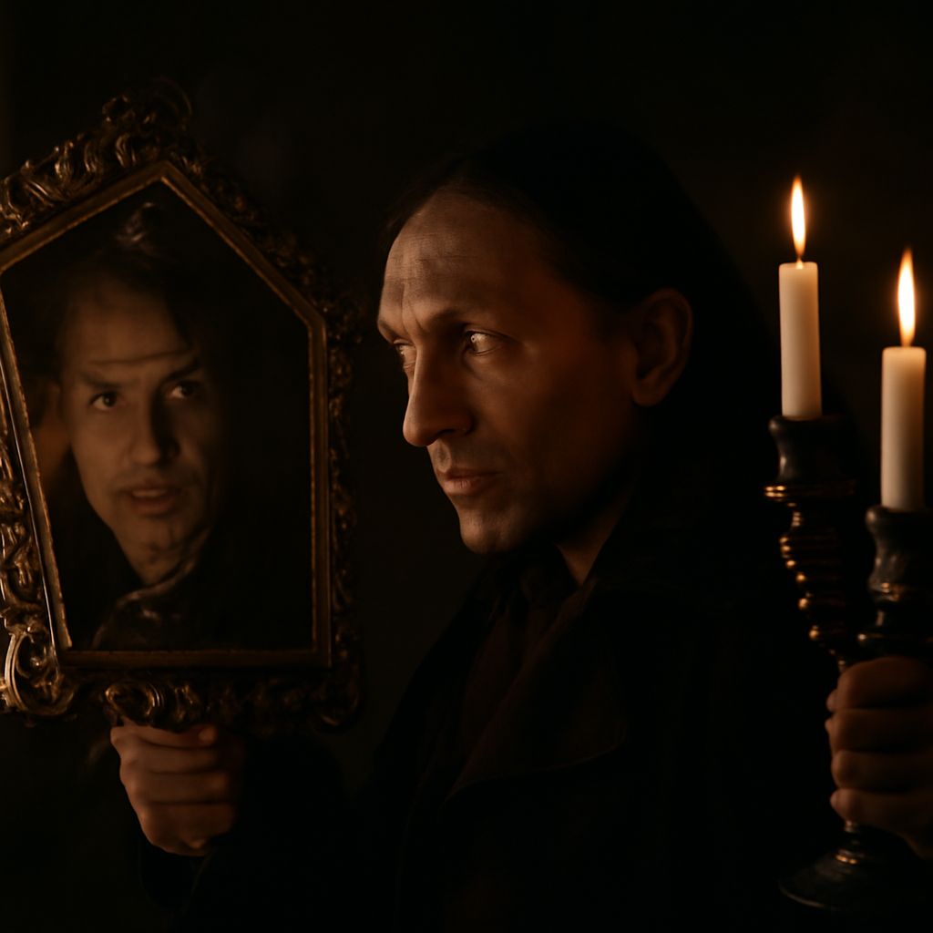
Have you ever wondered how the right typography can transform a design project? The choice of font styles—be it the whimsical Snoopy font styles, the bold Oktoberfest font, or the vintage appeal of letterman fonts—plays a crucial role in setting the tone and mood of your design. Each font carries its unique personality, and understanding these can greatly enhance your creative endeavors. Whether you’re aiming for a playful, traditional, or modern look, the right typography choice can make all the difference.
Typography isn’t just about aesthetics; it’s about communication. Fonts like the vampire font styles bring a dramatic flair to your work, while others, such as the classic Oktoberfest font, evoke a sense of tradition and authenticity. In this article, you’ll explore how to strategically use these unique font styles, ensuring your projects stand out and effectively convey your intended message.
Introduction to Unique Fonts
Typography can speak volumes about your brand or project without uttering a single word. Unique fonts like vampire font styles and Snoopy font styles offer distinct voices that can captivate and communicate with your audience. While exploring these fonts, it’s essential to consider their impact on readability and the message they convey.
Exploring Vampire Fonts
Vampire font styles are perfect for projects that require a touch of the macabre or mysterious. These fonts often feature sharp, pointed serifs and gothic influences, making them ideal for Halloween-themed designs or anything that requires an eerie aesthetic. When using vampire fonts, balance their dramatic appearance with simpler elements to ensure your design doesn’t become overwhelming.
Consider pairing vampire font styles with neutral backgrounds or minimalistic layouts to allow the typography to take center stage. This approach keeps your design clean, ensuring that the font’s unique characteristics shine through without distraction.
The Charm of Snoopy Font
Snoopy font styles bring a sense of nostalgia and playfulness to your designs. Inspired by the beloved comic strip, these fonts are characterized by their rounded, hand-drawn appearance. They are perfect for children’s books, playful invitations, or any project that requires a lighthearted touch.
When incorporating Snoopy font styles into your designs, emphasize their playful nature by using bright colors and whimsical graphics. This can create a cohesive and engaging visual story that resonates with younger audiences and evokes fond memories in older ones.
Oktoberfest Font: A Traditional Favorite
The Oktoberfest font is synonymous with tradition and festivity. Its bold, blackletter style is instantly recognizable and transports viewers to a world of Bavarian culture and celebration. Ideal for posters, beer labels, or events celebrating German heritage, this font exudes a sense of authenticity and history.
To maximize the impact of the Oktoberfest font in your designs, pair it with traditional patterns or motifs, such as pretzels or beer steins. This enhances the thematic consistency and ensures the font complements the overall cultural narrative of your project.
Letterman Font in Modern Designs
Letterman fonts are making a comeback in contemporary design, offering a retro yet sporty vibe. These fonts, reminiscent of varsity jackets, are characterized by bold, block letters that evoke a sense of nostalgia and school spirit. They’re perfect for event posters, apparel, and branding that aims to capture an energetic and youthful essence.
When using letterman fonts, consider combining them with modern elements like minimalistic backgrounds or contrasting colors. This juxtaposition can create a dynamic look that appeals to a wide range of audiences, from those yearning for a touch of nostalgia to those appreciating modern design trends.
How to Choose the Right Font for Your Project
Consider Your Audience
Understanding who you’re designing for is crucial. A vampire font may be perfect for a Halloween event but could alienate an audience looking for something more conventional. Consider the expectations and preferences of your target audience when selecting a font.
Match the Font to Your Theme
Ensure that your font choice aligns with the overall theme of your project. If you’re designing for a children’s party, Snoopy font styles may be more appropriate than the Oktoberfest font, which suits cultural or festive events better.
Test Readability and Accessibility
No matter how visually appealing a font is, it must be readable. Test your chosen font in various sizes and formats to ensure it maintains clarity. This is especially important for vampire font styles, where intricate details could become muddled in smaller text.
Conclusion: Enhancing Designs with Unique Fonts
Unique font styles, from the dramatic vampire font to the playful Snoopy font styles, offer endless possibilities for creative expression. By understanding their characteristics and contexts, you can choose the perfect typography to enhance your design projects. Each font carries its own narrative, allowing you to tell your story in a way that resonates with your audience and achieves your design goals.