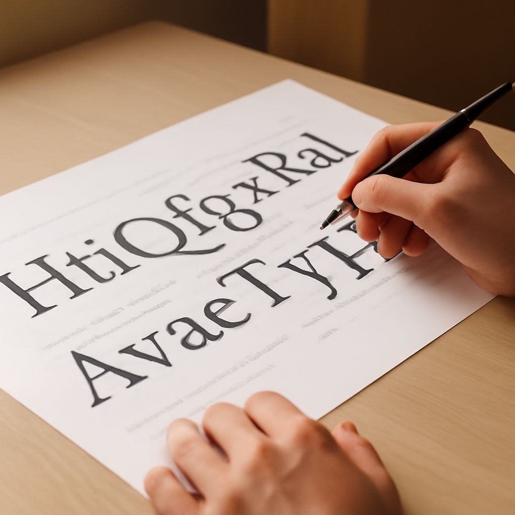
Have you ever wondered why certain fonts evoke specific emotions or how they convey different messages through design? Understanding the anatomy of a font is crucial for graphic designers and typographers aiming to create visually compelling and effective designs. By exploring the different parts of a font, you can enhance your typography knowledge and ultimately improve your design skills. In this article, we will delve into the fascinating world of type anatomy, uncovering the essential components that make up the fonts you use every day.
Introduction to Typography Anatomy
The world of typography is vast and intricate, with each font having its unique structure and characteristics. Typography anatomy refers to the study and understanding of the individual elements that constitute a typeface. By examining the anatomy of a font, you can gain a deeper appreciation of how fonts are crafted and how they function to communicate effectively. This knowledge not only enhances your design skills but also empowers you to make informed typographical choices that align with your project’s goals.
The Basics of Type Anatomy
At its core, type anatomy involves identifying and understanding the various parts that make up a font. These parts include the baseline, x-height, ascenders, descenders, and more. The baseline is the imaginary line upon which most letters sit, while the x-height refers to the height of the lowercase ‘x’ in a typeface, which affects readability. Ascenders are the parts of lowercase letters that extend above the x-height, such as the stem of ‘d,’ whereas descenders drop below the baseline, as seen in ‘p.’ Recognizing these elements is fundamental in analyzing a typeface’s structure and style.
Exploring the Parts of a Font
Every font consists of various parts that contribute to its overall appearance and functionality. Some of the most commonly discussed parts of a font include serifs, stems, bowls, and counters. Serifs are the small lines or strokes attached to the end of larger strokes in a letter. These are often found in serif fonts, contributing to their classic and formal appearance. Stems are the main vertical or diagonal lines in a letter, such as the upright stroke of ‘T’ or ‘V.’
Bowls are the curved parts of letters that enclose spaces, like those in ‘b’ and ‘o,’ while counters refer to the enclosed or partially enclosed spaces within these bowls. Understanding these parts of a font helps you analyze typefaces more critically and choose fonts that best suit your design needs.
Understanding Font Anatomy in Detail
To truly master the anatomy of a font, you must delve deeper into more complex elements like ligatures, terminals, and spines. Ligatures are formed when two or more letters are joined to create a single glyph, often used to enhance readability and aesthetic appeal. Terminals are the ends of strokes not terminated by serifs, and they come in various forms such as teardrop or ball terminals.
Moreover, the spine is the main curved stroke in characters like ‘S’ or ‘s,’ influencing the font’s style and flow. Each of these components serves specific purposes and contributes to the overall readability and visual impact of a typeface. By understanding these finer details, you can make more nuanced decisions in your typography work.
The Importance of Knowing Typography Anatomy
Having a solid grasp of typography anatomy is essential for anyone involved in design. It enables you to select and customize fonts that align with the intended tone of your project, whether it’s a formal business report or a playful children’s book. Moreover, when you understand the anatomy of a font, you are better positioned to identify typographical errors and make necessary adjustments.
Knowledge of typography anatomy also enhances your ability to communicate with other design professionals. Whether discussing design concepts with clients or collaborating with fellow designers, a shared understanding of type anatomy ensures clarity and precision in your work. Ultimately, this knowledge elevates the quality of your designs and enhances your professional credibility.
Conclusion: Mastering the Anatomy of a Font
Mastering the anatomy of a font is a journey that involves understanding both the basic and intricate parts of a typeface. By familiarizing yourself with the various components, such as serifs, ascenders, and ligatures, you can make informed decisions in your typography work. This expertise allows you to select fonts that effectively convey your intended message and suit the project’s context. As you continue to explore the fascinating world of type anatomy, your design skills will grow, and your ability to create impactful visuals will be significantly enhanced.