Have you ever wondered how to capture the essence of autumn in your design projects? As a designer, the choice of typography can significantly impact the mood and message your work conveys. Fall fonts, with their warm and cozy aesthetics, offer a perfect opportunity to reflect the season’s unique charm. Whether you’re drawn to the handcrafted appeal of cross stitch fonts or the precision of fixed width fonts, there’s a wealth of options to explore. But how do you choose the right autumn fonts that resonate with the spirit of the season while enhancing your designs? Let’s delve into the world of typography that celebrates the beauty of fall.
Introduction to Fall Fonts
Fall is a season filled with rich colors and textures, and your typography choices should reflect this vibrancy. Fall fonts are not just about aesthetics; they play a crucial role in setting the tone and enhancing the narrative of your design projects. From invitations to seasonal branding, selecting the right typeface can turn a simple design into a stunning piece of art. Understanding the characteristics and applications of different font styles, such as cross stitch fonts and fixed width fonts, can help you make informed choices.
Exploring Cross Stitch Fonts
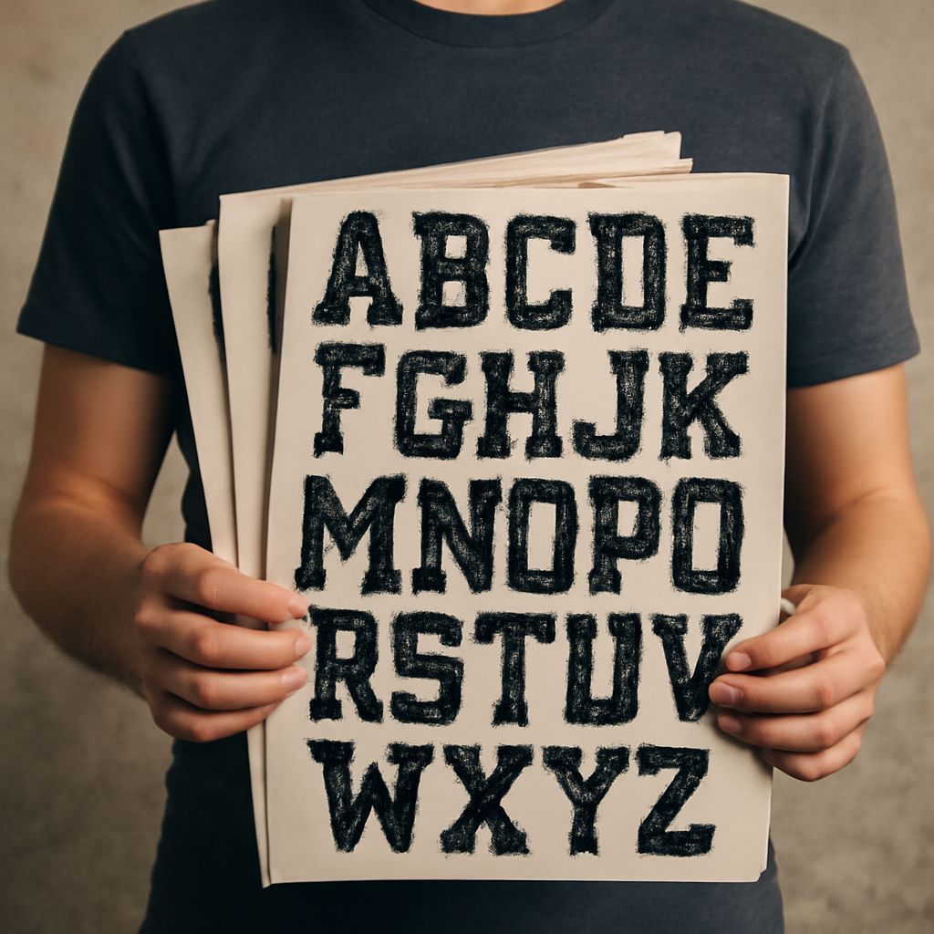
Cross stitch fonts bring a crafty charm to your designs that is reminiscent of cozy autumn afternoons spent indoors. These fonts are inspired by the traditional needlework style, characterized by a grid-like pattern that mimics hand-stitched letters. When you incorporate cross stitch fonts into your projects, you add a touch of nostalgia and warmth. They’re perfect for DIY projects, greeting cards, and seasonal decor.
While using cross stitch fonts, consider their readability and visual impact. These fonts can create focal points in your designs, drawing attention and adding depth. Pair them with simpler font styles to ensure balance and clarity.
Why Fixed Width Fonts Matter
Fixed width fonts, also known as monospaced fonts, are defined by their uniform character spacing. This consistent spacing makes them essential in coding and technical writing, but they also have a place in creative design. In the context of autumn designs, fixed width fonts offer a structured and clean aesthetic that contrasts beautifully with more whimsical styles.
Using fixed width fonts can enhance the legibility of your text, especially in detailed projects or when clarity is paramount. Moreover, their straightforward style makes them easy to pair with decorative elements or more elaborate autumn fonts, creating a harmonious and visually appealing layout.
Embrace Autumn with Unique Autumn Fonts
Autumn fonts capture the essence of the fall season through their design elements, which often include leaf motifs, rustic textures, and earthy tones. These fonts are specifically crafted to evoke the feeling of autumn, making them an excellent choice for seasonal campaigns or bespoke invitations.
When selecting autumn fonts, let the theme of your project guide your choices. Consider integrating these fonts into headers or main titles to capture immediate attention, while using simpler fonts for body text to maintain readability. The goal is to create a seasonal narrative that resonates with your audience.
Incorporating Public Domain Fonts into Your Collection
Public domain fonts offer a treasure trove of typography options that can enhance your fall designs without the hassle of licensing fees. These fonts are free to use, modify, and share, providing flexibility and creative freedom.
Incorporating public domain fonts into your collection can save time and resources while still allowing you to experiment with different styles. They can be particularly useful for personal projects or small business branding. As you explore these fonts, look for those that complement the autumn theme and match the tone of your project.
Choosing the Right Fonts for Your Project
Considerations for Selecting Fonts
When choosing fonts for your project, consider the overall message and target audience. The right font can enhance the mood and aid the communication of your design. Pay attention to the font’s readability, especially in smaller sizes, and ensure it aligns with the project’s aesthetic goals.
Combining Font Styles
Combining different font styles can create a dynamic and visually appealing design. When pairing fonts, consider their contrast and complementary features. A successful combination often involves a balance between decorative and simple styles, ensuring that the text is both engaging and easy to read.
Conclusion: Elevate Your Designs with Diverse Typography
Incorporating a diverse range of fonts into your projects allows you to harness the full potential of typography. By exploring cross stitch fonts, fixed width fonts, and public domain fonts, you can create designs that are not only visually captivating but also rich in storytelling. Let the beauty of autumn guide your choices and inspire your creativity.
Next steps: As you continue to explore typography, experiment with different font combinations and applications. Regularly update your font collection to include the latest styles, and don’t hesitate to innovate with your designs. Remember, the right font can transform your work and communicate your message more effectively.