Cartoon Map Design: Drawing City Maps, Town Maps, and Illustrated Worlds
What makes a cartoon map instantly recognizable as a place even when the geography is entirely fictional? The answer lies in a set of visual conventions that cartoonists and illustrators have developed over more than a century of imaginary world-building. Whether you’re working on a stylized city map drawing for a game, a book, or a personal project, understanding those conventions will save you hours of trial and error.
This guide explores how cartoon maps work as a genre, how to approach city map drawing with a clear visual hierarchy, the design differences between a cartoon city map and a cartoon town map, and practical techniques for bringing your illustrated geography to life using cartoon maps as your reference framework.
Understanding the Cartoon Map as a Visual Genre
Conventions and Visual Language
A cartoon map operates differently from a technical map. Where technical cartography prioritizes accuracy and consistency of scale, a cartoon map uses selective exaggeration to tell a story. Important locations appear larger than their physical size would suggest. Roads and paths are simplified into clear, readable lines rather than accurate representations. Elevation is suggested through illustration rather than measured through contour lines.
When you study classic cartoon maps from children’s books, board games, or illustrated fantasy novels, you start to see the same decisions made again and again. Buildings are shown in isometric or front-facing elevation rather than as ground-level footprints. Water features get wavy lines or stylized ripples. Forests become clusters of identical tree symbols. These conventions exist because they communicate spatial relationships clearly without requiring the reader to decode complex cartographic notation.
Color and Atmosphere
Color in a cartoon city map or town illustration does more than differentiate zones. It creates atmosphere and emotional tone. Warm greens and rich browns suggest a lived-in, organic settlement. Cool blues and grays imply a more industrial or modern environment. The limited palette approach, where you work with three to five colors maximum, keeps illustrated maps readable and gives them the cohesive graphic quality that makes them feel like finished work rather than reference documents.
City Map Drawing Techniques
Establishing Scale and Hierarchy
In any city map drawing, you need to establish visual hierarchy before placing individual elements. The most important landmark in your illustrated city, whether that’s a castle, a marketplace, or a transit hub, should be the largest and most detailed element on the map. Secondary points of interest get moderate detail. Background fill elements like residential blocks or parks get the least detail.
This hierarchy tells the viewer where to look first, then guides their eye through the rest of the composition. Without it, every element competes for attention and the map becomes visually exhausting rather than inviting.
Isometric vs. Top-Down Approaches
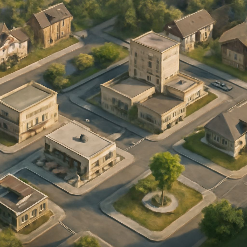
Most city map drawing approaches fall into one of two perspectives: true top-down, which looks straight down at the city like a satellite view, or isometric, which tilts the view slightly to show building facades alongside the ground plane. Isometric views are more common in cartoon maps because they allow you to show the personality of individual buildings rather than reducing everything to a ground-level footprint. Top-down views work well for large-scale maps where the overall shape of the city matters more than individual building character.
Cartoon City Map vs. Cartoon Town Map: Key Differences
The difference between a cartoon city map and a cartoon town map is primarily one of scale, density, and character. A cartoon city map needs to suggest urban complexity: multiple districts, layered infrastructure, and a sense of overlapping systems. It can afford to be busier and more layered in its detail.
A cartoon town map, by contrast, works better with breathing room. Fewer buildings, more visible green space, and clearer individual landmark placement all contribute to the intimate, readable quality that makes a small-settlement illustration feel distinct from its urban counterpart. The character of individual buildings matters more in a cartoon town map because each building can carry more visual weight when there are fewer of them competing for attention.
Building Your Map from Sketch to Finish
Start every cartoon map project with a rough thumbnail that establishes the overall shape of the landmass or settlement. Then block in major zones and landmarks. Work from large to small in every phase: overall shape, then districts, then individual blocks, then building details. This sequence prevents you from over-investing in detail in one area before the overall composition is resolved.
Key takeaways: Cartoon maps use selective exaggeration to guide the viewer’s eye and tell spatial stories that purely accurate maps cannot. City map drawing requires a clear hierarchy from landmark to background fill. The distinction between a cartoon city map and a cartoon town map lies in density, scale, and how much individual buildings are allowed to breathe.