Wedding Calligraphy Fonts: Picking the Best Font for Invitations That Last
How do you choose wedding calligraphy fonts that feel timeless rather than trendy? Typography is often the first detail guests encounter when they receive an invitation, and the font you choose sets the tone for the entire event before a single candle is lit or a single flower is arranged. Getting the best font for invitations right means balancing elegance, readability, and the specific personality of the couple.
This guide covers the characteristics that define strong cursive wedding fonts, how to create successful wedding font combinations, where to find free wedding calligraphy fonts that are actually worth using, and the practical steps for applying your selections across the full suite of wedding stationery.
What Defines a Great Wedding Calligraphy Font
Elegance and Legibility Together
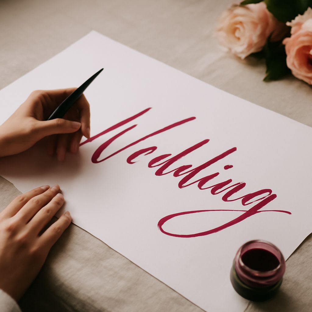
The best wedding calligraphy fonts balance visual beauty with readability. A font that requires guests to decode individual letters is not serving its purpose, no matter how beautiful it looks in a mockup. When evaluating wedding calligraphy fonts, test them at actual print sizes. A script that looks stunning at 72pt on your screen may become a tangle of loops and ligatures at the 14pt size you’d use for body copy on an insert card.
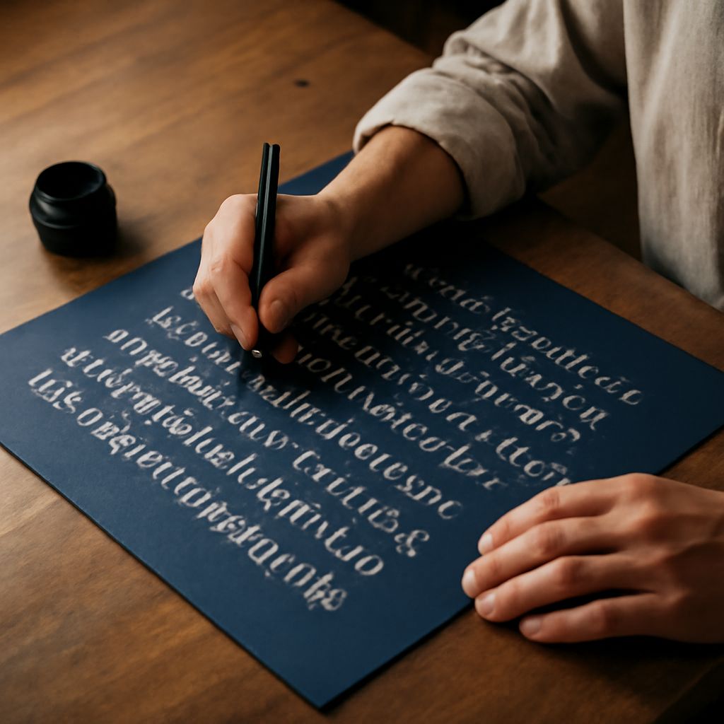
Calligraphy fonts draw from the tradition of hand-lettered scripts, including Copperplate, Spencerian, and modern brush lettering. Each has distinct characteristics: Copperplate uses thin upstrokes and thick downstrokes with sharp angles; Spencerian has a softer oval structure; modern brush scripts vary wildly from bold and casual to fine and refined. Knowing these distinctions helps you choose the right calligraphic family for your aesthetic.
Matching the Font to the Event Tone
A black-tie formal event calls for different typography than a bohemian garden party. For formal weddings, look toward traditional cursive wedding fonts with strong contrast between thick and thin strokes. For relaxed or rustic weddings, a looser, more organic brush script reads as more appropriate. The font is a design signal, and getting that signal wrong creates a disconnect between the stationery and the event experience.
Building Effective Wedding Font Combinations
The Script Plus Serif Rule
The most reliable wedding font combinations pair a calligraphic script for headings and names with a clean serif or sans-serif for body text. The contrast between the expressive script and the neutral body font creates visual hierarchy without confusion. Avoid pairing two scripts together; the result is almost always harder to read and visually busy.
When testing wedding font combinations, print your mockups at actual stationery size. What reads as harmonious on screen can look jarring in print, and vice versa. Physical paper and ink have different contrast properties than backlit screens, so always validate your pairings in the final medium.
Limiting Your Palette to Two or Three Faces
Discipline in font selection is a mark of professional typographic judgment. Two fonts, one script and one complementary face, is the standard for formal stationery. A third font might be justified for accent text or decorative elements, but anything beyond three creates visual noise. The best font for invitations is always the one that communicates clearly without asking the reader to process too much typographic variation at once.
Free Wedding Calligraphy Fonts Worth Using
The free font market has matured significantly. Platforms like Google Fonts, Font Squirrel, and DaFont host genuinely beautiful free wedding calligraphy fonts alongside a much larger collection of mediocre ones. The key to finding good free options is filtering by license type, looking specifically for fonts with full character sets including swash alternates, and reading reviews from other designers who’ve used them in production work.
Allura, Great Vibes, Pacifico, and Sacramento are consistently cited as strong free wedding calligraphy fonts. They hold up at print sizes, include enough character variation for names and headings, and are available under licenses that permit commercial use in printed goods. Always verify the license for any free font before using it in a client project or selling any stationery that incorporates it.
Applying Your Fonts Across the Full Stationery Suite
A wedding stationery suite typically includes the main invitation, the envelope, RSVP cards, menu cards, programs, and signage. Your cursive wedding fonts and supporting faces need to work cohesively across all of these. The script handling a large guest name on an envelope performs differently than the same font used for a five-word sign on a chalkboard. Test every application.
Digital files meant for professional printing should be submitted with fonts embedded or converted to outlines. Never send a design that requires the printer to have access to your specific font files, especially free ones that may not be commercially licensed for all production methods.
Next steps: Download two or three free wedding calligraphy fonts and test them at actual print scales in your preferred design software. Build sample wedding font combinations using a complementary serif, print the result on your target paper stock, and compare readability and tone side by side before committing to any final selection.