Script Monogram Font: How to Choose the Right Cursive Style for Your Monogram
What makes a script monogram font feel personal rather than generic? The difference usually comes down to the weight of the strokes, the angle of the letterforms, and how fluidly the letters connect when combined into a monogram. A monogram script font that looks elegant on a wedding invitation may look out of place on athletic gear, and vice versa. Understanding the spectrum of available options helps you match the font’s personality to the object or context you are designing for.
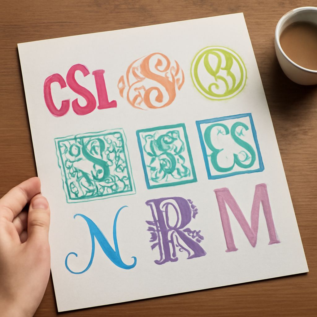
Cursive monogram font options range from formal copperplate-derived styles with sharp thick-to-thin contrast to casual brush scripts with loose, energetic letterforms. Fonts for monograms also include more structured calligraphic styles that sit between formal and casual, offering a middle ground that works across contexts. Even among what casually gets called mongram fonts, significant variation exists in how letters connect, how much flourishing appears on ascenders and descenders, and how the three-letter combination reads as a unified mark rather than three separate letters.
Understanding Script Font Categories
Formal Calligraphy Scripts
Formal calligraphy-derived script monogram font options have their roots in copperplate and Spencerian penmanship. These styles feature extreme thick-to-thin contrast, pronounced slant (usually 52 to 55 degrees from horizontal), and elaborate flourishing on entry and exit strokes. They suit wedding stationery, formal certificates, fine jewelry, and luxury product branding. The complexity of these styles requires high-resolution output; fine hairlines disappear at small sizes or on rough surfaces.
Brush Script Options
Brush script cursive monogram font styles simulate the pressure variation of a flexible brush rather than a rigid pen nib. Strokes feel more relaxed and organic. The thick-to-thin transition is less extreme than in copperplate-derived styles, and letterforms carry a hand-drawn warmth. These fonts for monograms suit casual apparel, artisan product branding, and contemporary invitations where personality matters more than formality.
Structured Script Fonts
Structured script monogram font options maintain connected, flowing letterforms but with more uniform stroke weight than calligraphy-derived scripts. They are easier to read at small sizes and work better for embroidery and engraving where fine hairlines do not reproduce well. Many of the most versatile monogram script font choices fall in this category because they balance readability with the elegance that script conveys.
How Letter Combination Affects Font Choice
Traditional Three-Letter Monogram Order
Traditional American monogram order places the first initial, the last initial (largest, in the center), and the middle initial. British convention often uses first, middle, last in order of size. When evaluating fonts for monograms, check how your specific letter combination looks in the font’s character set. Some letters connect beautifully in certain script styles and awkwardly in others. The R-to-J connection, for example, is notoriously difficult in many cursive monogram font designs.
Single Letter vs. Interlocking Monograms
Not all monogram designs use three letters. A single bold initial in a script monogram font is a clean, versatile choice for product labeling, jewelry, and personal stationery. Interlocking monograms, where two or three letters share strokes or overlap, create more complex marks that can work as logos. When choosing mongram fonts for interlocking designs, look for fonts with strong stroke consistency so the overlapping areas read clearly rather than becoming a confusing tangle.
Technical Considerations for Monogram Fonts
Embroidery and Physical Applications
When using a script monogram font for embroidery, engraving, or laser cutting, hairline strokes below about 0.5 mm often disappear or break in production. Test your chosen fonts for monograms by checking the thinnest strokes at the production size. Embroidery digitizers often need to manually thicken hairlines that would otherwise not translate from screen to thread. Structured script options with more uniform stroke weights solve this problem from the start.
Digital Format and Resolution
Use monogram script font files in vector format (OTF or TTF from a reputable foundry) rather than raster image versions. Vector fonts scale infinitely without quality loss, which matters when a monogram needs to appear at both a ring’s interior and a billboard scale. When downloading mongram fonts, verify the license allows commercial use if the monogram will appear on products you sell.
Free and Paid Sources for Monogram Fonts
Where to Find Quality Options
Google Fonts and Font Squirrel offer free script monogram font options that are licensed for commercial use. Adobe Fonts includes script fonts through Creative Cloud subscriptions. Paid foundries like MyFonts and Creative Market offer both individual font purchases and bundles. The paid cursive monogram font options from specialty foundries often have more complete character sets, better OpenType features for automatic ligatures, and more reliable technical quality than free alternatives.
Evaluating a Font Before Committing
Before selecting fonts for monograms, type your specific letter combination in the font preview tool. Pay attention to how the connection strokes between your letters behave, whether any letters collide awkwardly, and whether the overall combination reads as a monogram or as three separate letters. A good monogram script font makes your combination feel designed rather than assembled.