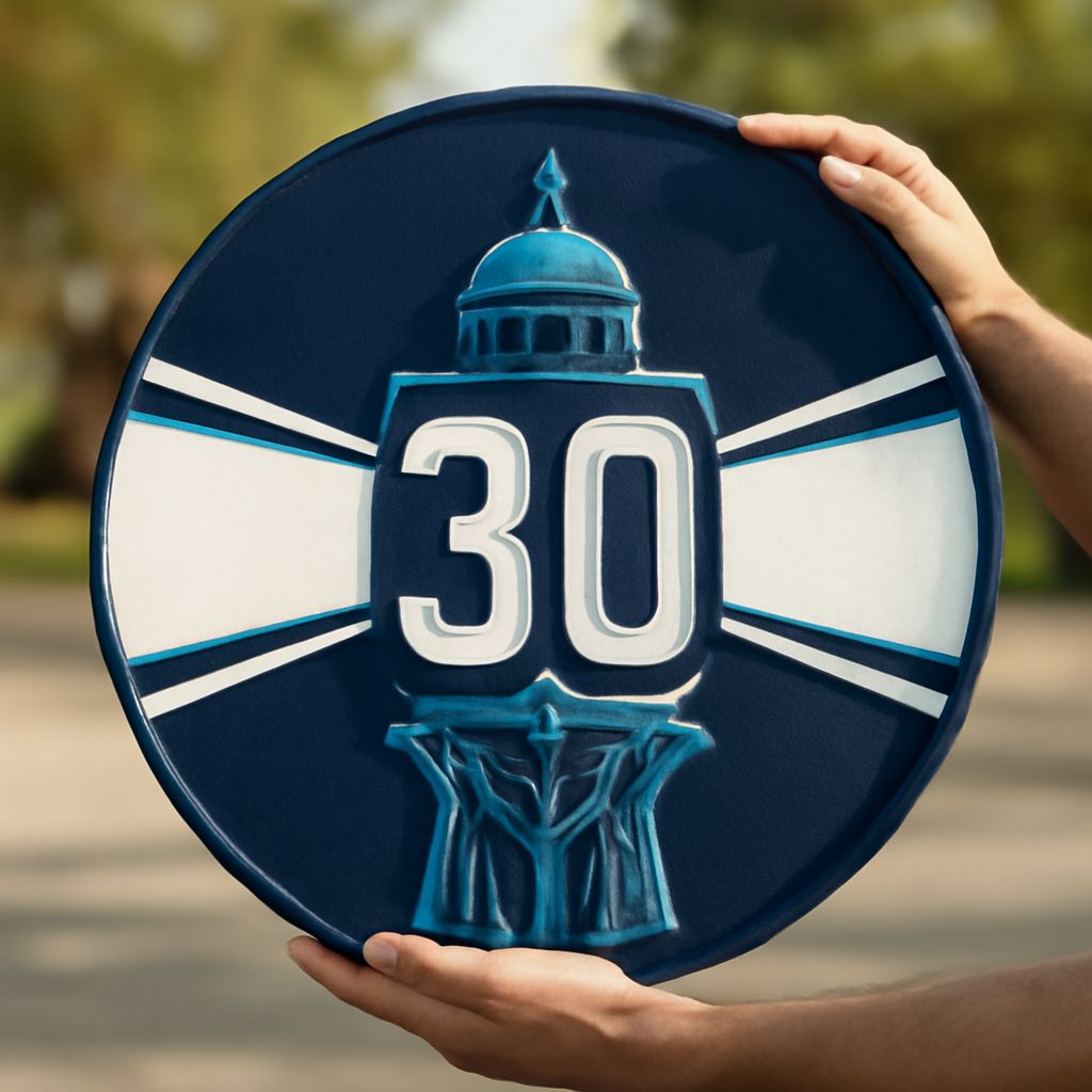
How do you capture the essence of decades of success in a single image? An anniversary logo is more than just a symbol; it’s a celebration of milestones and achievements. Whether you’re crafting a 30th anniversary logo or a 40th anniversary logo, the design serves as a testament to your journey and resilience. In this article, we’ll delve into the intricacies of anniversary logo design, helping you to create a visual narrative that resonates with your audience and aligns with your brand’s identity.
Creating a unique anniversary logo is a journey in itself. It involves understanding the nuances of your brand, the significance of the milestone, and the elements that make a design impactful. As you tackle the challenge of designing an anniversary logo, consider the elements that contribute to its success. From color schemes to typography, every detail plays a pivotal role in conveying your story and celebrating your achievements.
Understanding the Importance of an Anniversary Logo
An anniversary logo is more than a decorative piece; it symbolizes your company’s journey and accomplishments over the years. It’s a visual representation of your brand’s legacy and future aspirations. When you use a well-crafted anniversary logo, you acknowledge your past successes while setting the stage for future growth.
Why is an anniversary logo crucial for your brand? First, it strengthens your connection with customers by celebrating shared successes and milestones. It also serves as a marketing tool, drawing attention to your brand’s longevity and reliability. Whether it’s a 30th anniversary logo or a 40th anniversary logo, the design can enhance brand loyalty and attract new customers who value established brands.
Key Elements of Effective Anniversary Logos
For an anniversary logo to be effective, it must incorporate essential design elements that reflect your brand’s identity and the milestone being celebrated. Key elements include the use of symbolic imagery, such as numbers or icons that represent the specific anniversary. A 30th anniversary logo might use three intertwined rings, while a 40th anniversary logo might incorporate elements of Rubies, symbolizing 40 years.
Typography and color schemes are also crucial. The font should align with your brand’s style yet be distinct enough to signify the special occasion. Colors should evoke the right emotions and resonate with your audience. Earthy tones might be appropriate for a brand celebrating sustainability, while metallics could suit a luxury brand. Consistency with your existing branding is vital to ensure recognition and continuity.
Designing a Memorable Anniversary Logo
When designing a memorable anniversary logo, start with your brand’s core values and narrative. Consider what message you want to convey and how your logo can tell that story. It’s helpful to brainstorm with your team to gather diverse ideas and perspectives.
Incorporate unique design elements that distinguish your anniversary logo from your regular branding. Experiment with shapes, lines, and textures to add depth and interest. Ensure scalability of the design, as it will be used across various platforms, from business cards to billboards.
Remember, a memorable logo is not just about aesthetics; it’s about creating a connection. Your anniversary logo should evoke emotions and nostalgia, reminding stakeholders of the journey and achievements over the years.
Crafting a 30th Anniversary Logo
Creating a 30th anniversary logo requires creativity and attention to detail. Start by reflecting on the past three decades—your accomplishments, challenges, and growth. Incorporate elements that signify the number 30, such as pearls, traditionally associated with 30-year milestones, or the Roman numeral XXX.
Consider a modern twist to traditional symbols to make your logo stand out. Use contemporary fonts and a fresh color palette to keep the design current and appealing. Ensure the logo aligns with your existing brand image while highlighting the 30-year journey.
Creating a 40th Anniversary Logo
A 40th anniversary logo should reflect the maturity and stability of your brand. Rubies, often linked to 40-year celebrations, can be a central motif. Integrate this symbolism subtly into your design, using red tones to emphasize passion and dedication.
Balance tradition with innovation by combining classic design elements with modern aesthetics. This approach ensures your logo appeals to a diverse audience, from long-term loyal customers to new prospects. Remember, the logo should encapsulate the brand’s journey and future vision, celebrating the past 40 years while looking forward to the next chapter.
Finalizing Your Anniversary Logo Design
Once you’ve crafted the perfect anniversary logo, it’s time to finalize the design and prepare it for launch. Conduct a thorough review, ensuring the logo is versatile, scalable, and aligns with your brand’s identity. Gather feedback from stakeholders, including employees, customers, and industry peers, to refine the design further.
Plan a strategic launch to maximize impact. Use the logo across various media, including your website, social media platforms, and marketing materials. Consider special edition products or packaging featuring the logo to commemorate the milestone.
Pro Tips Recap: When designing an anniversary logo, focus on storytelling and brand alignment. Use milestones like a 30th anniversary logo or a 40th anniversary logo to reinforce brand identity and celebrate achievements. Incorporate key design elements such as symbolic imagery, appropriate typography, and color schemes. Finally, ensure the logo is versatile, impactful, and resonates with your audience.