What do the four rings of Audi, the prancing horse of Ferrari, and the three-pointed star of Mercedes-Benz have in common? They’re all european car logos that have become so recognizable they communicate brand identity without a single letter of text. European automakers have built some of the most enduring logo designs in commercial history, and understanding how those designs developed — and what they mean — gives you a richer appreciation of both automotive culture and logo design principles. This guide also looks at race car logos, custom car logos, and the distinct visual language of the muscle car logo, which developed separately in America as a counterpoint to European automotive branding.
The History Behind Major European Car Logos
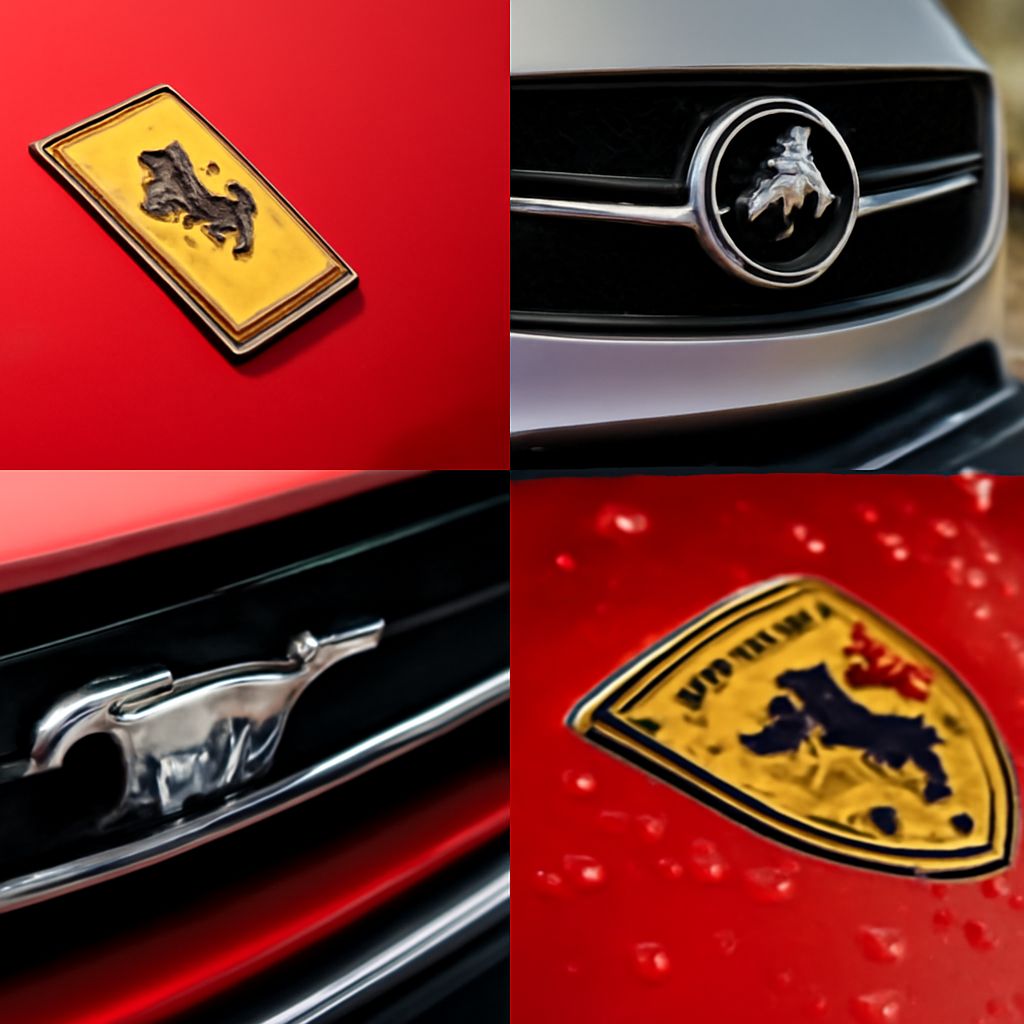
European car logo design draws on heritage in a way that few other industries can match. The Audi four rings represent the four companies — Audi, DKW, Horch, and Wanderer — that merged to form Auto Union in 1932. BMW’s roundel is often said to represent a spinning propeller against a blue sky, a nod to the company’s origins as an aircraft engine manufacturer. The Ferrari prancing horse was originally the personal emblem of World War I flying ace Francesco Baracca, given to Enzo Ferrari by Baracca’s family. These origin stories are part of what gives european car logos their cultural weight — they carry actual history rather than invented mythology.
Design Principles in European Car Logo Design
The most enduring european car logo designs share several characteristics. They’re immediately legible at small sizes — a necessity given that they appear on grilles, wheels, and steering hubs in physically limited space. They work in single color without losing their essential identity. They rely on geometry and silhouette rather than photorealistic detail, which means they reproduce well across a century of printing and manufacturing technologies.
The Porsche crest is a notable example: a complex shield incorporating the Stuttgart city crest and the Baden-Württemberg state flag, it should by rights be too complicated to function as a logo. But the specific arrangement of elements and the proportions of the shield itself make it work at both very large and very small sizes. This kind of durability is the benchmark for great European car logo design.
Race Car Logos and Their Visual Language
Race car logos operate in a different visual environment from production car branding. They appear at high speed, viewed in motion, often from a distance or through a windscreen. This demands extreme legibility and bold, high-contrast design. Race car logos also need to work in the context of livery — the full-body color treatment of a racing vehicle — which means they must read clearly against a range of background colors and patterns.
Sponsor logos that have appeared on racing liveries for decades have shaped public perception of those brands in ways that conventional advertising rarely matches. The association with speed, precision, and competition transfers to the brand through repeated high-profile visibility. Custom car logos for racing teams follow similar principles but add the need to communicate team identity and personality in addition to the individual driver or sponsor brands.
Custom Car Logos and Personalized Branding
The custom car logo market has grown significantly alongside the custom and modified vehicle culture. Builders, shops, and individual collectors all want visual identities that communicate their approach to car culture. Strong custom car logos borrow visual language from both the automotive heritage brands and from the broader world of American industrial and craft design: bold typography, shield or badge shapes, vintage illustration styles, and material-referencing textures like chrome and brushed metal.
When designing or evaluating custom car logos, the same principles that govern race car logos apply: legibility at a range of sizes, durability in single color, and clear brand personality from the design itself without relying on color alone.
The Muscle Car Logo Aesthetic
The muscle car logo developed as a distinctly American counterpoint to European automotive branding. Where european car logos tend toward heraldry, rings, and refined geometry, the muscle car logo aesthetic favors aggressive, forward-leaning forms, animal imagery (the Mustang pony, the Dodge Ram, the Pontiac Indian head), and typographic treatments that communicate raw power rather than heritage prestige.
The Chevrolet bowtie, the Dodge Scat Pack bee, and the original Pontiac GT imagery are all muscle car logo examples that capture this energy. The visual language is unmistakably American: bold, immediate, unsubtle in the best sense. Understanding this contrast helps you read automotive logo design across cultural contexts and apply those principles to your own vehicle branding work.
Pro tips recap: Study historical logos at their original intended sizes before judging modern reproductions. The best european car logos and race car logos all work in a single flat color and at small sizes — test any custom car logo or muscle car logo design the same way before committing to production.