Have you ever stopped to wonder how the anatomy of a letter influences your reading experience? The intricate details of typeface anatomy often go unnoticed but play a significant role in both design and readability. When you delve into the anatomy of typography, you uncover a world that combines art and science to create the visual language we often take for granted.
Typography is more than just arranging letters on a page. It’s an art that shapes how text is perceived, influencing everything from aesthetics to the usability of a document. In understanding these elements, such as the anatomy of a letter, you will appreciate how nuanced decisions impact the effectiveness of communication.
Introduction to the Anatomy of Typography
Definition and Importance
The anatomy of typography refers to the study of the structural elements that make up each letter and how they interact within a typeface. Understanding these components reveals the subtleties of design that affect readability and visual harmony. When you grasp the anatomy of typography, you become more adept at choosing the right typeface for any given context.
Historical Perspective
Typography has evolved significantly over the centuries, influenced by cultural, technological, and artistic shifts. Originally a craft perfected by scribes, it transitioned through the invention of the printing press to digital typography today. As you explore the anatomy of a letter in historical contexts, you gain insight into how typographic styles have mirrored societal changes.
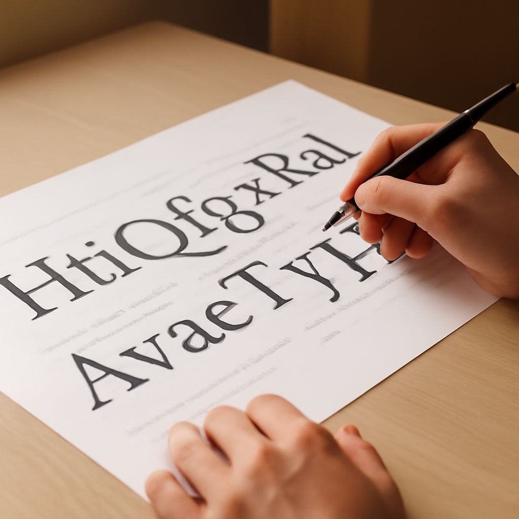
Exploring the Anatomy of a Letter
Key Components of Letter Anatomy
Central to understanding letter anatomy are key components such as the stem, serif, ascender, descender, and the baseline. Each part plays a crucial role in forming a cohesive type design. For instance, the thickness of a stem can affect a letter’s visibility, especially in smaller sizes.
Examples of Letter Anatomy in Different Typefaces
Different typefaces interpret these components uniquely. In a serif typeface, serifs might be prominent, enhancing readability in large blocks of text, while sans-serif typefaces may offer a cleaner, modern look. By studying the anatomy of a letter across various typefaces, you can discern subtle differences and select the most applicable style for your project.
Understanding Typeface Anatomy
Common Terms in Typeface Anatomy
The anatomy of typography encompasses various terms such as x-height, counter, and ligature. The x-height influences the perceived size of a typeface, while counters, the enclosed spaces within letters, contribute to legibility. Ligatures, which are special character combinations, can add elegance and fluidity to text.
The Impact of Typeface Anatomy on Design
Typeface anatomy significantly impacts design aesthetics and functionality. For instance, a typeface with a larger x-height can enhance readability in small print, making it a preferred choice for mobile screens. Understanding these nuances allows you to choose typefaces that align with the intended tone and purpose of your design.
The Role of Letter Anatomy in Typography
Readability and Aesthetics
The anatomy of a letter is crucial in balancing readability with aesthetic appeal. Letter spacing, line height, and contrast between text and background all contribute to a comfortable reading experience. Typography that respects these principles not only conveys information effectively but also engages the reader visually.
Typography Trends and Innovations
Modern typography increasingly embraces experimental designs that challenge traditional norms. New technologies enable the creation of variable fonts that adapt their anatomy dynamically. Staying informed about these trends ensures you remain at the forefront of typographic innovation, incorporating cutting-edge styles while maintaining readability.
Conclusion: The Significance of Understanding Typography Anatomy
Summary of Key Points
Exploring the anatomy of typography deepens your appreciation of the intricate details behind letter and typeface design. Recognizing components like the stem, serif, and x-height empowers you to make informed choices that enhance both the visual and functional aspects of your text.
Future Prospects in Typography
As digital communication evolves, so too will the demands on typography. Future innovations will likely focus on personalization and adaptability, ensuring text remains accessible and engaging across various platforms. By understanding the fundamental principles of typography anatomy today, you position yourself to leverage these advancements effectively.