What makes wedding calligraphy feel so distinctly personal when you hold a beautifully lettered invitation in your hands? There’s something about hand-drawn letterforms — the slight variations in pressure, the flowing connections between letters — that digital fonts simply cannot replicate. Calligraphy wedding invitations set the tone for an entire celebration before the first guest arrives. They communicate care, craft, and intention in a way that mass-produced stationery cannot match. Alongside the writing itself, couples today often pair lettered paper goods with elements like a watercolor wedding dress illustration or custom wedding calligraphy font selections that carry the same handcrafted aesthetic across every detail.
Whether you’re planning to hire a professional calligrapher, learn the skill yourself, or find a middle path through digital tools and wedding photoshop actions that simulate hand-lettered effects, this guide gives you the full picture of your options and how to make the most of each.
Choosing a Wedding Calligraphy Style
Classic Copperplate and Pointed Pen Styles Traditional wedding calligraphy draws from the copperplate tradition — a pointed pen nib that flexes under pressure to produce the characteristic thick downstrokes and hairline upstrokes of formal script. This style pairs beautifully with formal venues and traditional ceremonies. The letterforms are recognizable: the slight forward slant, the generous loops in the ascenders and descenders, the consistent rhythm across a line of text.
For calligraphy wedding invitations in this style, expect higher pricing from professional calligraphers because copperplate work is technically demanding and slow. The hourly output of a skilled copperplate calligrapher is modest compared to a brush lettering artist — the investment reflects that craft reality. A standard set of 100 addressed envelopes in copperplate typically takes a professional three to five hours of focused work.
Modern Calligraphy and Brush Lettering
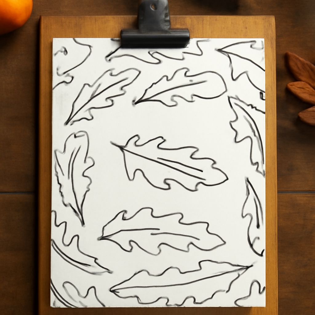
Modern calligraphy loosens the rules of traditional scripts, allowing for more expressive, individual letterforms and unconventional connections between letters. Brush lettering uses flexible brush pens or traditional brushes rather than a pointed pen, producing bolder strokes with a different textural quality. Both modern styles have become extremely popular for wedding calligraphy because they feel contemporary and personal without losing the handcrafted quality that makes them special.
For couples who want to learn a skill and write their own invitations, modern calligraphy with a brush pen is the more accessible entry point. Pointed pen work requires building up pressure sensitivity gradually and managing ink flow — a steeper learning curve than the brush method.
Wedding Calligraphy Fonts for Digital Stationery
Not every couple has the budget for fully hand-lettered stationery, and the quality of digital wedding calligraphy font options has improved dramatically. A well-chosen wedding calligraphy font at a high resolution — at least 300 DPI for print — can produce stationery that reads as distinctly hand-crafted to most guests.
The best digital calligraphy fonts include alternate character sets that introduce subtle variations between repeated letters, mimicking the natural inconsistency of real hand lettering. When choosing a font for your invitations, look for OpenType features that enable these alternates and check that the font license covers commercial printing if you’re working with a print vendor.
Popular options include fonts with multiple stylistic sets so you can vary the script slightly across different pieces — the invitation, envelope, table cards, and signage — while maintaining visual cohesion throughout the event’s paper goods.
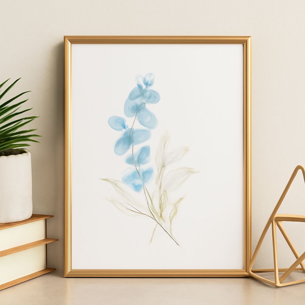
Watercolor and Illustrated Wedding Stationery
Pairing calligraphy with watercolor illustration creates a stationery suite that feels genuinely artisan. A custom watercolor wedding dress illustration on the invitation suite gives couples a keepsake that doubles as a personal piece of art. The dress illustration can reference the actual gown through a consultation with the artist, or take a more impressionistic approach that captures the mood rather than exact details.
A watercolor wedding dress illustration works particularly well on the front panel of a folded invitation, with the calligraphed text on the interior. The combination of fluid watercolor washes and precise lettering creates visual contrast that makes each element stronger. When commissioning this type of work, provide the artist with good reference photos of the dress, the venue’s color palette, and any floral designs you’ve chosen — context helps the illustration feel cohesive with the rest of your wedding aesthetic.
Using Photoshop Actions for Wedding Stationery
For couples and designers working with digital files, wedding photoshop actions offer a way to achieve certain handcrafted effects — watercolor textures, aged paper finishes, ink bleed simulations — without specialized artistic skills. A good set of wedding photoshop actions can transform a clean digital layout into something that reads as warm and textured rather than sterile and corporate.
These actions work best as finishing touches rather than the primary design strategy. Apply watercolor wash overlays to add depth to background elements. Use ink texture actions to give clean font letterforms slightly more character. Combine effects in moderation — layering too many actions produces a muddy, artificial result that defeats the purpose.
Next Steps for Your Wedding Stationery
Start your stationery planning at least four to six months before the wedding date if you’re working with a human calligrapher — booking windows fill quickly for events in peak season. If you’re using digital tools, begin with font selection and build a mood board that connects your stationery aesthetic to your broader wedding visual identity. Test print a sample invitation before ordering the full run to verify color accuracy, font rendering at production size, and paper quality. Small adjustments at the proof stage save significant money and disappointment when the full order arrives.