Weird Font: Exploring the World of Unusual Typography
Have you ever stumbled upon a design and wondered what makes it stand out? The answer might lie in its typography. While traditional looks have their charm, diving into the world of weird fonts can introduce a playful twist to your work. These unique styles challenge the norms, catching viewers’ eyes and sparking curiosity. But what exactly makes these fonts so appealing, and how can you make the most of them in your projects?
The journey into unusual fonts, from the weirdest fonts to even straight fonts, offers designers a vast playground of creativity. Whether you’re seeking to make a bold statement or subtly enhance your message, understanding these typography styles can significantly impact your design’s effectiveness.
Introduction to Weird Fonts
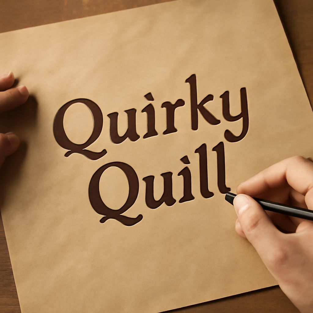
Weird fonts add a distinctive flair to typography, pushing boundaries and breaking the monotony of standard designs. They are distinguished by their unconventional curves, unexpected angles, and creative embellishments. Such fonts draw attention, infusing creativity into designs that demand a second look.
The Appeal of Weird Fonts
The allure of weird fonts lies in their ability to transform the mundane into something extraordinary. They offer a fresh perspective, allowing designers to break away from traditional constraints. This bold approach can invigorate your creative process, providing a canvas for self-expression and innovation.
By incorporating weird fonts, you can communicate uniqueness and capture your audience’s interest. These fonts act as a visual statement, enhancing thematic elements and reinforcing brand personality.
Popular Weird Fonts to Try
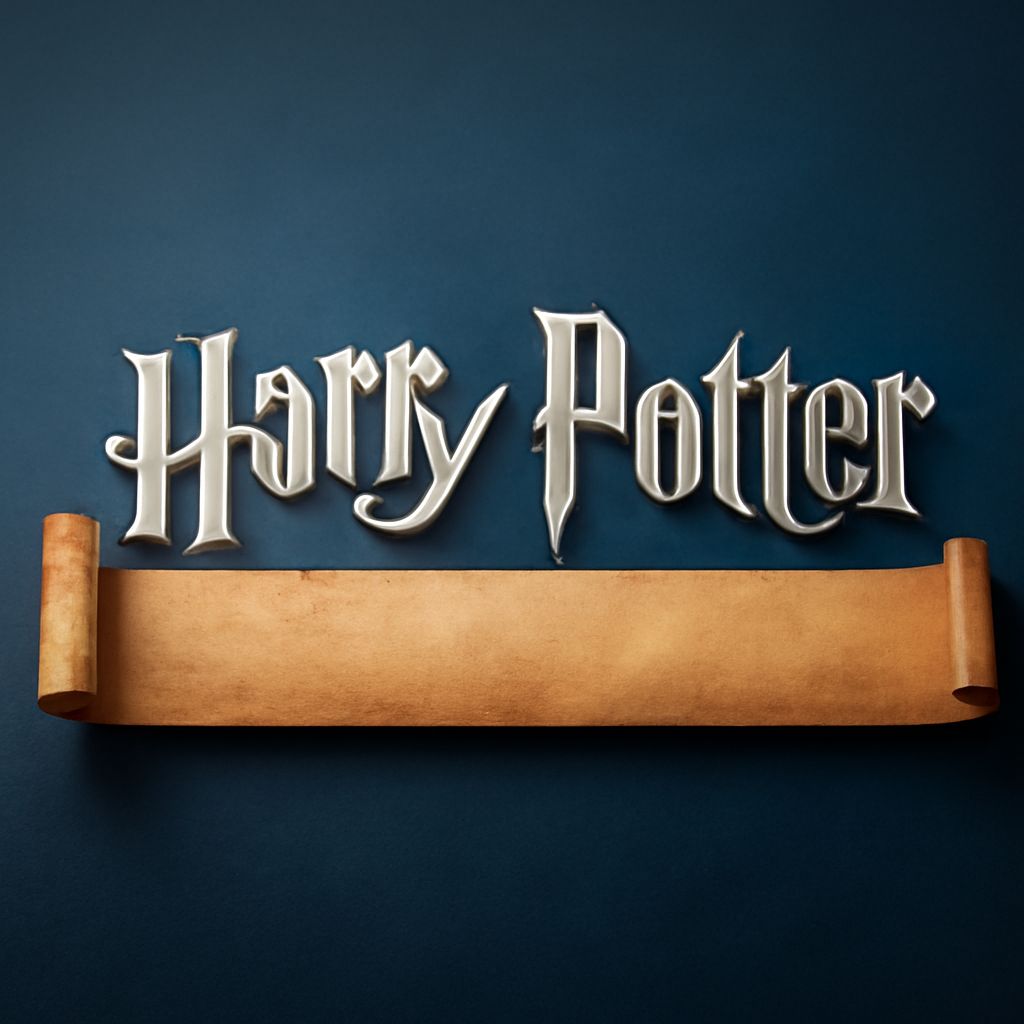
Exploring the world of typography reveals a plethora of options for those seeking fonts with a twist. Some popular choices include “Comic Sans” for its playful nature, and “Papyrus” for its ancient aesthetic. These fonts, while unconventional, have found their niche in specific design contexts.
Other noteworthy mentions are “Wingdings” and “Curlz MT,” each providing a unique visual language. Whether you seek the weirdest fonts or something subtly different, there is no shortage of options to explore.
Understanding the Weirdest Fonts
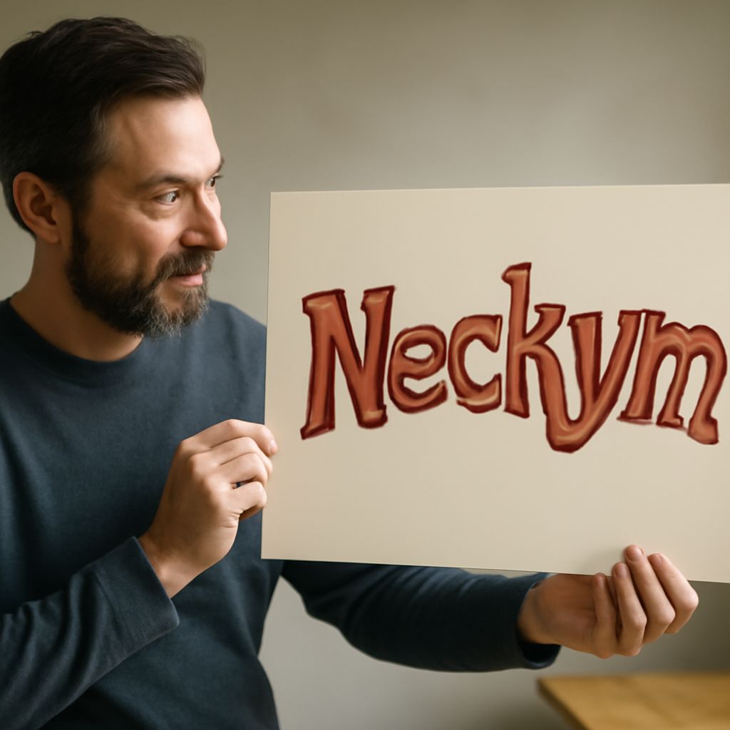
Delving into the weirdest fonts, you encounter designs that defy logic and challenge perception. They often incorporate extreme distortions, abstract shapes, and intricate details. These fonts may not suit every project, but when used correctly, they can create memorable, impactful designs.
When exploring these fonts, consider their purpose and the message they convey. While they might not be for everyone, their distinctiveness can leave a lasting impression when used appropriately.
Common Missteps with Wierd Fonts
Despite their appeal, using weird fonts can lead to pitfalls if not approached carefully. A common mistake is overusing them, leading to cluttered and confusing designs. It’s crucial to balance creativity with readability to maintain design effectiveness.
Another error is neglecting the context in which the font will appear. Ensure that the font aligns with the overall tone and message of your project to avoid unwanted disconnects between text and content.
Straight Fonts vs. Weird Fonts
When comparing straight fonts to weird fonts, the distinction lies in their structural predictability. Straight fonts are characterized by their clean lines and uniformity, offering clarity and ease of reading. They are ideal for formal or professional settings, where clarity is paramount.
In contrast, weird fonts thrive in creative environments where experimentation and boldness are encouraged. Balancing these two styles can provide versatility in your design toolkit, offering a range of expressive possibilities.
Choosing the Right Font for Your Project
Selecting the appropriate font involves understanding your project’s goals and audience. Start by considering the emotional response you wish to evoke. Weird fonts can introduce whimsy and creativity, while straight fonts ensure clarity and professionalism.
Evaluate each font’s compatibility with your brand identity and message. By aligning font choice with project objectives, you can effectively communicate your intended message and enhance overall design impact.
Conclusion: Embrace the Unusual
Diving into the realm of unusual typography opens doors to innovative design possibilities. By embracing both weird fonts and straight fonts, you equip yourself with a diverse range of tools to captivate and communicate effectively. Allow your creativity to flourish as you explore the vibrant world of typography, continually pushing the boundaries of conventional design.