Russian Fonts, Lorax Font, Letterpress Fonts, and Free Cyrillic Typography Guide
Typography spans an extraordinary range of cultural traditions and visual histories, and few areas are as fascinating — or as underexplored by Western designers — as the world of russian fonts. Whether you need Cyrillic script for a branding project, want to explore the playful world of lorax font options for a children’s design, are drawn to the tactile quality of letterpress font aesthetics, or simply need quality free russian fonts for a multilingual project, this guide cuts through the noise and gives you exactly what you need.
From the nuances of Cyrillic type design to the revival of historical letterpress aesthetics in contemporary digital typography, the terrain we’ll cover is broad, practical, and genuinely fascinating for anyone who loves letterforms.
Russian Fonts and Cyrillic Typography
Understanding Cyrillic Script
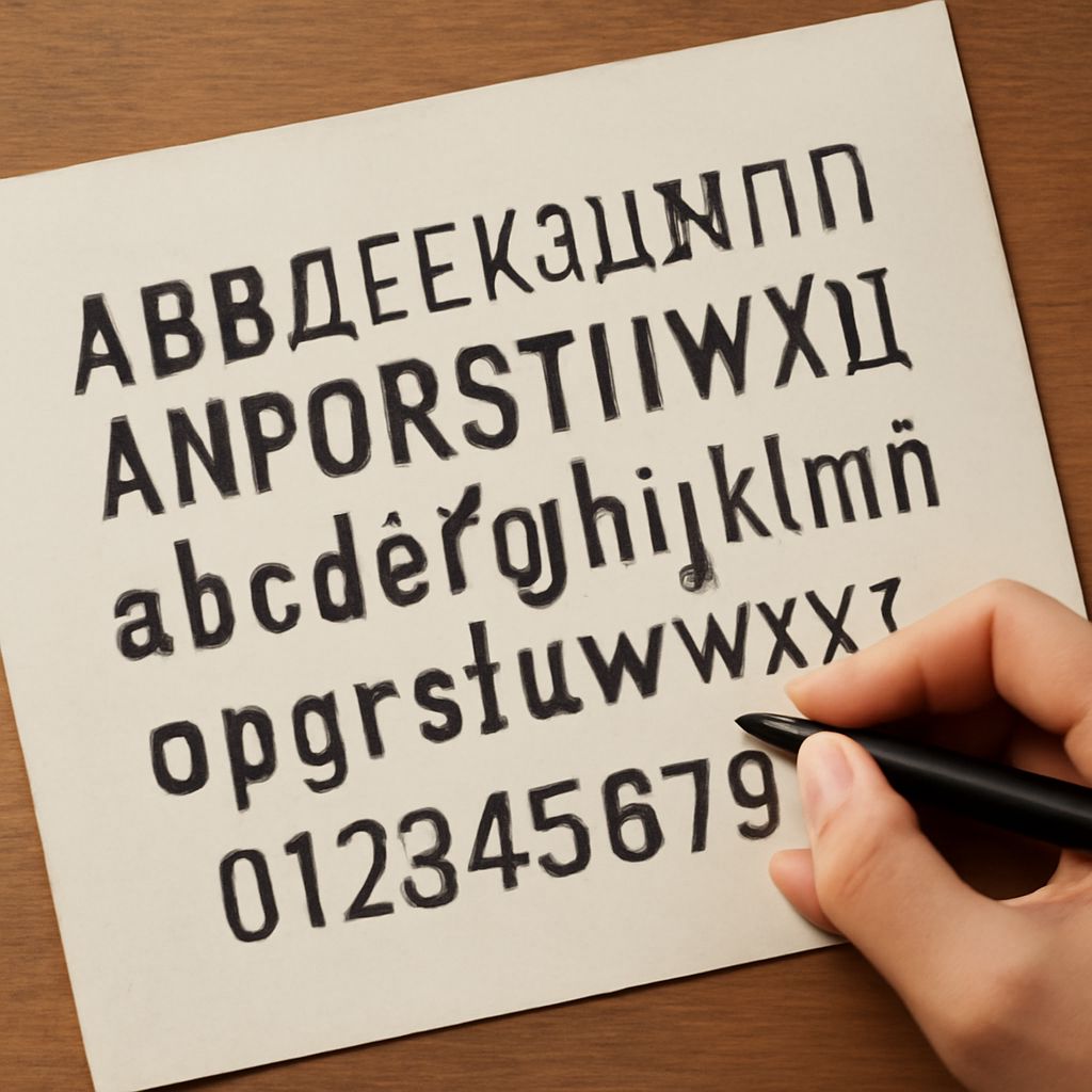
Russian fonts are built on the Cyrillic alphabet, which contains 33 letters — some visually similar to Latin characters, others uniquely distinctive. When selecting or designing russian fonts, understanding the specific letterforms that differentiate quality Cyrillic design from Latinized approximations is essential. Several Cyrillic letters — Б, Г, Д, Ж, З, И, Й, Л, П, Т, Ф, Ц, Ч, Ш, Щ, Ъ, Ы, Ь, Э, Ю, Я — have no Latin equivalents and must be designed with the same care and proportional consideration as their Latin counterparts in a dual-script font.
The best russian fonts are developed by designers with genuine fluency in Russian language and culture. Type foundries like ParaType, Letterhead Fonts, and Brownfox specialize in Cyrillic typography and produce fonts where the Latin and Cyrillic character sets feel genuinely harmonious rather than bolted together.
Where to Find Free Russian Fonts
Several reliable platforms offer quality free russian fonts. Google Fonts includes a growing Cyrillic subset across multiple styles — search by “Language: Cyrillic” to filter appropriately. Font Squirrel maintains a Cyrillic category with hand-selected, quality-reviewed options. Free russian fonts from legitimate foundries typically include both the full Cyrillic character set and corresponding Latin characters for bilingual design work. Always verify the character set completeness before committing free russian fonts to a multilingual project.
The Lorax Font: Children’s Book Typography
The lorax font refers to the hand-lettered display typeface used in Dr. Seuss’s “The Lorax” (1971) and the broader Seussian typographic tradition — playfully irregular, slightly wobbly letterforms that feel hand-drawn and whimsical without sacrificing legibility. Several commercial and free typefaces have been designed to capture this aesthetic, including Cartoonist and Dr Sugiyama.
Using a lorax font appropriately means choosing projects that genuinely benefit from the childlike whimsy the style communicates: children’s publishing, educational materials, theme park signage, environmental advocacy campaigns that want a playful but earnest tone. Avoid the lorax font in contexts that demand authority or sophistication — the stylistic associations are strong and specific.
Letterpress Font: Tactile Typography in the Digital Age
A letterpress font captures the visual characteristics of historical letterpress printing: the slight ink compression around letterform edges (called ink squish or impression halo), the subtle variation in ink density across large areas of coverage, and the overall organic quality that distinguishes physical printing from clean digital reproduction. Digital letterpress font options simulate these effects through textured edges, subtle distress, and ink density variation.
The letterpress font aesthetic has been experiencing a sustained revival driven by the popularity of artisan printing, wedding stationery, and the broader cultural appetite for the authentic and handmade. For designers who want the letterpress aesthetic without the actual printing process, quality digital letterpress font options from foundries like P22, Font Bureau, and Village give you that tactile quality in a scalable vector format.
Pro tips recap: When selecting russian fonts for bilingual work, always test the Cyrillic character set thoroughly in your actual copy — don’t assume quality based on Latin characters alone. For the lorax font aesthetic, look for the slight baseline irregularity that makes the style feel genuinely hand-drawn rather than merely rounded. Quality letterpress font options should include subtle variation rather than uniform distress applied identically to every character.