Have you ever wondered why certain fonts seem to appear everywhere you look, from websites to print media? The world of typography is vast, yet some fonts stand out due to their frequent use and iconic status. These most used fonts shape how we perceive information and influence our design choices. So, what makes these fonts so popular, and how can you incorporate the most common font styles into your projects effectively?
Recognizing the most commonly used fonts can elevate your design work, making it more accessible and engaging. Whether you’re a seasoned designer or a novice, understanding these fonts’ roles can significantly impact your projects. Join us as we explore the intricacies of the most common fonts and discover what makes them essential in the digital and print world.
Introduction to Fonts
Fonts are more than just letters on a page; they are a vital element of visual communication. The right font can enhance readability, convey emotion, and create a connection with the audience. From classic serif styles to clean sans-serif lines, the font you choose can set the tone for your entire design. The most used fonts have become staples in the industry, recognized for their reliability and timeless appeal.
Understanding the Most Common Fonts
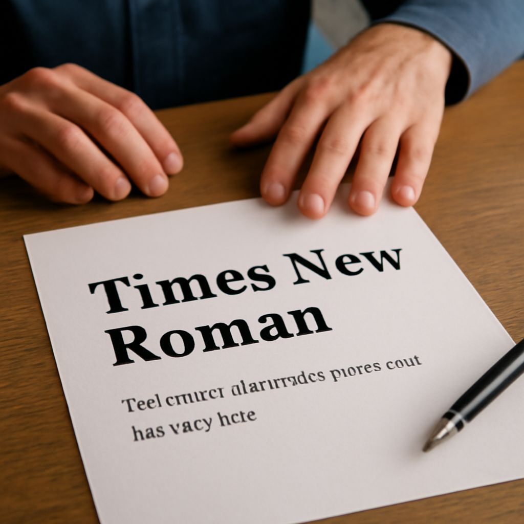
What defines the most commonly used fonts? Typically, these are typefaces that have proven their effectiveness across various media. They are the backbone of modern design, providing a consistent and familiar experience for readers. Fonts like Times New Roman and Arial are ubiquitous in digital and print formats due to their clarity and neutrality. Understanding these fonts’ evolution and application can help you make informed design decisions.
The Most Used Fonts in Graphic Design
The realm of graphic design is where the most common fonts truly shine. Designers gravitate towards fonts like Helvetica, known for its sleek and versatile appearance, or Garamond, prized for its elegance and readability. These fonts have become the go-to choices for professionals who need reliable typefaces that work across different platforms and formats. Knowing when and how to use these fonts can elevate your design projects, providing both aesthetic appeal and functional efficiency.
Factors That Influence Font Popularity
Several factors contribute to a font’s popularity, ensuring it remains a favorite among designers. Understanding these elements can help you choose the most appropriate font for your project.
Readability
One of the primary reasons fonts become popular is readability. The most commonly used fonts are often those that offer clear and legible type, even at smaller sizes. A font like Verdana, for example, is designed for on-screen readability, making it a popular choice in digital applications.
Versatility
A versatile font can adapt to various design contexts without losing its effectiveness. The most used fonts, such as Futura, offer flexibility that allows designers to apply them in diverse projects, from branding to editorial design. Their ability to maintain consistency while accommodating different styles makes them invaluable in the toolkit of any designer.
Cultural Influence
Fonts can also gain popularity through cultural influence and historical significance. A font like Bodoni, with its roots in the Enlightenment, carries with it a sense of tradition and sophistication. Understanding the cultural context of a font can add depth to your design, making it more resonant with the audience.
How to Choose the Right Font for Your Project
Choosing the right font is an essential part of any design project. Start by considering the message you want to convey and the audience you are targeting. If clarity and professionalism are key, the most commonly used fonts like Calibri or Georgia may be suitable options. Consider the medium as well; digital projects might benefit from sans-serif fonts for clean lines, while print media may thrive with serif fonts that offer more character and detail.
Experimentation is also crucial. While the most used fonts provide a solid foundation, incorporating lesser-known or custom fonts can add uniqueness to your work. Balance is key; blending familiar fonts with new styles can create visual interest without sacrificing readability.
Conclusion
In the ever-evolving landscape of design, the most common fonts remain a cornerstone of effective communication. By understanding what makes these fonts so widely used—be it readability, versatility, or cultural significance—you can make informed choices that enhance your projects. Whether you choose to stick with the classics or venture into new typographic territories, the power of fonts in design is undeniable, shaping the way we see and experience the world around us.