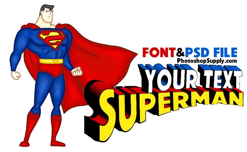
Fishtail Font Guide: Embroidery, Monograms, Awards, and Lettering Uses
Have you ever seen a vintage sign or an ornate trophy plaque and noticed those distinctive letter terminals that flare outward like a fish’s tail? That’s a fishtail font in action — a lettering style with deep roots in American sign painting and a remarkable range of modern applications. Whether you need a fishtail embroidery font for heirloom stitching projects, a fishtail monogram font for personalized gifts and luxury goods, an award font for recognition certificates and trophies, or guidance on drawing a fish tail font by hand, this guide covers every practical angle. Understanding what makes this style distinctive helps you use it confidently and avoid the common mistakes that dilute its impact.
Fishtail lettering communicates heritage, craftsmanship, and pride. These associations make it a natural fit for athletic awards, club insignia, monogrammed textiles, and any context where you want to signal tradition and quality. You don’t need to be a typography expert to use it well — you just need to understand the rules before you start bending them.
What Is a Fishtail Font and Where It Comes From
Historical Roots in Sign Painting
The fishtail font tradition grew from 19th and early 20th century American sign painting, where lettering artists developed ornate terminal treatments to distinguish their work and fill compositional space attractively. The fishtail terminal — a serif that splits into two pointed lobes resembling a fish’s tail — appeared on storefront signs, circus posters, and trade catalog headings. It signaled craft and permanence in an era when hand-painted signage was a primary communication medium.
Key Visual Features
A fishtail font is defined by its split-terminal serifs on the caps of strokes — particularly at the top of letters like I, H, and L, and on the baseline terminals of letters like A and N. These serifs flare symmetrically outward from the stroke end, creating a silhouette that reads as both decorative and structurally intentional. The letter body itself is typically Roman in proportion — neither condensed nor extended — which gives the decorative terminals room to read clearly.
Variations Within the Fishtail Style
Inline fishtail fonts add a fine white line through the center of each stroke, increasing legibility at large sizes and adding visual richness. Shadowed variants simulate three-dimensional relief, evoking trophy engraving and award plaques. Some contemporary fish tail font interpretations apply the terminal treatment to all lowercase letters, while traditional versions reserve it for display capitals only.
Fishtail Embroidery Font for Digitized Stitching
Converting Vector to Embroidery Format
Using a fishtail embroidery font requires digitizing the vector letterforms into stitch paths. Embroidery digitizing software like Wilcom, Hatch, or Ink/Stitch reads the letter outlines and assigns stitch types, directions, and densities. The fishtail terminal presents a specific challenge: the split lobes are narrow, and thin areas stitch poorly below about 1.5mm width. Scale your fishtail embroidery font to ensure terminals fall at or above this minimum for clean results.
Stitch Type Selection
Satin stitches — closely packed parallel threads — work best for fishtail embroidery font letterforms because they replicate the smooth, filled appearance of the original sign-painting style. The satin angle should follow the stroke direction rather than running uniformly horizontal, which would create an artificial look. For very small fishtail embroidery font applications, consider a simplified version with reduced terminal elaboration — the detail adds stitch count without being visible at small scales.
Thread Color Pairings
Traditional fishtail embroidery font colorways use metallic gold or silver thread for the letters against deep navy, forest green, or black backgrounds — an aesthetic directly borrowed from varsity and club lettering traditions. For a more contemporary feel, use tonal pairings: a warm off-white fishtail font on cream, or a deep burgundy on blush. The fishtail terminal detail reads best when there is sufficient contrast between thread and fabric.
Fishtail Monogram Font: Designing with Initials
Classic Monogram Layouts
A fishtail monogram font traditionally arranges three initials with the surname initial larger and centered between the given name and middle name initials. This tripartite layout gives the fishtail font’s decorative terminals room to display across a pleasing horizontal composition. Single-initial monograms in a fishtail monogram font format suit towels, napkins, and wax seals, where the letter fills a circular field cleanly.
Sizing for Different Products
Scale your fishtail monogram font according to the product’s primary viewing distance and material constraints. On embroidered pillowcases, a 2–3-inch letter height works well. On engraved stationery, 0.75 inch is legible without crowding. On custom leather goods, where embossing tools trace the outline, ensure your fishtail monogram font file has enough anchor points on the terminal curves to hold the split lobe shape through the tooling process.
Digital Templates and Software
Adobe Illustrator and CorelDRAW both handle fishtail monogram font design effectively. Start with a premium OTF fishtail font, convert letters to outlines, and then modify terminal shapes manually if the font’s built-in terminals don’t satisfy your project’s elegance requirements. Many Etsy sellers offer pre-built fishtail monogram font templates with editable initial placeholders — a practical starting point for makers who need fast turnaround.
Award Font Alternatives and Fishtail Pairings
What Makes a Good Award Font
An award font must communicate achievement, formality, and permanence. The fishtail font satisfies all three criteria. Engraved award plaques have used fishtail-inspired lettering for decades because the terminal detail reads as deliberate craftsmanship even at small engraved scales. For awards where legibility competes with ornament, pair a lighter-weight fishtail display heading with a clean transitional serif for names and dates.
Combining Fishtail with Serif Body Text
Award font combinations work best when the body typeface echoes the structural qualities of the fishtail heading without competing with it. A classic old-style serif like Garamond or Caslon provides historical consistency — both share roots in pre-industrial typographic tradition — while remaining easy to read at smaller point sizes. Avoid modern geometric serifs alongside a fishtail font; the optical mismatch between organic historical terminals and cold geometric precision creates visual tension that reads as unresolved.
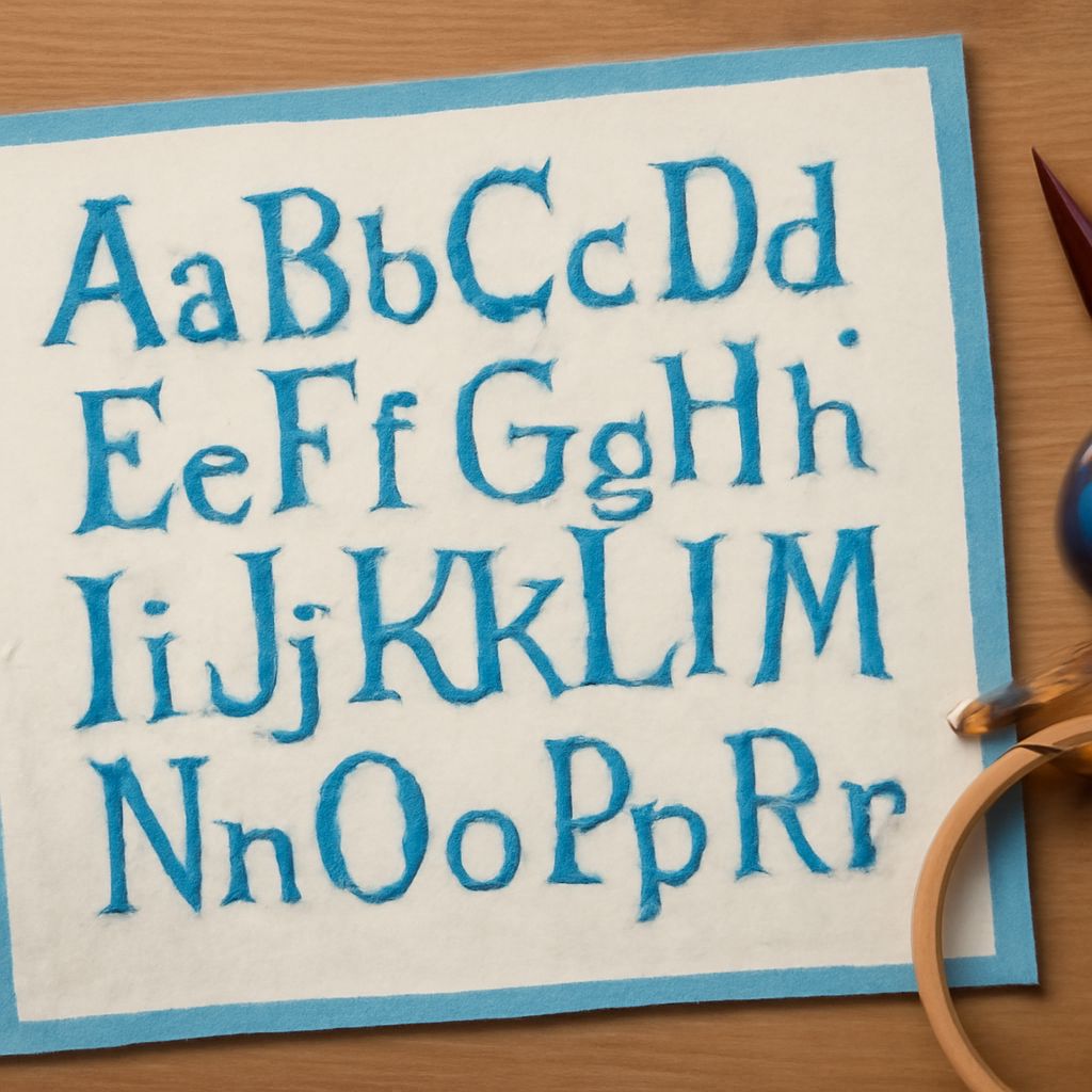
Drawing a Fish Tail Font by Hand
To draw a fish tail font by hand, start each letter with its core stroke in pencil, then add a small V-notch at each terminal end before flaring both sides outward symmetrically into the split lobe. Use a ruling pen or brush for ink work — the terminal flares need a controlled, tapered line that conventional felt-tip pens struggle to produce. Practice the I stroke repeatedly before moving to more complex letters; the I isolates the terminal form without the distraction of curves and intersections. Your next steps: pick one application from this guide — embroidery, monogram design, or award layout — and spend a focused session working only in that context. Mastery of the fishtail font in one specific use case gives you the confidence and craft knowledge to transfer it everywhere else.