Wedding Script Fonts: Choosing the Right Style for Every Occasion
What separates a memorable wedding invitation from one that gets set aside? Much of it comes down to the wedding script fonts printed across that first line of text. The typeface you choose for your ceremony stationery, signage, and paper goods sets the emotional tone before a single word is read. A well-chosen wedding script font carries softness, romance, and intention — while the wrong one can make even the most heartfelt message feel generic.
This guide covers everything you need to pick the best fonts for wedding invitations, from classical calligraphic styles to contemporary brushed scripts. You’ll also find guidance on wedding sign fonts, pairing strategies, and how to tell which of the elegant wedding fonts in your shortlist will hold up across every piece of your stationery suite.
Why Font Choice Matters for Wedding Stationery
Your invitations arrive weeks before the event itself. They’re the first physical object guests interact with, and the typography does immediate work. Fonts communicate formality, theme, and personality. A heavy black-letter script suggests a grand, traditional affair. A loose, ink-textured brush script points toward something more relaxed and modern. Understanding this language lets you make a deliberate, informed choice rather than defaulting to whatever looks pretty in a thumbnail preview.
The same principle applies to your on-site paper goods. Wedding sign fonts need to work at large sizes — on foam board, acrylic, or chalkboard — so you need letterforms that don’t fall apart when scaled up. What reads beautifully at 12-point on a screen can become an unreadable tangle of loops at 4 inches tall on a seating chart.
Types of Wedding Script Fonts
Classical Calligraphy Scripts
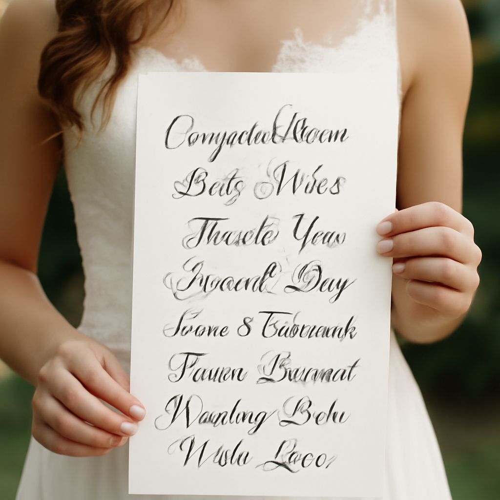
Classical calligraphy scripts mimic traditional pen-and-ink letterforms, with high contrast between thick downstrokes and thin upstrokes. Copperplate and Spencerian-inspired typefaces fall into this category. They’re ideal for formal invitations, inner envelopes, and programs where a sense of heritage and craftsmanship matters. These wedding script fonts tend to be tighter and more structured, which makes them easier to read in dense text blocks.
Modern Brush Scripts
Modern brush scripts use variable stroke widths to simulate the look of a brush pen or marker. They’re one of the most popular wedding script font families right now because they feel personal and handmade without requiring actual calligraphy skill. The informal bounce in the baseline gives each piece a relaxed, approachable energy that pairs well with natural textures like kraft paper, wood, and linen.
Romantic Flourish Fonts
Some fonts for wedding invitations are engineered specifically for decorative use, with extended swashes, alternating letterforms, and ornate terminals. These romantic flourish fonts shine as display text — think the bride and groom’s names, the date, or a short poem across the front of an invitation. Keep them away from body copy: the flourishes that look beautiful in a three-word name become unreadable across a paragraph of RSVP instructions.
Pairing Scripts with Supporting Typefaces
Almost no wedding stationery suite uses a single font throughout. The main script carries the emotional weight, while a secondary typeface handles practical information — venue address, dress code, RSVP deadline. The pairing rule that works most reliably: combine the script with a clean, low-contrast serif or sans-serif. The contrast keeps things readable and stops the suite from feeling overly ornate.
When choosing elegant wedding fonts as your primary display face, test the combination at actual print size. Something that looks balanced on a 1920-pixel-wide screen can feel lopsided at 5×7 inches. Print a mockup and hold it at arm’s length — that’s closer to how your guests will experience it.
Font Sizing and Spacing for Invitations and Signs
Invitation Sizing Guidelines
For standard A7 invitations (5×7 inches), the couple’s names typically run between 36 and 72 points depending on name length. The event details — date, time, venue — work at 10 to 14 points in the supporting typeface. The script itself usually needs generous tracking (letter-spacing) adjusted downward from defaults, because script fonts are drawn to connect naturally and extra tracking breaks those connections.
Signage Sizing Considerations
Wedding sign fonts must perform at sizes ranging from 1 inch on a place card to 24 inches on a welcome sign. Not every script typeface scales that far. Look for fonts that maintain their character weight ratio at large sizes — thin hairlines that look elegant at small scale can become nearly invisible when printed large. Test the actual font at actual size in a mockup before ordering any printed materials.
Where to Find Quality Wedding Fonts
Creative Market, Etsy digital downloads, and MyFonts are the three main paid sources for premium wedding script fonts. Each offers extended licensing options for commercial use if you’re a stationer or event designer selling finished pieces. For personal use with a tighter budget, Font Squirrel and DaFont both carry solid script options — just read the license carefully before printing anything you plan to sell or share publicly.
When you’ve settled on a shortlist, download the trial or free version if available and test the actual glyphs you need. Not every script font includes ampersands, curly quotes, or accented characters — all of which you’ll likely need somewhere in your stationery suite. Discovering a missing glyph after you’ve purchased a license is a frustrating detour.
Bottom line: Great wedding stationery starts with a font that fits your event’s personality, scales across every printed piece, and pairs cleanly with a supporting typeface. Take the time to test at print size, check licensing, and proof every glyph before you commit to production.