Body Outline Drawing: Techniques, Tools, and Typography Connections
Why does a simple body outline drawing carry so much visual weight? Strip a figure down to its outer contour — no shading, no internal detail — and the silhouette alone communicates posture, movement, and proportion with startling clarity. Artists and designers reach for outline-based approaches across a wide range of applications: figure studies, fashion illustration, geometric drawing compositions, product packaging, and editorial work. The same economy of line that makes a body outline drawing powerful in illustration shows up in typography, where knowing how to create an outline font in word or source a collegiate outline font gives your text the same visual lightness that outline figure work gives a composition.
This guide covers the drawing side — how to build accurate body outlines, how geometric drawing principles apply to figure work — and the design side, including how to find and use an orchid drawing outline approach for botanical subjects and where collegiate outline font options fit into display typography.
Building Accurate Body Outlines
Starting with the Gesture
A body outline drawing begins with gesture — the overall flow and movement of the figure before any contour is committed to paper. Rushing to the outline without establishing the gesture first produces stiff, lifeless silhouettes. Use a light, fast gesture mark to establish the spine curve, the tilt of the shoulders, and the weight distribution through the legs. This takes thirty seconds and fundamentally determines whether the final outline reads as alive or rigid.
Mapping the Major Forms
Once the gesture is in place, block in the major forms as simplified geometric shapes: the head as an oval, the torso as a modified rectangle or cylinder, the hips as a wider form, the limbs as cylinders. This is where geometric drawing thinking intersects directly with figure work. The geometric underdrawing isn’t the final outline — it’s the structural scaffolding that keeps proportions correct while you develop the actual contour. Artists who skip this step tend to struggle with distorted proportions in the extremities.
Refining the Contour
The actual outline contour traces the outer edge of each form with line variation that suggests three-dimensionality. Heavier line weight on shadow edges and lighter line weight on lit edges creates the illusion of roundness even without internal shading. Study how fashion illustrators and character designers use line weight variation in body outline drawing to give flat silhouettes a sense of volume and depth.
Geometric Drawing and Figure Construction
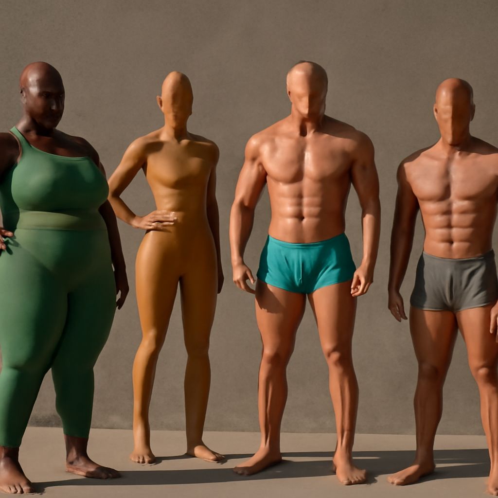
Geometric drawing provides the conceptual vocabulary for building any figure from basic forms. Every visible body part is, at its core, a geometric solid: the head is a sphere, the ribcage is an egg shape, the forearm is a cylinder that tapers slightly, the foot is a wedge. When you learn to see the body as an assembly of geometric forms, proportion problems become easier to diagnose — if the arm looks wrong, you can ask which geometric form is the wrong length or the wrong diameter.
This approach also helps you draw body outlines in unusual or foreshortened poses, because geometric forms have predictable perspective behavior. A cylinder viewed end-on becomes an ellipse; a sphere viewed from any angle remains round. These principles apply equally whether you’re doing a figure study or a geometric drawing composition for graphic design purposes.
Orchid Drawing Outline Techniques
Botanical Outline Basics
The orchid drawing outline approach applies the same contour-first thinking to botanical subjects. Orchid petals have complex, irregular edges that require careful observation — rushing the outline produces shapes that read as generic rather than species-specific. Start with the overall silhouette of the bloom, then work inward to the individual petal outlines, and finally to the lip (labellum) which is the most distinctive and complex feature of most orchid species.
Line Weight in Botanical Drawing
Botanical outline work traditionally uses consistent, even line weight rather than the varied line weight of figure drawing. This gives botanical illustrations their characteristic precision and legibility. Some contemporary illustrators mix both approaches — fine, consistent outlines for the main forms with slightly heavier weight at overlapping edges to establish spatial depth. Either approach works; the important thing is consistency within a single piece.
Outline Fonts in Design: A Quick Guide
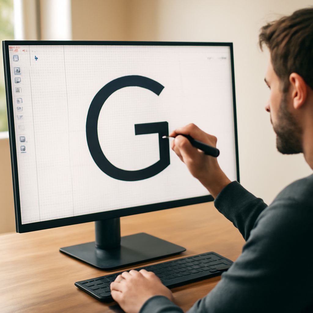
The outline drawing concept translates directly into typography through outline fonts — typefaces where the letterforms are defined by their outer edges rather than filled in with solid color. Knowing how to create an outline font in word is a common practical question: in Microsoft Word, select your text, go to Format > Text Effects, choose Text Outline, and pick your outline color and weight. This produces a basic outline effect, though for true outline fonts you’ll get better results by using a dedicated outline typeface rather than an effect applied to a standard font.
A collegiate outline font uses the same visual logic as the athletic block letters seen on varsity jackets and stadium signage — bold, slightly condensed letterforms with a clean outline rather than a solid fill. These fonts work well for sports graphics, team merchandise, and any design context where you need readable text at large sizes with a retro athletic feel. Sources for collegiate outline font options include DaFont, Creative Market, and MyFonts, where you can filter by keyword to find options licensed for your specific use case.
Combining Outline Drawing and Typography
Some of the most effective editorial and poster designs combine outline figure drawing with outline typography, creating a visual system where image and text share the same visual weight and line-based language. When both elements use the same stroke weight and the same approach to form, the design reads as intentional and unified rather than assembled from unrelated parts. This technique appears frequently in vintage sports posters, contemporary fashion editorial, and identity design for athletic brands.
When combining a body outline drawing with outline text, keep the text line weight consistent with the figure line weight. If your figure uses a 2pt stroke, your text outline should also read at approximately 2pt at the final display size. Visual consistency at the line level ties the elements together without the need for color or additional graphic treatment.