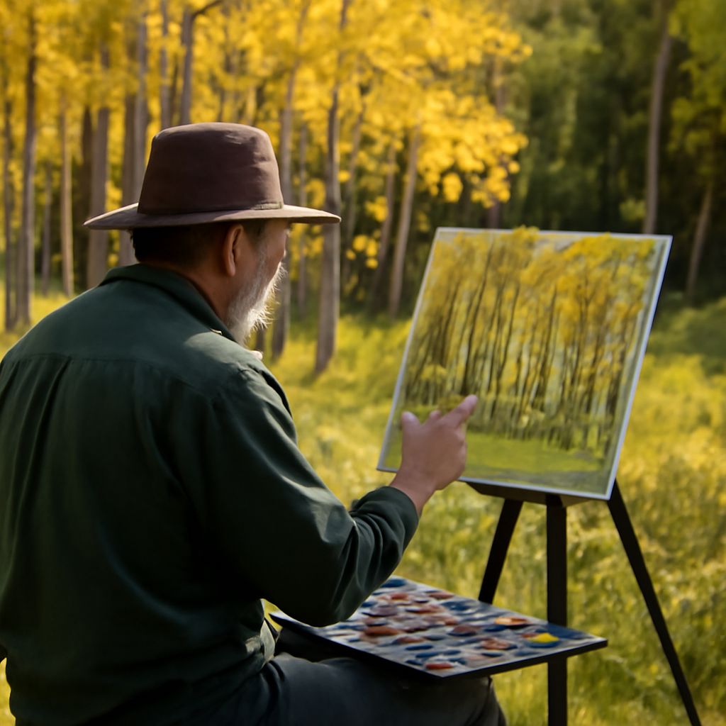
Watercolor Techniques Every Painter Should Know
What keeps watercolor painting both endlessly challenging and deeply satisfying? The medium rewards patience and punishes rigidity in equal measure — one of the few art forms where the material itself participates in the creative process. Mastering watercolor techniques means learning to work with water, gravity, and pigment rather than against them. Whether you’re exploring watercolor lettering, attempting your first watercolor anime portrait, or building a collection of vintage watercolor illustrations, each approach has its own set of skills and its own rewards.
This guide covers foundational and specialized techniques, including approaches suitable for kids watercolor projects that introduce young painters to the medium. You’ll find practical guidance you can apply in your next painting session regardless of your current level.
Core Watercolor Techniques for Every Level
Before branching into specialized styles, building a solid foundation in the core methods makes everything else easier. These are the techniques you’ll return to regardless of subject matter or style.
Wet-on-Wet
Wet-on-wet involves applying wet pigment to paper that’s already been dampened with clean water. The result is soft, diffused edges and unexpected blooms of color that are difficult to control precisely but beautiful in their unpredictability. This technique is ideal for skies, soft backgrounds, and impressionistic washes. It’s also one of the most approachable watercolor techniques for beginners because the forgiving edges hide small errors.
Wet-on-Dry
Wet-on-dry applies pigment to dry paper or over a dried wash. This produces crisp, defined edges — essential for architectural details, botanical illustration, and any subject where precision matters. Alternating between wet-on-wet and wet-on-dry within a single painting creates the kind of varied edge quality that makes work look professional rather than flat.
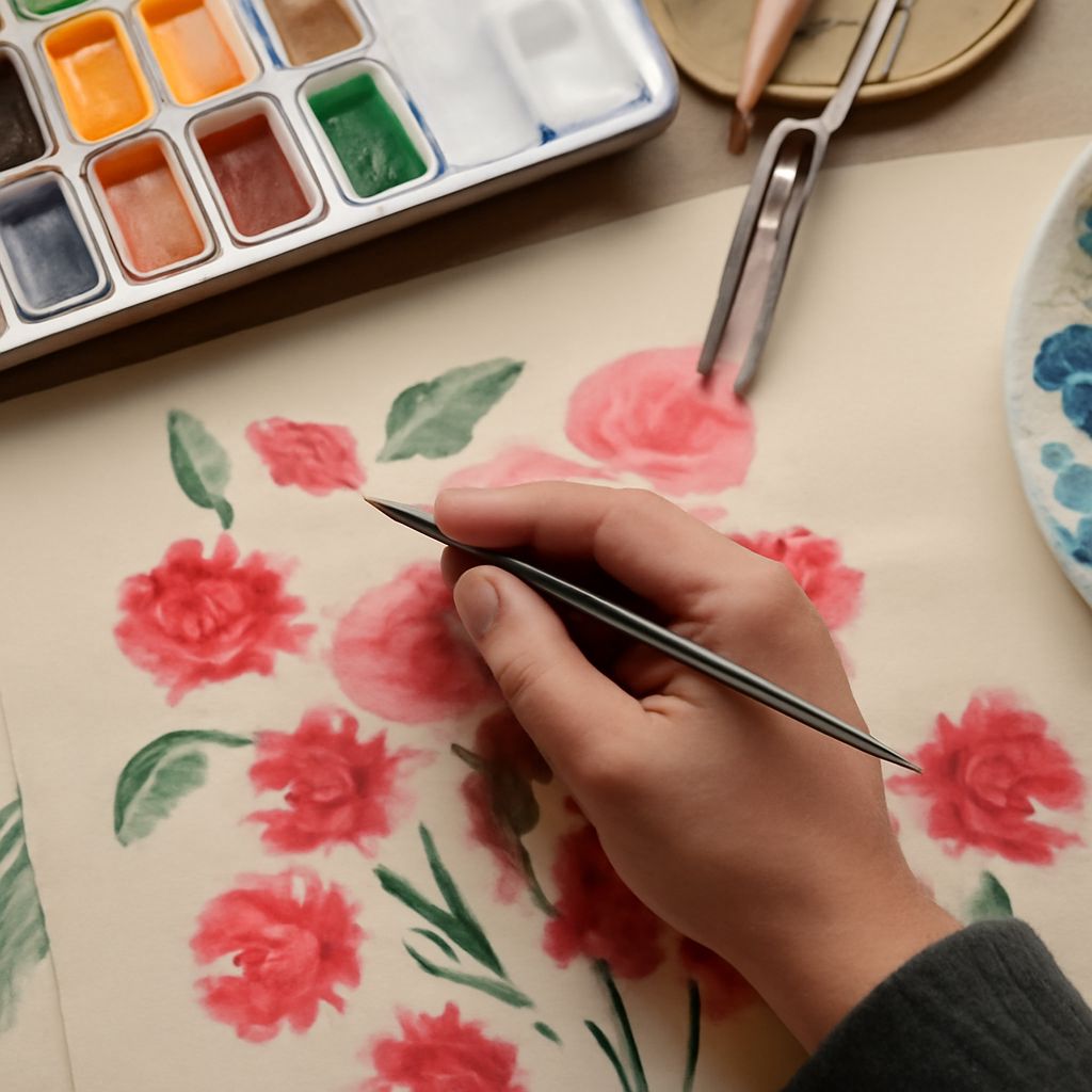
Glazing
Glazing means applying thin, transparent layers of color over completely dried previous layers. Each glaze slightly shifts the hue and deepens the tone. This is how watercolor painters build rich, luminous color without losing the white of the paper shining through. Patience is essential — rushing and painting over wet layers causes lifting and muddiness rather than the jewel-like depth glazing produces.
Watercolor Lettering: Combining Typography and Painting
Watercolor lettering sits at the intersection of calligraphy and painting. You can approach it two ways: paint letterforms directly with a pointed brush, or use masking fluid to protect letter outlines while washing color over the background. Both methods have devoted followings.
For brush lettering with watercolor, a good pointed round brush in size 2 or 4 gives you the pressure-responsive line variation that makes letterforms expressive. Load the brush fully with pigment and practice on cheap paper before moving to quality watercolor paper. The key insight with watercolor lettering is that letter spacing and consistency of stroke angle matter as much as color choice. Pair vibrant hues with neutral backgrounds for maximum legibility.
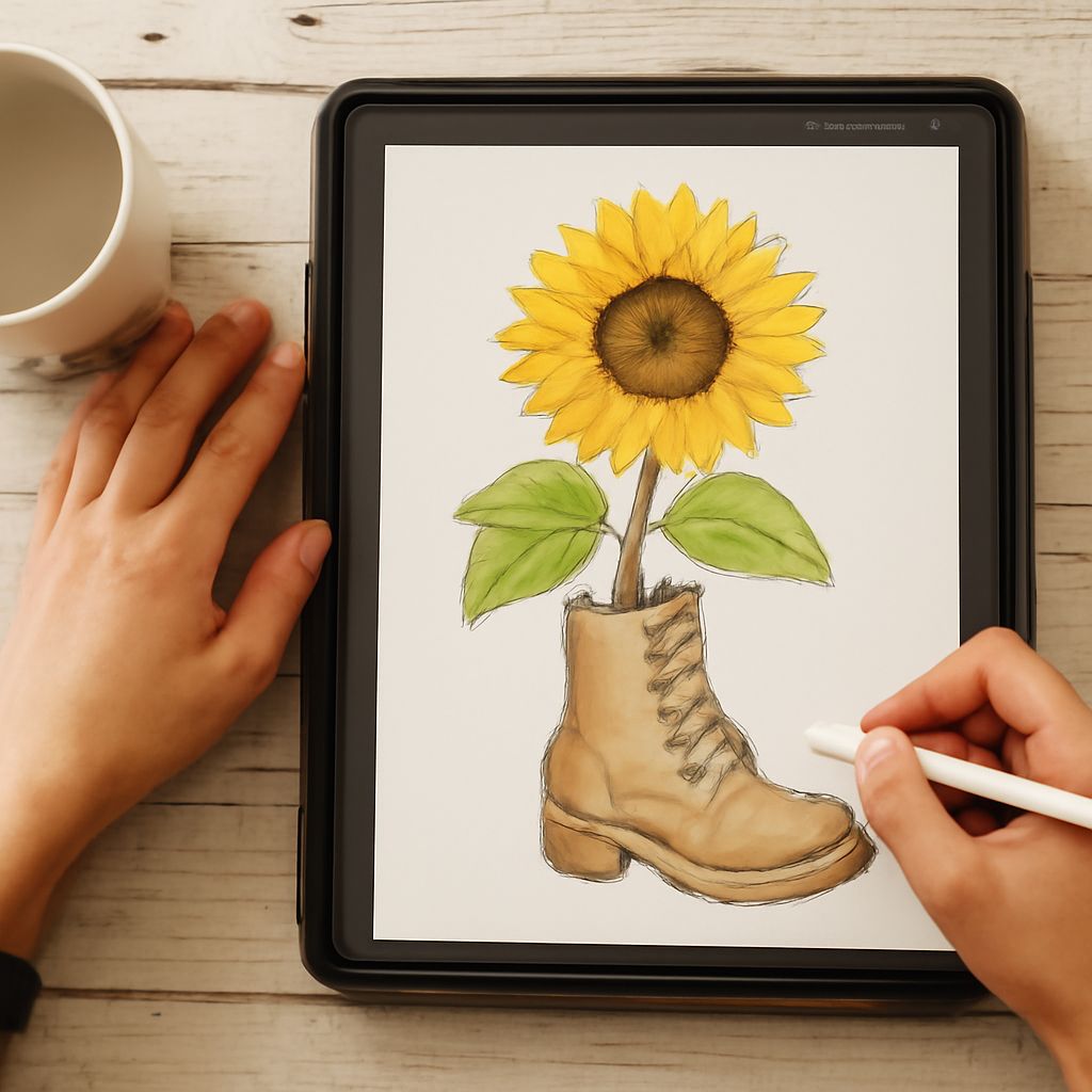
Watercolor Anime Style
Watercolor anime blends the graphic clarity of Japanese animation with the organic softness of traditional watercolor. The result is striking — characters retain their bold outlines and simplified features but gain luminous skin tones, gradient hair, and atmospheric backgrounds that cel animation can’t match.
To achieve convincing watercolor anime results, work with a limited palette — three to five colors maximum per character. Anime color design already uses simplified hue relationships, and watercolor’s transparency reinforces that simplicity. Use masking fluid or leave white paper for eye highlights, as losing those points of reflected light flattens the face entirely.
Vintage Watercolor Aesthetics
Vintage watercolor refers to illustration styles from the late 19th and early 20th centuries — botanical prints, natural history illustrations, travel postcards, and editorial artwork from before photography dominated publishing. These pieces used muted, earthy palettes, precise brushwork, and often incorporated fine pen linework over the paint.
To recreate a vintage watercolor look, choose colors like raw umber, yellow ochre, Prussian blue, and alizarin crimson rather than modern fluorescent or highly saturated pigments. Allow more white paper to show than you might in a contemporary style. Finish with thin, deliberate pen lines over the dried paint to add the structural crispness that characterized pre-photographic illustration.
Kids Watercolor Projects and Teaching Tips
Watercolor is one of the best painting mediums for children because cleanup is easy and the transparent, bright colors produce instant gratification. Kids watercolor projects work best with pan paints rather than tubes — the portability and ease of use means children can focus on the painting rather than the setup.
- Start with wet-on-wet sky washes — children find the color-mixing magic exciting and immediate.
- Use cold-press watercolor paper rather than copy paper; the texture holds paint better and resists warping.
- Teach kids watercolor basics through simple subjects: rainbows, sunsets, and simple flower shapes require only a few colors and basic brush strokes.
- Resist the urge to correct their work — experimentation is how young painters internalize what the medium can do.
Combining watercolor techniques like wet-on-wet backgrounds with simple stamping or masking tape resist techniques creates projects that feel experimental and produce results children are genuinely proud of.