C Logo Design: Letter C Logo Ideas, Process, and Proposal Tips
What makes a c logo instantly recognizable? The letter C has one of the most versatile shapes in the alphabet — open, arcing, directional. It suggests movement, embrace, and completion all at once. Brands from media companies to tech startups have built entire visual identities around a well-crafted C mark. Whether you’re working through a full logo design process or searching for a starting point for a letter c logo, this guide breaks down what works, why it works, and how to take your concept through to a polished logo design proposal.
You’ll also find specific direction on building out a complete letter c logo design from sketch to final deliverable, including how to present your work professionally when the time comes to share it with a client.
Why the Letter C Works So Well in Logo Design
The C shape naturally creates visual interest because it’s almost — but not quite — a closed circle. That gap creates tension and directionality. The eye is drawn toward the opening, which designers use to point toward other elements, create negative space forms, or suggest forward motion.
A letter c logo can be rendered in countless styles: serif, sans-serif, slab, script, or entirely abstracted into a geometric form. The inherent roundness of the letter makes it friendly and approachable in circular badge designs, while the same shape in sharp geometric form reads as modern and technical. This range of interpretation means the c logo works for industries from hospitality to software.
The Logo Design Process for Letter-Based Marks
A solid logo design process starts long before you open design software. The most effective letter-based marks come from deep understanding of what the brand needs to communicate and who it needs to communicate to.
Discovery and Brief
Before sketching anything, gather information: what does the company do, who are its customers, what are its primary competitors, and what three to five adjectives should the logo communicate? This brief shapes every decision that follows. A letter c logo design for a children’s education company will look radically different from one for a cybersecurity firm, even if both start with the same letter.
Sketch Phase
Generate volume before quality. Aim for 20 to 30 thumbnail sketches of possible letter c logo design directions before evaluating any of them. Some will be obvious; some will be experimental. The goal is to exhaust obvious solutions so you can discover less expected ones. Pay attention to negative space — the area inside and around the C arc often holds the most interesting design opportunities.
Digital Development
Move the strongest three to five sketches into vector software. Work in black and white first; if the c logo doesn’t read clearly in monochrome, color won’t save it. Refine proportions, test at multiple sizes from favicon to billboard scale, and ensure the mark reproduces clearly at all dimensions.
Letter C Logo Design Variations Worth Exploring
Several design directions consistently produce strong results for C-based marks:
- Monogram integration: Nest a secondary letter inside the C arc for companies with two-word names.
- Icon hybrid: Transform the C into a related symbol — a wave, a crescent, a tool shape — relevant to the industry.
- Bold geometric: Strip the letterform to its essential geometry for a clean, modern mark that works at any size.
- Script C: A flowing, calligraphic C suggests creativity, tradition, or luxury depending on weight and slant.
- Negative space play: Use the gap in the C to reveal a hidden element — an arrow, a face, a relevant symbol.
Each of these directions suits a different brand personality. The right choice comes from your discovery brief, not from personal preference.
Building a Logo Design Proposal
A logo design proposal does two things: presents your design work clearly, and contextualizes it so the client understands what they’re seeing and why. Many designers present logos too small, against white backgrounds only, without showing how the mark will actually be used in the real world.
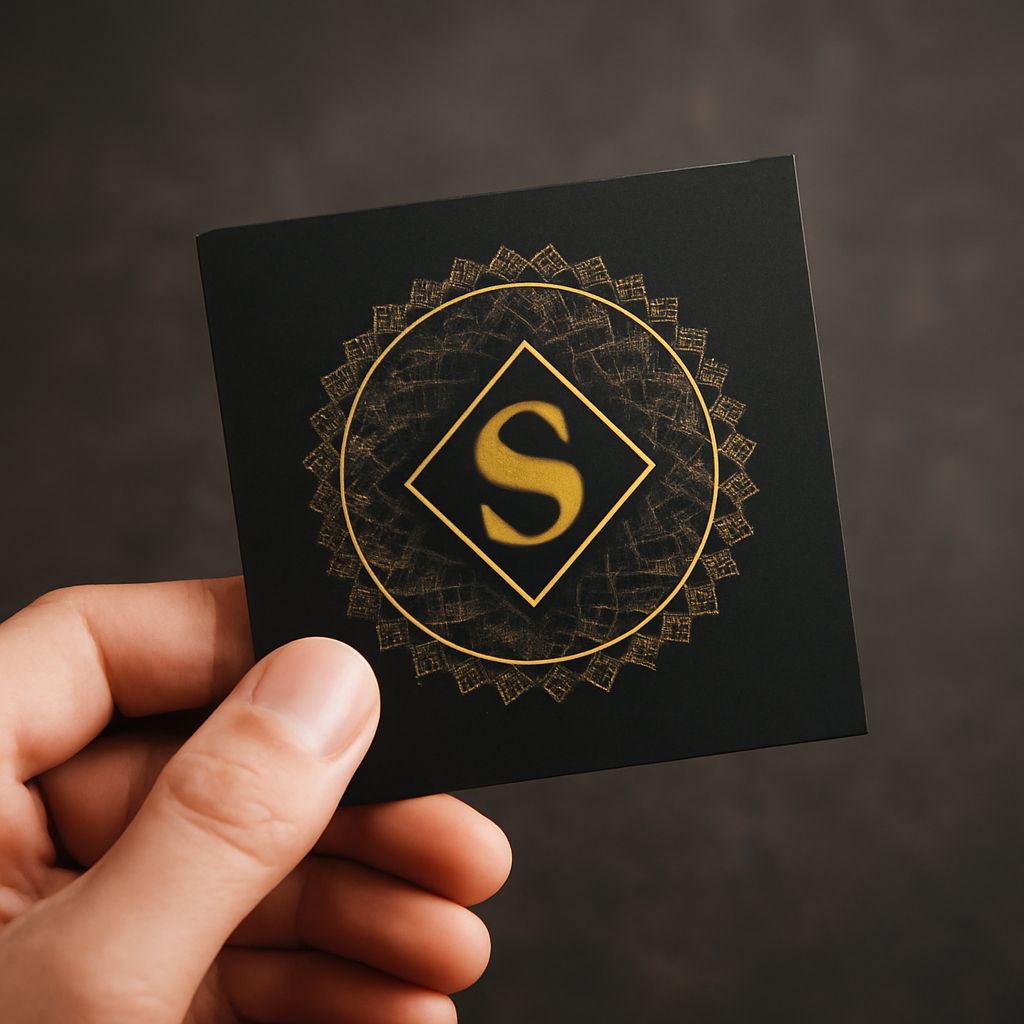
For a strong logo design proposal, show your letter c logo in multiple contexts: on a business card, on a website header, as an app icon, on a dark background, and on a light background. Include the rationale for your design decisions in plain language — not design jargon. Explain what the mark communicates and why those choices align with the brief. This transparency builds client confidence and reduces revision cycles dramatically.
Present two to three distinct directions rather than one finished design. Giving clients choice prevents the all-or-nothing dynamic that leads to frustrating revision conversations. Each direction should be genuinely distinct — different in concept, not just in color.
Delivering the Final Letter C Logo Design
Once a direction is approved, finalize your letter c logo design with full attention to technical quality. Deliver vector files (SVG, AI, EPS) at all standard sizes, along with PNG exports optimized for web and print use. Include both full-color and single-color versions, reversed versions for dark backgrounds, and a version that works at favicon dimensions without losing legibility.
A thoughtfully packaged delivery — organized files, clear naming conventions, a brief usage guide — is the final step in a professional logo design process. Clients remember how the handoff feels as much as they remember the design itself.