Darth Vader Drawing Easy: Line Weight, Expressive Style and the Iconic Look
Can you really make a darth vader drawing easy enough for beginners without losing what makes the character recognizable? The answer is yes, and it starts with understanding what visual information your eye actually needs to read the design. Vader’s helmet is one of the most graphically efficient designs in film history, meaning a handful of shapes communicate everything. Add line weight drawing principles on top of that foundation, and you get results that look far more polished than the effort requires.
This guide covers how to simplify the helmet into basic shapes, how line weight drawing affects the mood of your illustration, how expressive line drawing techniques bring the figure to life, what the darth vader font tells us about the character’s design language, and how to approach a complete darth vader line drawing from rough sketch to finished piece.
Breaking Down the Helmet into Simple Shapes
The Underlying Geometry
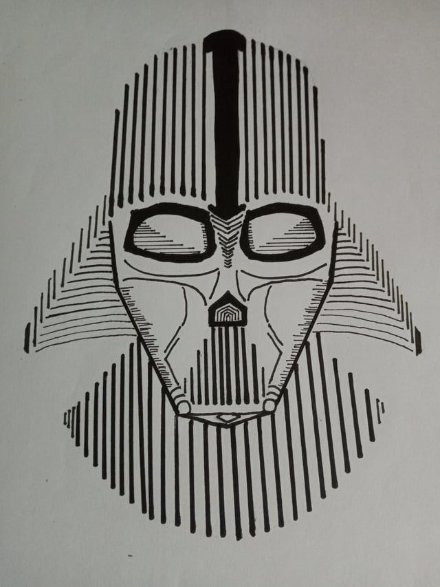
Every darth vader drawing easy approach begins with geometry. The helmet is essentially an elongated dome sitting on a trapezoidal face mask. The face plate has a central ridge, two eye lenses of slightly different sizes at the drawing level, and a mouth grille with horizontal bands. None of these elements require advanced drawing skills. They require accurate observation of proportion and placement.
Start with a vertical center line. The dome sits symmetrically around it. The face plate is slightly narrower at the bottom than the top, creating a subtle wedge shape that gives the design its slightly menacing taper. Get these proportions right first, and adding detail becomes straightforward.
Reference and Simplification
If you want to make the drawing accessible, reduce each complex form to its simplest equivalent. The breathing apparatus becomes a rectangular block. The shoulder armor becomes a curved trapezoid on each side. The cape is a single flowing shape rather than a collection of fabric folds. This simplification strategy is exactly what makes a darth vader drawing easy to replicate at any skill level.
Line Weight Drawing for Maximum Impact
How Weight Creates Depth
Line weight drawing is the practice of varying the thickness of your lines to communicate form, shadow, and spatial relationships. Thicker lines at the base of forms suggest shadow and weight. Thinner lines at the top suggest light and elevation. For a Vader illustration, heavy lines define the silhouette and the deep shadow areas under the helmet brow. Lighter lines describe the reflective surfaces of the helmet dome.
The contrast between heavy exterior lines and lighter interior detail lines creates a sense of three-dimensional form even in a flat illustration. Line weight drawing is one of the most powerful tools available in black-and-white illustration, and Vader’s predominantly dark design makes it an ideal subject for practicing this technique.
Pressure and Tool Choice
With a ballpoint pen, you control weight through pressure. With brush pens, you control it through angle and speed. With digital tools, you can set pressure sensitivity to mimic both. Whatever your medium, practice making deliberate weight transitions within a single stroke rather than going back over lines to thicken them after the fact. That habit produces cleaner, more confident-looking work.
Expressive Line Drawing and Character Presence
Beyond Technical Accuracy
Expressive line drawing prioritizes emotional communication over precise geometry. Where a technical illustrator might measure proportions carefully, an expressive approach uses confident, flowing strokes that suggest energy and intention. For a character like Vader, this might mean slightly exaggerating the forward lean of the helmet, extending the cape with more dramatic flow, or letting the lines of the respirator suggest heaviness and mechanical menace rather than mapping it accurately.
The best expressive line drawing comes from drawing the gesture first, the emotional core of the pose, and then adding structural information on top. Vader’s most iconic poses, arms at his sides, cape spreading behind him, have a gravity-defying stillness that reads as powerful restraint. Capture that quality in your gesture lines first.
Darth Vader Font as a Design Reference
The darth vader font used in Star Wars marketing isn’t just a typographic choice. It’s a visual language statement. The extended, spaced letterforms suggest authority and grandeur. The slight condensed quality in some versions suggests efficiency and precision. These same design principles, authority, weight, precision, apply directly to how you approach a Vader illustration. Your line quality should communicate the same qualities as the darth vader font: nothing wasted, everything intentional.
Looking at the design language of a character’s associated typography can give you clues about the character’s visual identity that go beyond the costume itself. It’s a design research habit worth building.
Building a Complete Darth Vader Line Drawing
A finished darth vader line drawing follows a clear sequence. Thumbnail the composition first, deciding on the angle, the pose, and how much of the figure you’re including. Then rough in the major shapes lightly. Check proportions before committing to any detail. Once the structure is solid, begin your expressive line drawing pass, working from large shapes to small details. Save your darkest, heaviest lines for the final pass so you maintain control of value relationships throughout the process.
Next steps: Practice the helmet alone in multiple views before drawing the full figure. Then combine your line weight drawing skills with the gesture-first expressive approach by drawing Vader in at least three different poses. Each repetition builds the muscle memory that makes the design feel natural rather than labored.