Calligraphy Script Guide: Modern Styles, Fake Calligraphy, and Faux Fonts
What is the difference between calligraphy script done with a real pen and fake calligraphy font created digitally? Surprisingly little, from the viewer’s perspective, as long as the execution is clean. Script calligraphy as a discipline ranges from traditional pointed pen techniques to fully digital approaches using a modern calligraphy generator. Whether you want to learn to write or just want a faux calligraphy font for a design project, understanding the underlying letterforms helps you use them well.
Understanding Calligraphy Script Styles
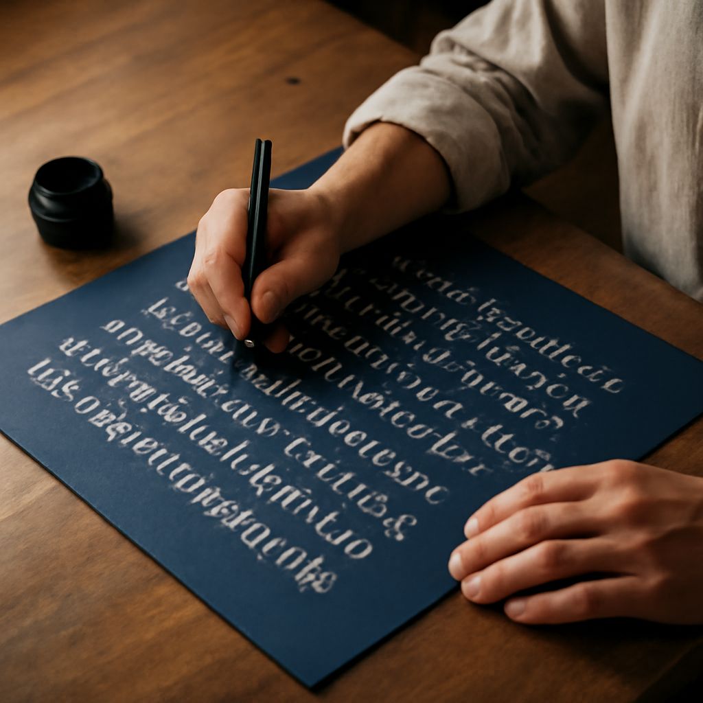
Calligraphy script covers a wide range of letter styles. Copperplate and Spencerian are the foundational Western pointed pen styles, characterized by hairline upstrokes and broad downstrokes created by flex nib pressure. These historic forms are what most people picture when they hear the term script calligraphy. Modern calligraphy, which became popular in the 2010s, takes those same basic pressure rules and applies them more freely, with irregular letterforms and personal flourishes that would not appear in formal copperplate.
Each style has a different feel. Traditional calligraphy script is formal, precise, and carries strong associations with official documents and historic correspondence. Modern script calligraphy feels personal, expressive, and approachable. The choice between them depends on what the final piece needs to communicate.
Using a Modern Calligraphy Generator
A modern calligraphy generator is a web or app tool that renders typed text in a calligraphic script style. Most generators offer multiple style options ranging from formal copperplate to brush lettering. They are useful for quickly visualizing how a name or phrase will look in a script before committing to hand lettering.
The limitation of any modern calligraphy generator is that the output is only as good as the underlying typeface. Computer-generated connections between letters often miss the subtle ligatures and entry strokes that make hand lettering feel natural. Use the generator as a reference or starting point rather than a final output for important projects.
Fake Calligraphy Font Techniques
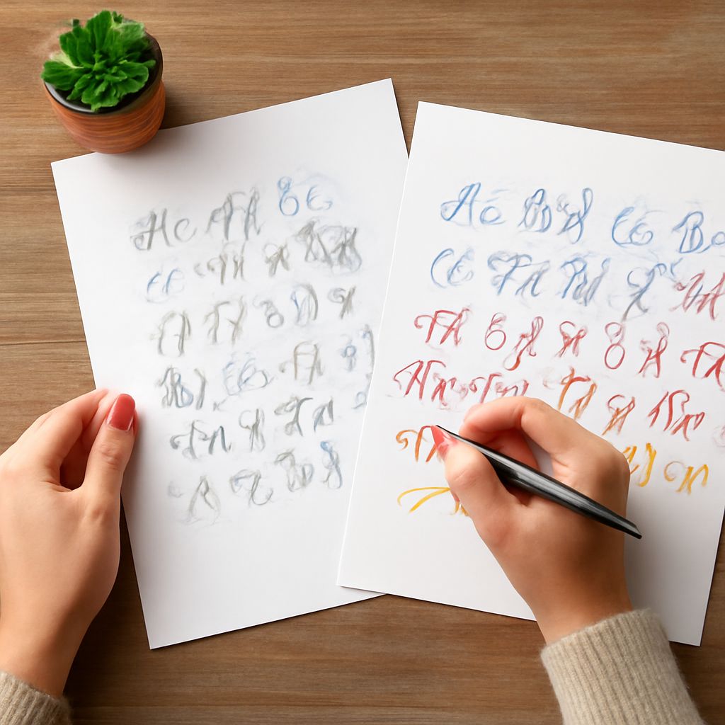
Fake calligraphy font techniques let you produce the look of pointed pen calligraphy with any pen, including a basic ballpoint or felt tip. The process involves writing the letterforms first with normal consistent pressure, then identifying all the downstrokes, and thickening them by drawing parallel lines along their inside edges and filling the resulting space. The result mimics the thick-thin contrast of real calligraphy script without requiring a flex nib.
A fake calligraphy font approach is popular in crafting and DIY contexts because it requires no specialized tools. The main skill required is control: you need to draw the thickening strokes smoothly and consistently without changing the overall shape of the letterform. Practice on printed guidelines until your thickening strokes are even before moving to final pieces.
Choosing a Faux Calligraphy Font for Design Projects
A faux calligraphy font is a digital typeface designed to mimic the look of hand lettering or calligraphy. Many free options exist on Google Fonts, Font Squirrel, and DaFont. When choosing a faux calligraphy font, look at the connecting strokes between letters. Natural-looking connections suggest a well-designed typeface; abrupt joins or mismatched angles suggest a cheaper conversion from disconnected letterforms.
Test the font with the actual words you plan to use, not just the standard alphabet preview. Some letter combinations create awkward collisions in faux calligraphy fonts that only appear when you type specific words. The letters r-n, f-i, and t-t are common problem combinations worth checking before committing to a font choice.