E Logos: Design Principles for the Letter E in Brand Identity
Why do e logos appear so consistently across industries as diverse as technology, entertainment, education, and finance? The letter E’s horizontal stroke structure gives designers unusual compositional flexibility — those three parallel lines can be spaced, weighted, rotated, and selectively removed to create distinctive marks that maintain E-letterform recognition while expressing radically different brand personalities. A well-designed logo with e at its center communicates the same letterform through remarkably varied visual approaches, from minimal geometric abstractions to ornate monogram treatments. Logos in i have a dream speech and similar rhetorical contexts demonstrate that the word “ethos” — itself beginning with E — carries argumentative weight, just as a well-executed letter E mark carries visual authority.
This guide covers the design logic behind effective logos with e, explores how the letter E’s specific geometry creates opportunities and constraints, and gives you practical criteria for evaluating whether a letter e logo concept will hold up across real-world applications. You’ll also find specific guidance on developing a cool e logo that doesn’t rely on obvious design moves.
The Geometry of the Letter E in Logo Design
Structural Advantages of the E Letterform
E logos benefit from the letter’s inherent geometric order: three horizontal strokes connected by a single vertical stroke create a natural rhythm and visual hierarchy. The middle horizontal (the crossbar) can be moved up or down, shortened or extended, to create completely different visual personalities while maintaining E recognition. Raised middle strokes suggest elegance and restraint; centered middle strokes signal balance and stability; shortened middle strokes create tension and energy.
The E letterform also has natural asymmetry that makes it directionally dynamic — it points right. This rightward orientation makes a logo with e feel naturally forward-moving when used as a standalone lettermark. Companies wanting to project momentum, progress, or future-orientation frequently find that E lettermarks communicate these qualities without requiring additional design elements.
Common E Logo Design Approaches
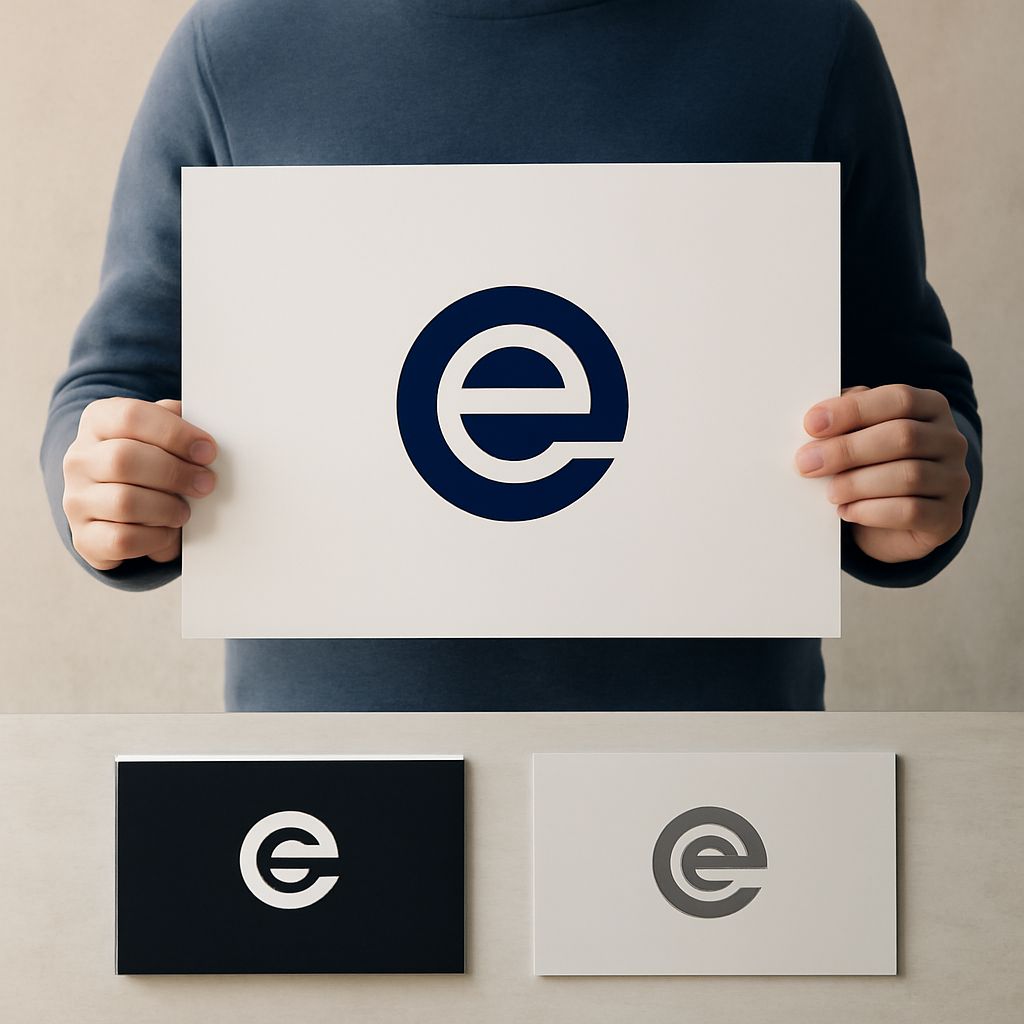
The most common approaches to logos with e include the geometric reduction (stripping all organic curves to reveal the pure horizontal-and-vertical structure), the negative-space E (where the letterform is defined by surrounding shapes rather than drawn directly), and the integrated monogram (where the E combines with secondary initials to form a unified compound mark).
The negative-space approach is particularly effective for e logos because the E’s three horizontal strokes create natural opportunities for the letterform to emerge from background shapes. A rectangle with three notches cut from the right side reads clearly as E — the surrounding negative space does the work of defining the letter without requiring any drawn line to be the E itself.
Developing a Cool E Logo
Moving Beyond the Obvious
A cool e logo requires moving past the first three solutions that come to mind — those are also the first three solutions your competitors will think of. Once you’ve exhausted the obvious approaches (three horizontal lines, standard letterform, obvious negative space), start asking structural questions: What happens if one stroke is missing? What if the strokes are not parallel? What if the vertical connection is hidden or implied rather than drawn? Each of these questions opens a different design direction.
The best letter e logo designs succeed because they make a single unexpected geometric decision and then commit to it with precision. The unexpected element creates memorability; the precision creates professionalism. A cool e logo that looks clever but renders inconsistently across sizes and materials fails the real-world test regardless of how good it looks in a mockup.
Testing Your Letter E Logo
A letter e logo should pass four critical tests before being considered finished: legibility at small size (favicon, embroidery), clarity when reversed on a dark background, readability in single color, and distinctiveness within its category. The last test is the hardest — research what other e logos look like in your specific industry. If your mark too closely resembles an existing brand’s E lettermark within the same category, you have a trademark and recognition problem regardless of how good the design is.
Logo Applications and Final Considerations
Once your logos with e design is finalized, prepare a complete asset package: the primary full-color version, single-color black and white versions, a reversed version for dark backgrounds, and approved minimum size guidelines. The minimum size matters especially for lettermark logos — a complex E with fine details may need a minimum application size of 1 inch to remain legible, while a bold, simple E can appear as small as a quarter-inch square without losing definition. Document these specifications and enforce them consistently across all brand applications to maintain the visual integrity your cool e logo was designed to achieve.