Have you ever wondered how a simple font can transform the entire look of your design? From marketing materials to movie posters, the right choice of font can make a significant difference. But what exactly makes a font stand out, and how do you choose the best one for your needs? This is where the concept of a font outline becomes essential. By understanding and utilizing various styles like block outline font, you can enhance your design’s readability and aesthetic appeal. Dive into the world of typography to see how a billing block font can impact film media and discover creative ways to apply bounce font in graphic design.
What is a Font Outline?
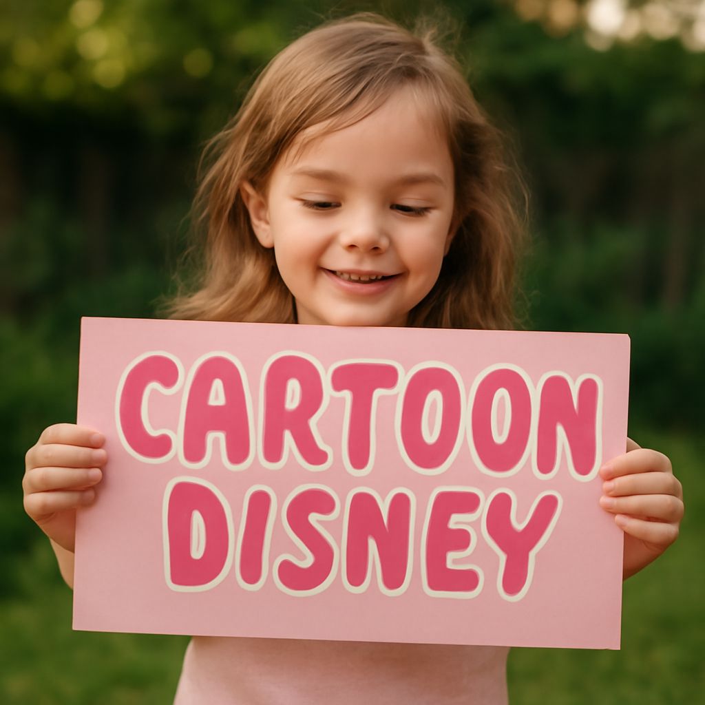
A font outline refers to the border or edge that surrounds each character in a typeface. This outline can add depth and clarity to the text, making it more visually engaging and easier to read against complex backgrounds. By incorporating fonts with outlines, designers gain the flexibility to emphasize specific words or entire sections, drawing the viewer’s attention to key content. Whether for print or digital media, font outlines enhance text visibility and add a striking element to any project.
Different Types of Fonts with Outline
Fonts with outline come in various styles, each offering unique characteristics suited to different design contexts. Among the popular types are block outline font and bounce font.
- Block Outline Font: This style features a thick border around each letter, providing a robust and bold appearance. It’s commonly used in headers and titles where a commanding presence is needed.
- Bounce Font: Known for its playful and dynamic nature, bounce font combines outline with irregular baseline shifts, creating a lively and informal look. It’s perfect for designs aiming to convey energy and creativity.
Other outline fonts can vary in thickness and shape, allowing you to perfectly match the tone and purpose of your project.
How to Use Block Outline Font Effectively
When integrating block outline font into your design, consider its impact and legibility. This style is excellent for making text stand out, especially in titles and headers. To effectively use it:
- Contrast: Ensure there is sufficient contrast between the font and the background to enhance readability.
- Spacing: Adjust the spacing between characters to prevent the outline from creating a cluttered appearance.
- Color: Choose outline colors that complement the main text color, adding depth without overwhelming the reader.
By paying attention to these details, you can utilize block outline font to capture attention and convey your message powerfully.
Understanding Billing Block Font in Film and Media
The billing block font is a staple in film and media, primarily used in movie posters and promotional materials. Characterized by its compact and uniform appearance, it effectively presents essential information such as cast and crew credits in a limited space. Here’s how it functions within the industry:
- Consistency: The uniform structure of billing block font ensures all text fits neatly within the designated area, maintaining a professional look.
- Hierarchy: It provides a clear hierarchy of information, guiding viewers through the important details of a film’s production.
Using billing block font strategically can contribute to a polished and organized presentation, essential for any media project.
Creative Uses of Bounce Font in Graphic Design
Bounce font offers endless creative opportunities in graphic design due to its whimsical and energetic style. Here are some innovative ways to incorporate it:
- Branding: Ideal for brands targeting a younger audience, bounce font can add a playful touch to logos and promotional materials.
- Invitations and Posters: Its dynamic nature is perfect for invitations, posters, or any design requiring an informal, fun vibe.
By applying bounce font thoughtfully, you can create memorable and engaging designs that resonate with your target audience.
Choosing the Right Font for Your Project
Selecting the appropriate font involves considering your project’s objectives and the tone you wish to convey. Here are some tips:
- Purpose: Identify the primary message or emotion you aim to express. Choose a font that aligns with this goal.
- Audience: Consider your audience’s preferences and expectations. A playful bounce font might appeal to a younger demographic, while a professional setting might require a block outline font.
- Medium: Adapt your font choice to the medium of your design, whether print, digital, or multimedia.
By carefully evaluating these factors, you can select a font that enhances your design and effectively communicates your message.