Have you ever searched for the perfect c in different fonts and found yourself lost in a sea of options? Typography offers an enormous range of letter styles, from rigid geometric forms to flowing scripts, and the letter C is one of the most varied shapes across type families. Whether you want curly fonts for a wedding invitation, letter c fonts for a logo, or simply want to understand how n fonts and l in different fonts compare to the letter C, this guide lays it all out.
You’ll learn how to identify font categories, what makes curly fonts work for certain projects, and how to choose the right letter style for your design needs. By the end, you’ll have a clear system for evaluating any c in different fonts you encounter.
How the Letter C Changes Across Font Categories
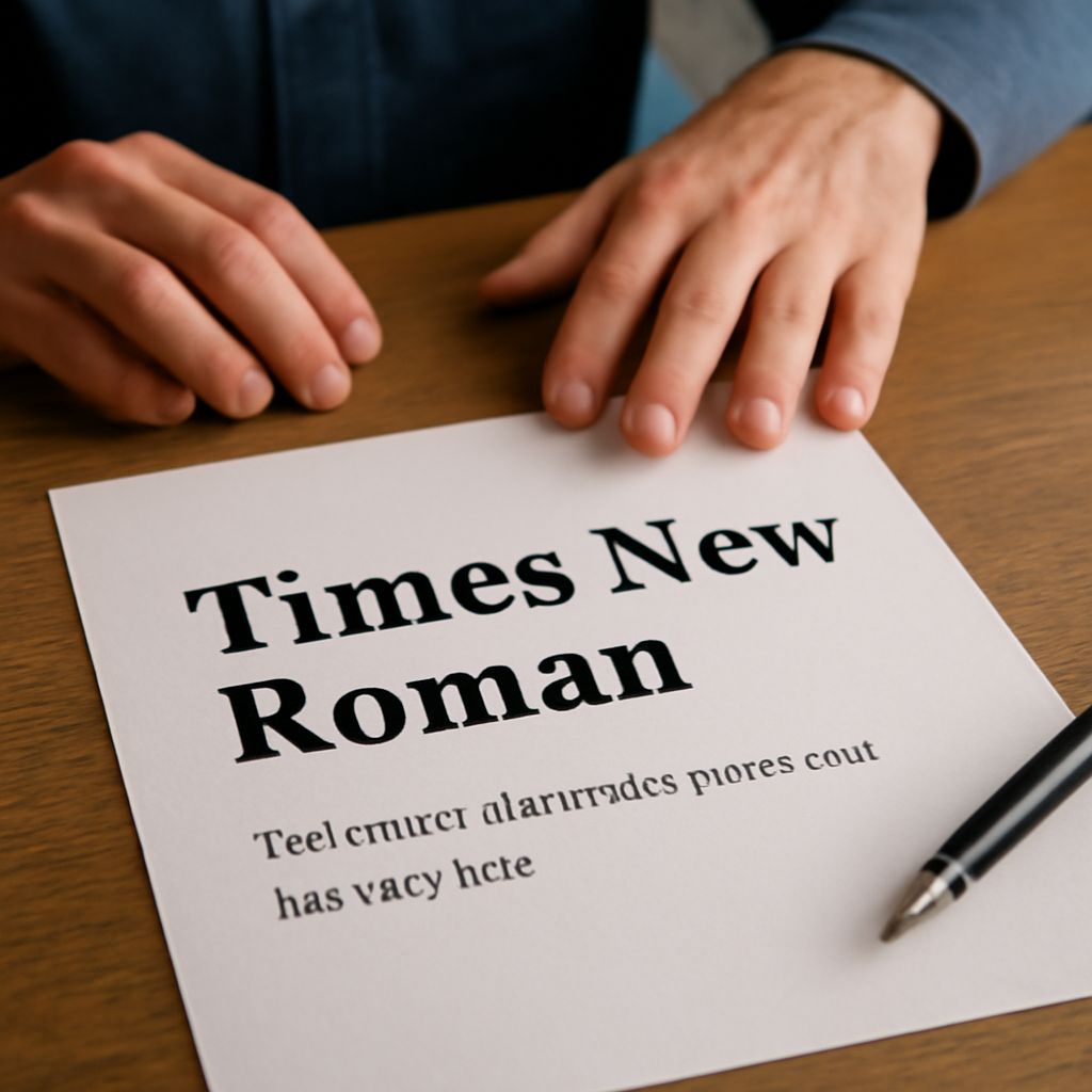
Serif Fonts In traditional serif fonts, the letter C has small horizontal strokes called serifs at the terminals. The opening of the C is typically moderate, neither fully closed nor wide open. Old-style serifs like Garamond give the C a slightly angled stress axis, meaning the thickest point of the curve sits at an angle rather than at the dead bottom. Modern serifs like Bodoni push that contrast further, giving very thick main strokes and razor-thin hairlines.
When looking at c in different fonts within the serif category, the terminal angle is one of the most reliable ways to distinguish styles. Humanist serifs keep the terminals at a natural pen angle; transitional serifs sit closer to vertical; modern serifs are fully vertical or even slightly inward-facing.
Sans-Serif Fonts
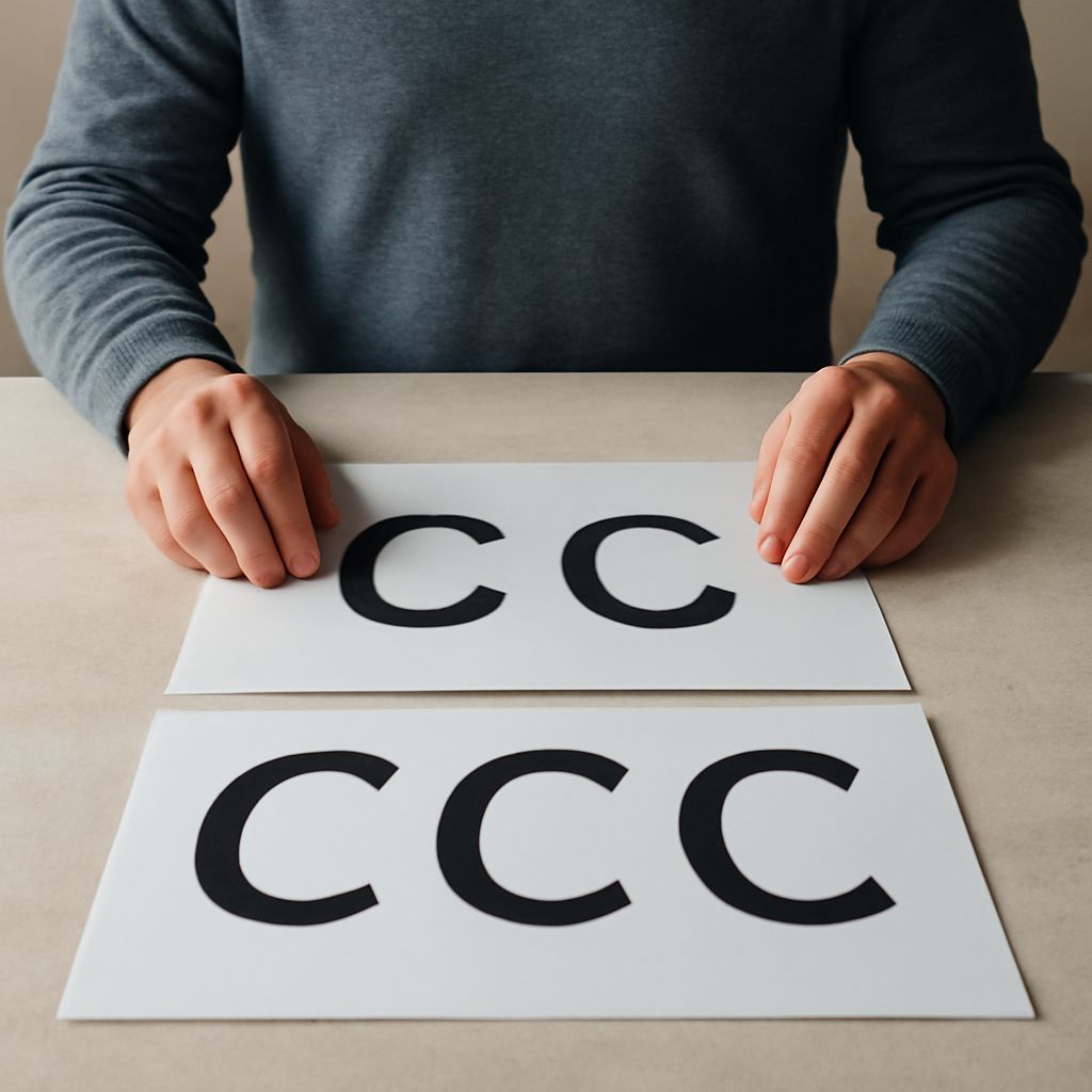
Sans-serif letter c fonts have no terminal strokes and generally show less stroke contrast. Geometric sans-serifs like Futura build the C from near-perfect circle arcs, giving it a clean, mathematical quality. Humanist sans-serifs like Gill Sans vary the stroke width slightly for a warmer feel. Grotesque sans-serifs like Helvetica have a slightly closed aperture that distinguishes them from more open humanist designs.
Comparing l in different fonts to the C in the same family is a quick way to understand how a typeface handles vertical versus curved forms. If the l has softened corners at the foot, the C will usually have a softer curve treatment too.
Curly Fonts and Script Typography
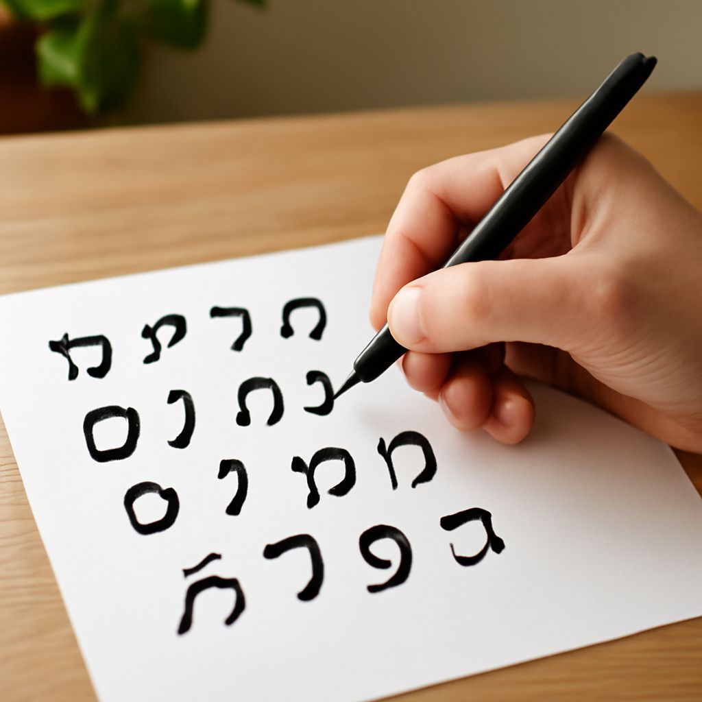
What Makes a Font Curly Curly fonts typically belong to the script or display categories. They mimic handwriting or calligraphic strokes, with the letter C often featuring a sweeping entry stroke that begins above the baseline and loops back into the main arc. Formal scripts like Edwardian Script have very controlled curls; casual scripts have looser, more irregular ones.
The terminal style is the defining feature of curly fonts. Instead of a clean cut or a serif, the stroke ends in a flourish or a curl that gives the letter its distinctive personality. This works beautifully in decorative headlines but can hurt legibility in body text at small sizes.
Choosing Curly Fonts for Projects
Curly fonts suit invitations, packaging, fashion branding, and children’s materials. For invitations, pair a curly script for headings with a simple serif or sans-serif for body text. The contrast keeps the design readable while letting the script personality come through on the headline. Avoid using curly fonts for long paragraphs, legal text, or digital interfaces where screen resolution will blur the fine strokes.
Understanding N Fonts and L in Different Fonts
Looking at n fonts alongside the C reveals how a typeface handles counter spaces. The counter of an n, the enclosed space inside the arch, should feel proportionally similar to the counter of the C. If a typeface has a very open, spacious C, the n will usually have a tall arch with generous interior space. Tight, narrow n fonts tend to pair with a C that has a smaller opening.
The l in different fonts often tells you about cap height, stroke weight, and baseline treatment. A tall l with a rounded foot suggests a humanist design philosophy that usually carries over to a more open, organic C shape. A strictly geometric l with no foot treatment will appear in font families where the C is a precise circle arc.
Practical Tips for Working with Letter C Fonts
When pairing letter c fonts in a design, check three things: aperture openness, terminal style, and stroke contrast. If your display font has a wide-open C with high stroke contrast, choose a body font with similar aperture values and at least moderate contrast. Mixing a font with a very closed C against one with a very open C creates a visual tension that feels unresolved.
Test your chosen fonts at multiple sizes. Many curly fonts fall apart below 14 points on screen. If your design requires small text captions, run a quick print test or screen test before committing to the font choice. A font that looks perfect at 60 points may be completely illegible at 9 points.
Where to Find and Test Fonts
Google Fonts offers a free collection with good preview tools that let you type your own text. Adobe Fonts has a larger catalog and is included with Creative Cloud subscriptions. Font Squirrel provides free fonts cleared for commercial use. For curly fonts specifically, DaFont and Creative Market have large script and display sections worth exploring.
Use the preview tool to type the specific letters that matter most to your project. If your logo text starts with C and N, test c in different fonts and n fonts side by side in the actual preview. That real-world test catches proportion mismatches that a general alphabet preview might miss.