Have you ever seen a perfectly lettered calligraphy circle on a wedding invitation or a logo and wondered how those letters curve so gracefully along an arc? Circular layouts test every calligrapher’s skills — the angle of each letter must shift continuously to stay perpendicular to the circle’s radius, and spacing requires careful planning to avoid crowded or gapped results. Whether you want to add circular compositions to your practice, explore turning your art into a calligraphy business, study the discipline of kanji calligraphy, discover the right stylish calligraphy font for digital projects, or build a consistent calligraphy journal practice, this guide walks you through each path in a practical, step-by-step way.
Calligraphy rewards patience and repetition. Each stroke, each curved letter, each new composition teaches your hand something that the next session will benefit from. Think of this guide as a map — you decide which destination to pursue first.
What Is a Calligraphy Circle and How to Draw One
Planning Circular Layouts
A calligraphy circle uses a circular baseline so that text wraps around an imaginary ring. Common applications include monogram seals, stamp designs, logo wordmarks, and decorative framing for a central motif. Before touching your nib to paper, count your characters, estimate average letter width, and calculate total arc length needed. Subtract that from the circle circumference to determine available spacing between words or before repetition.
Positioning Letters Along a Circle Use a compass to lightly draw your circle in pencil, then mark radial guidelines at intervals matching your planned letter positions. Each letter’s vertical axis should point toward the circle’s center — this is what gives a calligraphy circle its clean, intentional appearance. On upper arcs, letters rotate away from you; on lower arcs, they tilt toward you. Consistent radial alignment is the single most important technical factor in elegant circular lettering.
Common Mistakes and Fixes
Uneven spacing is the most frequent problem. Fix it by working with a template rather than freehand positioning. Inconsistent letter rotation — some leaning more than others — results from skipping the radial guidelines. Take the time to set them up; the visual improvement is immediate and significant.
Building a Calligraphy Business
Services to Offer
A calligraphy business can offer wedding stationery (invitations, place cards, envelope addressing), event signage, logo lettering, product packaging hand-lettering, and custom artwork. Starting with one specialty lets you build a portfolio and refine your systems before expanding. Wedding calligraphy is often the most accessible entry point because demand is consistent and clients are willing to invest in handcrafted quality.
Pricing Your Work
Price your calligraphy business services based on material cost, time, and market positioning. Envelope addressing typically runs $2–$8 per envelope depending on complexity; custom illustrated pieces command $150–$500+. Underpricing devalues the craft and attracts clients who won’t appreciate the skill involved. Research local competitors and price within range of others at your skill level, adjusting upward as your portfolio strengthens.
Marketing Your Calligraphy Business Online
Instagram and Pinterest are the primary discovery platforms for calligraphy work. Post consistently — three to five times per week — and photograph your work on clean neutral backgrounds with natural sidelight to highlight ink texture. A calligraphy business website with a clear service menu and an inquiry form converts followers into paying clients. Collect testimonials from early clients and display them prominently.
Kanji Calligraphy: Brush Techniques and Meaning
Brush Types and Ink Selection
Kanji calligraphy uses brushes made from animal hair — wolf, goat, or rabbit — that hold a reservoir of ink and release it smoothly across the stroke. Sumi ink, made from pine soot bound with animal glue, dries to a rich black that catches light differently at different angles. Prepared liquid sumi suits beginners; grinding your own from a solid ink stick develops sensitivity to consistency over time.
Stroke Order and Proportions
Kanji calligraphy follows strict stroke order rules that evolved over centuries to optimize brush movement and character legibility. Learning correct order isn’t pedantic — it determines the natural tapering and energy of each stroke. Proportions within a character grid (typically divided into 9 or 12 zones) keep elements balanced. Over-sized radicals crowd the overall character; under-sized ones make it look fragile.
Popular Kanji for Calligraphy Practice
Beginners often start with characters meaning “water” (水), “mountain” (山), “fire” (火), and “forest” (森). Each teaches a different stroke family — horizontal, vertical, diagonal, and compound forms. Kanji calligraphy practice journals traditionally dedicate pages to single characters, repeating them dozens of times in a session to internalize muscle memory.
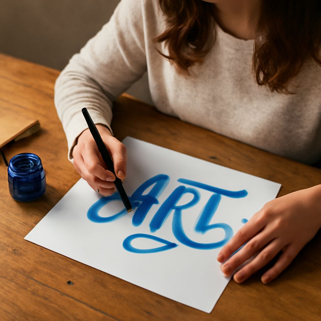
Choosing a Stylish Calligraphy Font for Design Projects
Digital Calligraphy Font Categories
A stylish calligraphy font in the digital space falls into one of three categories: copperplate-inspired (thin hairlines and dramatic thick strokes), brush script (loose, energetic, variable pressure), and modern calligraphy (minimalist forms with subtle stroke contrast). Each category signals a different brand personality. Copperplate reads as formal and luxurious; brush script feels spontaneous and artisanal; modern calligraphy bridges both, offering elegance with approachability.
Pairing Calligraphy Fonts with Body Text
Never pair one stylish calligraphy font with another script for body text — the competing decorative natures create visual chaos. Instead, set headlines in your calligraphy font and body paragraphs in a clean humanist sans serif or transitional serif. The contrast between expressive headlines and neutral body text lets the calligraphy breathe and makes long reading passages comfortable.
Keeping a Calligraphy Journal for Growth
A calligraphy journal is the single most effective tool for accelerating improvement. Use it daily — even ten minutes of deliberate practice compounds into significant skill over months. Dedicate sections to letterform drills, new alphabets, composition experiments, and notes on what worked and what needs attention. Date every session so you can flip back and measure your actual progress rather than relying on memory. Your next steps: choose one area from this guide — whether the calligraphy circle layout, a kanji alphabet, or a stylish font pairing for a current project — and practice it exclusively for two weeks before moving on. Depth of focus builds faster than breadth of exposure.