Faux Calligraphy: Alphabet, Worksheets, and Fake Calligraphy Techniques
Have you ever admired the thick-and-thin strokes of brush calligraphy and wished you could recreate them without investing in expensive brushes or spending months learning traditional techniques? Faux calligraphy is exactly the solution you need. This accessible technique mimics the look of authentic calligraphy using any pen or marker you already own, making it the perfect entry point for beginners who want beautiful lettering results immediately.
Whether you’re starting with a faux calligraphy alphabet, working through faux calligraphy worksheets, or trying to understand how to fake calligraphy convincingly, this guide covers every step. By the end, you’ll have a clear, repeatable process for producing lettering that looks polished and professional, even if your calligraphy experience is exactly zero.
What Is Faux Calligraphy?
Fake calligraphy is a lettering technique that replicates the appearance of brush calligraphy — specifically the distinctive thick downstrokes and thin upstrokes — by first writing normally, then manually adding weight to the downstroke portions of each letter. Unlike traditional calligraphy, which requires a specialized brush or flexible nib to vary line weight through pressure, faux calligraphy creates the same visual effect through a two-step drawing and filling process.
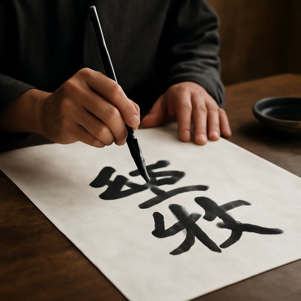
The result is a style that’s nearly indistinguishable from brush calligraphy in photographs and digital contexts, making it popular for wedding stationery, greeting cards, social media graphics, and hand-lettered quotes. The faux calligraphy technique works with ballpoint pens, markers, gel pens, and even crayon — any writing instrument you have at hand.
Learning the Faux Calligraphy Alphabet
Identifying Downstrokes
The foundation of the faux calligraphy alphabet is understanding which strokes in each letter move downward. In traditional calligraphy, downstrokes are the thick ones because the brush spreads under pressure; upstrokes are thin because the brush releases pressure on the return. In faux calligraphy, you manually thicken every downstroke after writing.
Go through the lowercase alphabet and identify the downstroke in each letter: the vertical stem in “n,” the left curve of “d,” the descending stroke in “g,” the initial curve of “h.” Once you can identify downstrokes instantly in any letter, applying faux calligraphy becomes automatic rather than effortful.
Adding Weight and Filling
After writing your word or phrase in a connected script, go back and draw a parallel line alongside each downstroke, creating a thin channel. Fill this channel in with your pen or marker, leaving a clean gap between the original stroke and the parallel line. The filled area creates the thick downstroke effect. Practice on individual letters before attempting full words, and work slowly until the muscle memory develops.
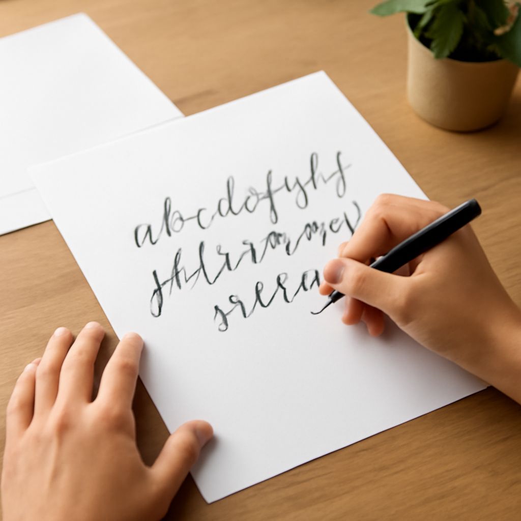
Using Faux Calligraphy Worksheets
Faux calligraphy worksheets provide structured practice with guidelines, letter examples, and tracing exercises that accelerate skill development significantly. Free printable faux calligraphy worksheets are available from lettering artists on Etsy, Creative Market, and personal blogs. Look for worksheets that include both uppercase and lowercase alphabets, common word pairings, and phrase practice.
The most effective faux calligraphy worksheets progress from single letter tracing to word-level practice to short phrase compositions. Work through each section deliberately rather than rushing to the “fun” phrase practice — the letter-level exercises build the foundational consistency that makes your longer pieces look polished.
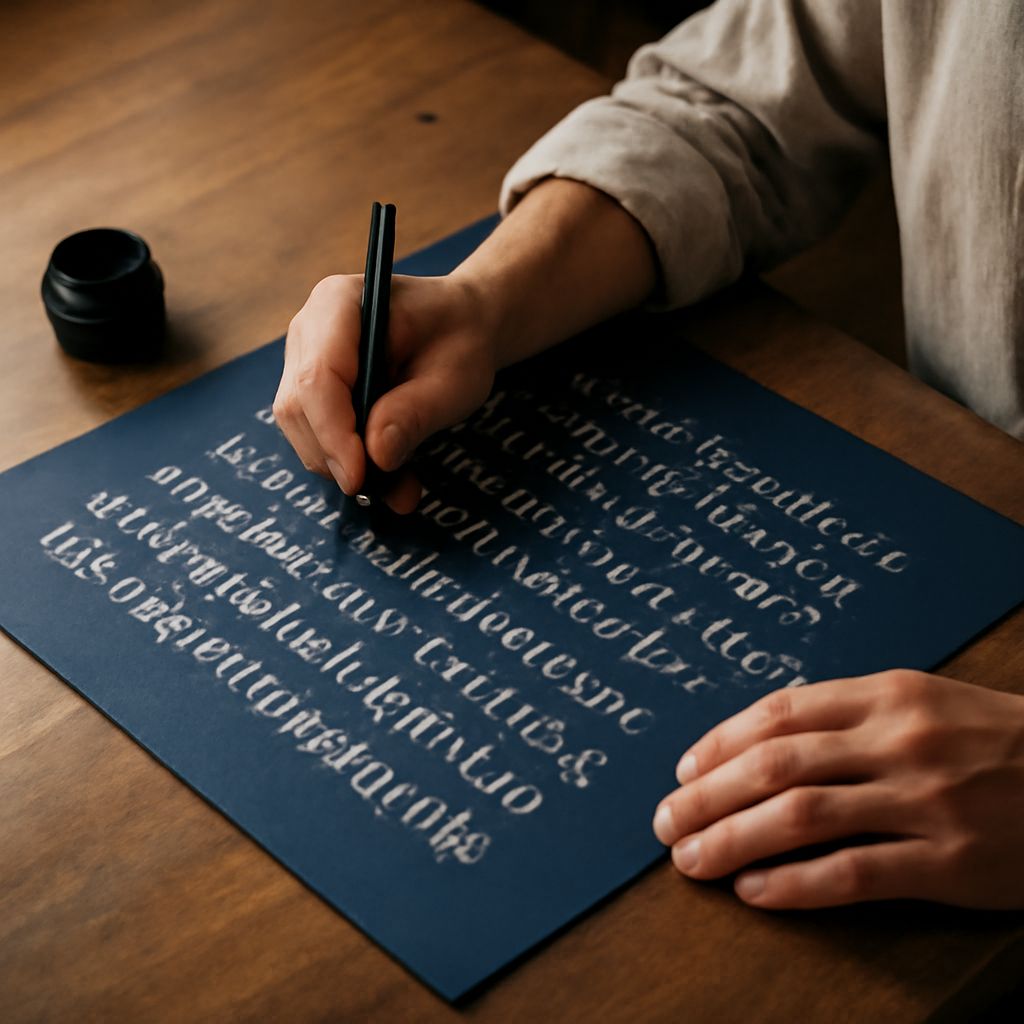
How to Fake Calligraphy on Different Surfaces
Once you understand how to fake calligraphy on paper, the technique adapts to many other surfaces. Chalkboard calligraphy uses a chalk pen for the initial writing and a wider chalk marker for filling in the downstrokes. Acrylic paint pens allow faux calligraphy on canvas, wood, glass, and ceramic. For digital work, a stylus on a tablet lets you apply the same two-step process electronically in Procreate or Adobe Fresco.
Surface texture affects line quality significantly when you fake calligraphy. Smooth surfaces produce the cleanest results; textured surfaces create organic variation that can add character or muddy the lines depending on the look you want. Experiment on scrap material before committing to a final piece, especially with premium materials or personalized gifts where you have one shot at getting it right.