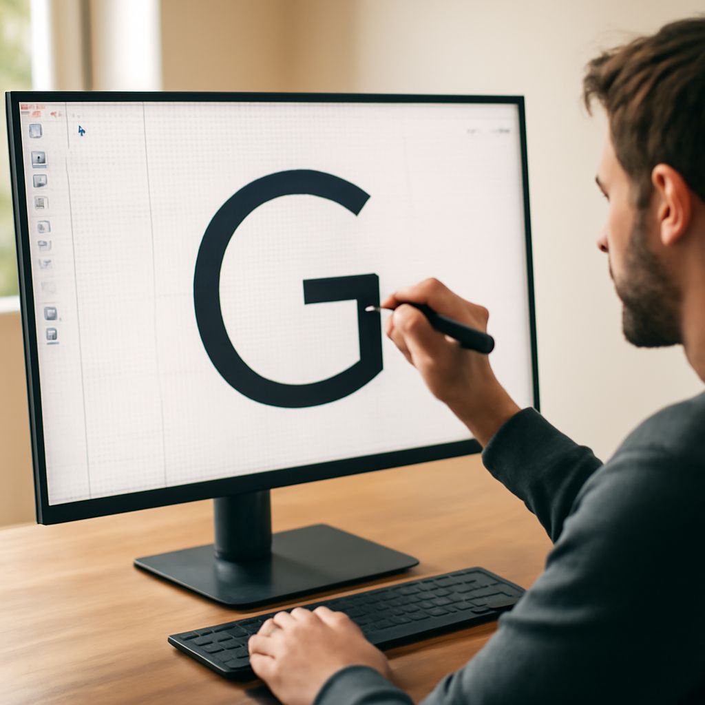
90s Fonts: Your Complete Guide to 1990s Typography and Retro Design
Ready to take your design back to the era of grunge, rave culture, and dial-up internet? 90s fonts capture a specific visual attitude that’s experiencing a powerful revival across branding, social media, and editorial design. Whether you’re looking for the perfect 90’s font for a nostalgic project or want to understand what made 1990s fonts so distinctive, this guide gives you everything you need to make smart, effective choices.
From the distorted grunge lettering of alternative rock album covers to the bubbly, rounded faces of teen magazines, 1990s fonts spanned an extraordinary range of aesthetics. Understanding that range — and where to find quality digital versions today — gives you a major creative advantage. Let’s dig into what made the 1990’s font landscape so visually explosive.
What Defined 90s Fonts
The Grunge and Distortion Aesthetic
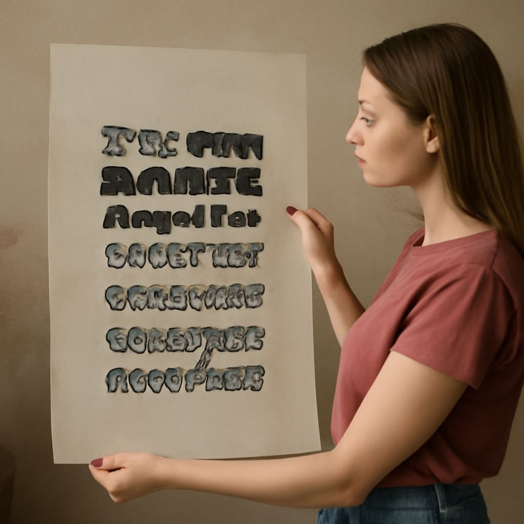
Perhaps the most iconic strand of 90s fonts is the distressed, deliberately imperfect lettering associated with grunge music and alternative culture. Designers like David Carson at Ray Gun magazine pushed typography to its expressive limits, overlapping text, rotating columns sideways, and using degraded, scratchy letterforms that prioritized feeling over legibility. These distressed 90’s font styles remain influential today, appearing in streetwear branding and independent music releases.
Rave and Techno Typography
Parallel to grunge, rave culture produced its own strand of 1990s fonts: acid-washed neon lettering, chrome-effect metallic text, and geometric display faces that evoked futurism and synthetic music. These typefaces relied heavily on the visual possibilities of early desktop publishing software, celebrating the digital medium rather than mimicking traditional print conventions.
Teen Magazine and Pop Culture Fonts
Not all 1990s fonts were aggressive or experimental. Teen publications and pop music branding favored rounded, friendly letterforms in bright colors — bubbly display faces that conveyed accessibility and youth energy. These softer 90s fonts are equally recognizable and work beautifully in contemporary nostalgia-driven branding for lifestyle products and entertainment.
Where to Find 1990s Fonts Today
Several dedicated sources make it easy to find high-quality digital 1990’s font options. Font sites like DaFont, Lost Type, and Fontspring maintain large archives of retro typefaces spanning every 90s sub-aesthetic. Adobe Fonts includes several licensed revivals of authentic 1990s display faces for Creative Cloud subscribers.
When searching for 1990s fonts, use search terms like “grunge,” “retro display,” “90s revival,” “rave,” or “distressed” to surface relevant options. Many community-created 90s fonts are available for free personal use, with commercial licenses available at low cost. Always check the license terms before using any typeface in paid work.
Using 90s Typography in Modern Design
The key to successfully incorporating a 90’s font into contemporary work is restraint. Use retro display faces for headlines, titles, and short bursts of text — never for body copy. Pair your chosen 1990s font with a clean, modern sans-serif for supporting text to create contrast that feels intentional rather than kitsch.
Color choices amplify the period feel. Neon greens, hot pinks, electric blues, and acid yellows — the palette of 90s rave flyers — immediately signal the era. For a more understated approach, use 1990s fonts in monochrome or earth tones to let the letterform shape carry the retro character without the full visual noise of the period.
Key takeaways: The 1990s font revival is driven by genuine nostalgia and the enduring visual power of that era’s experimental typography. Whether you favor grunge distortion or bubbly pop aesthetics, authentic 90’s font choices work best when paired thoughtfully with contemporary design elements. Build a curated library of 1990s fonts across the aesthetic spectrum so you have the right option ready for every retro brief.