S Logos: How to Design a Compelling Letter S Logo for Any Brand
Why does the letter S make such a strong foundation for brand identity? The S curve is one of the most dynamic shapes in typography and design, naturally conveying motion, energy, and fluidity. S logos appear across industries from sports teams to technology companies to luxury brands, and each one interprets the same letter in a completely different visual language. If you are thinking about creating a logo s design for your own project or client, understanding what makes these marks work gives you a meaningful head start.
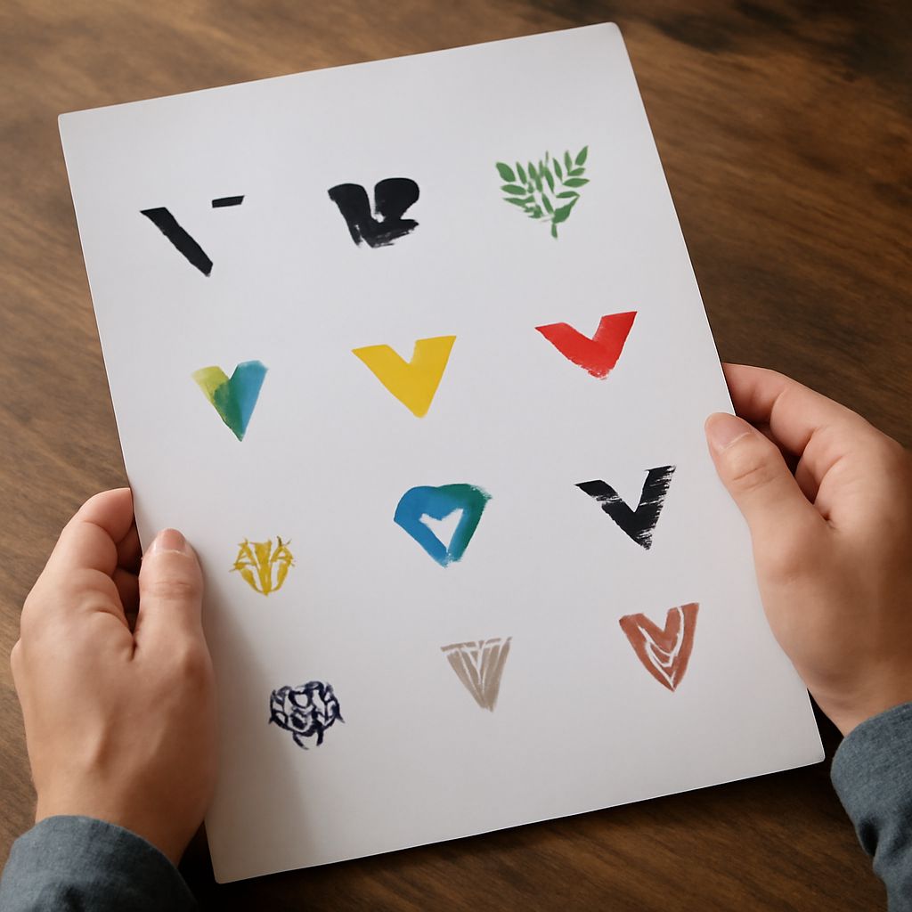
A letter s logo can take dozens of forms: a serif S, a sans-serif S, a monogram S, an abstract S shape, or an S formed from negative space. Logos with s at their center tend to feel dynamic simply because of the letter’s natural double curve. Cool s logos often get that quality not from complexity but from a single confident design decision that makes the S form feel inevitable. This guide walks through the strategic and visual considerations that separate forgettable from memorable S logo design.
Why Letter S Logos Work Across Industries
The S Curve and Visual Energy
The double curve of the letter S creates implied motion even in a static mark. This is one reason sports brands favor S logos: the shape communicates speed and athleticism without any additional visual element. For technology brands, the same curve reads as fluidity and innovation. For luxury brands, it can carry elegance when rendered in thin, high-contrast strokes. The S letter’s visual flexibility is the core of its brand utility.
Scalability and Simplicity
The strongest logos with s are those that read clearly at any scale, from a tiny app icon to a large billboard. An S built from a single unified shape, rather than multiple overlapping elements, tends to scale better because it loses no information as it shrinks. When you review your logo s design at very small sizes, the basic S form should still be immediately recognizable.
Memorability
Single-letter logos trade complexity for memorability. A well-designed letter s logo asks the viewer to remember only one thing, which makes it easier to recall than a more complex wordmark or pictorial mark. This simplicity does not mean the design process is simple; creating a letter that feels fresh and ownable within the crowded letter S design space takes careful consideration.
Design Approaches for S Logos
Serif vs. Sans-Serif S
Serif S logos feel traditional, authoritative, and trustworthy. They suit law firms, financial institutions, academic brands, and heritage businesses. Sans-serif S logos feel modern, direct, and approachable. They suit tech companies, lifestyle brands, and creative agencies. The choice between serif and sans-serif is usually the first structural decision in any S logo project, and it shapes everything that follows.
Abstract S Forms
Some of the most memorable cool s logos depart from any recognizable typeface and instead build the S from geometric shapes, interlocking curves, or negative space play. These abstract approaches require more visual testing because they can become unreadable if the S gesture becomes too subtle. The best abstract logos with s maintain clear letter recognition while adding a distinct visual concept.
Monogram and Combination Marks
A letter s logo often appears as part of a monogram, combining S with one or two other initials. The design challenge here is making all letters read individually while the combined mark reads as a unified shape. Interlocking or overlapping letters creates logos with s that feel intentional and crafted rather than simply typeset.
Color Strategies for S Logos
Single Color vs. Gradient
Single-color S logos test the strength of the mark on its own terms. If the design only works in color, the underlying form may not be strong enough. Gradients can add depth and dimension to a logo s, but they create challenges in single-color applications like embossing, engraving, or printing on non-white backgrounds. Build your S logo to work in black first, then add color as an enhancement.
Color Psychology for S Logos
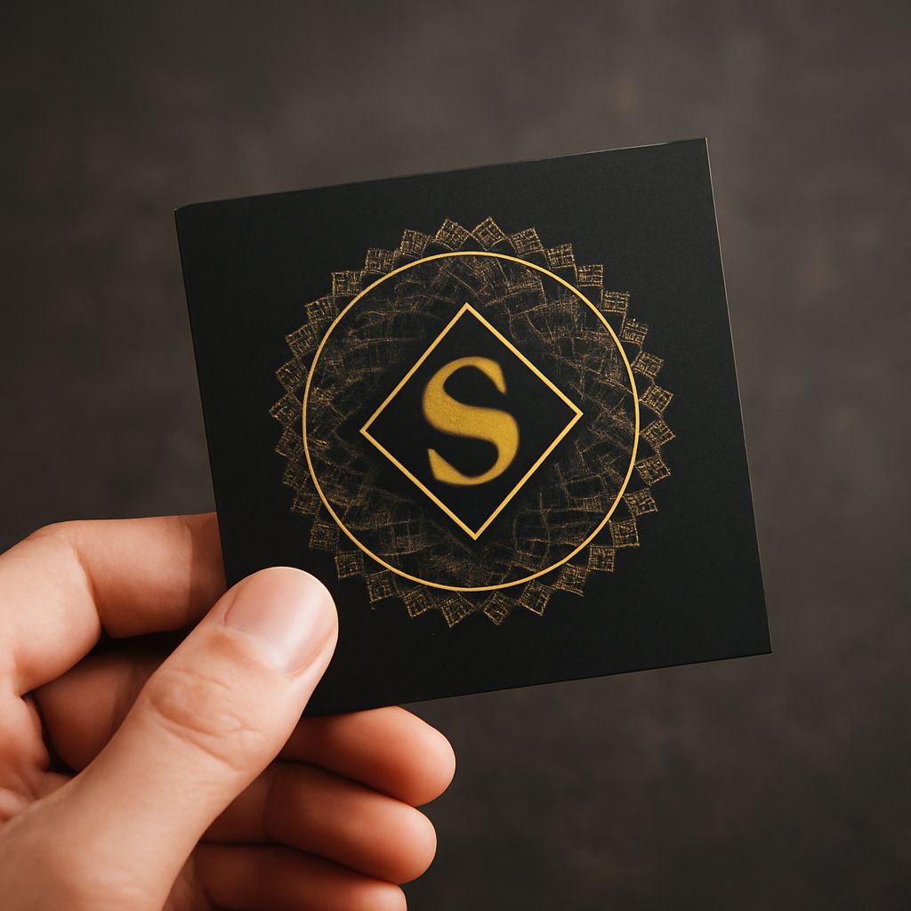
Color choices communicate personality even before the viewer processes the shape. Blue s logos read as trustworthy and stable. Red s logos feel urgent and energetic. Green s logos suggest growth or health. Black and gold s logos read as premium and exclusive. Cool s logos with unexpected color combinations, like a deep teal or terracotta, can differentiate a brand in crowded markets where competitors default to safe palettes.
Technical Considerations When Building S Logos
Vector Format Requirements
All professional S logos need to be built in vector format using software like Adobe Illustrator or Affinity Designer. Vector files scale infinitely without quality loss, which is essential for logos used across different media. A raster S logo looks sharp on screen but deteriorates when printed large or embroidered on fabric.
Negative Space Testing
Logos with s that incorporate negative space elements need testing across multiple background colors. A negative space design that reads clearly on white may disappear on a light gray background or become confusing on a colored background. Test your letter s logo on white, black, and at least two brand colors before finalizing the design.