M Logo: Design Ideas for Letter M, Metal, and B Logo Marks
What makes an M logo one of the most recognizable design formats in the world? The letter M has strong visual weight, clear directionality, and a silhouette that stands out from most other letterforms. M logos appear in automotive brands, fast food chains, media companies, and fashion houses, each using the same letter to communicate completely different brand values. Understanding what makes a successful m logo helps you apply those principles whether you are creating a single-letter mark or building on it with related m logos or b logos concepts.
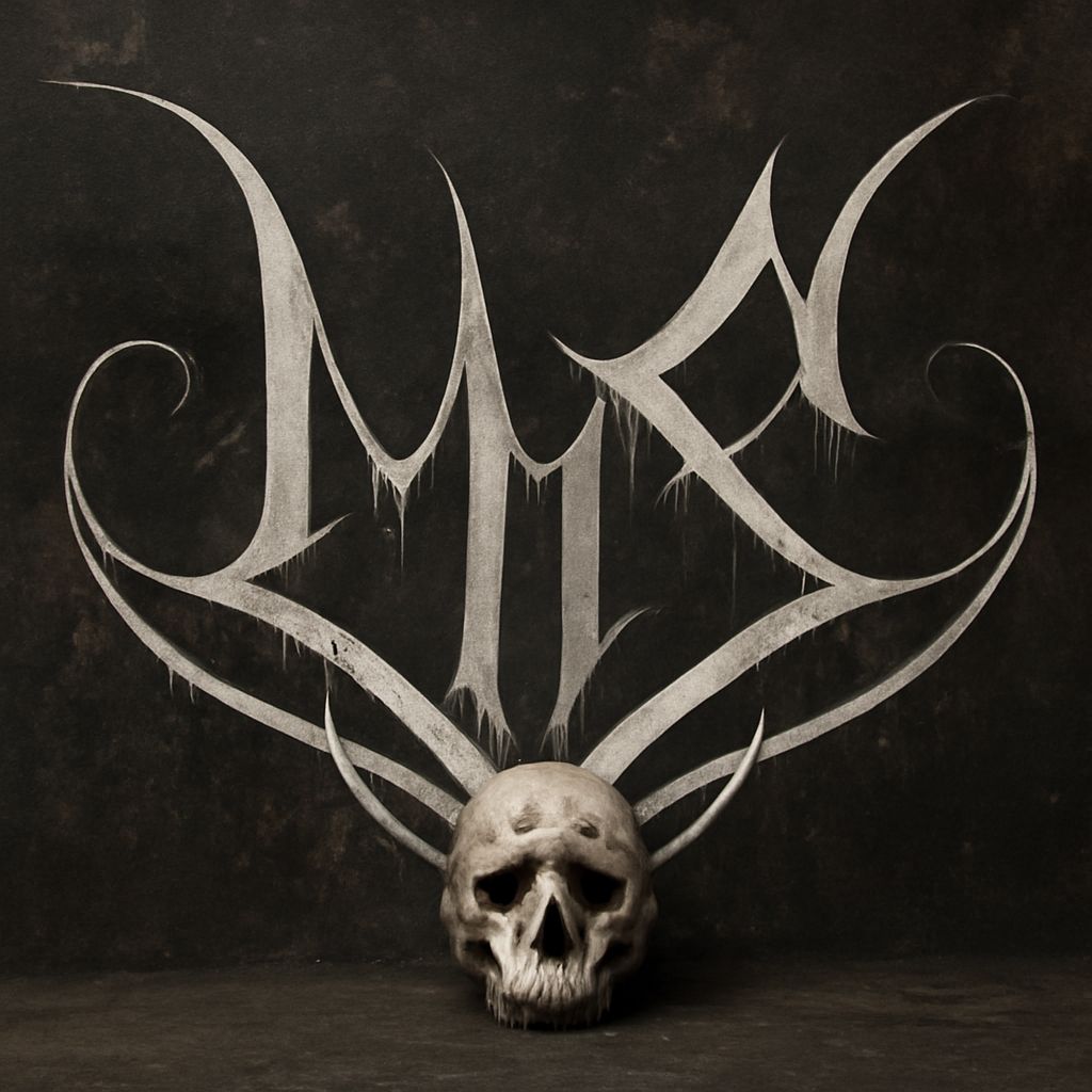
The design space for m logos is wide, ranging from clean sans-serif geometric marks to ornate serif initials to abstract interpretations where the letter form is suggested rather than stated. Metal logos occupy a specific niche in this space, using texture, gradients, and high-contrast rendering to suggest metallic material quality. Logos with m that take this approach appear frequently in automotive, electronics, and industrial branding, where the association with precision and material strength carries brand meaning.
Visual Principles Behind Strong M Logos
Symmetry and Structure
The uppercase M has a natural vertical axis of symmetry that gives m logos inherent visual balance. Designers can use this symmetry to create marks that feel stable and authoritative, or deliberately break it to create tension and dynamism. Many successful logos with m start by evaluating whether symmetry serves the brand’s personality or works against it.
Width and Proportion
The M is a naturally wide letter, which can create challenges in square and circular logo formats. When designing an m logo for a circular badge or app icon, you may need to adjust the letter’s proportions or tuck it tightly into the frame. This constraint often forces creative solutions that produce more interesting logo marks than an unconstrained design would.
Serif vs. Sans-Serif Options
Serif M logos tend to read as traditional, established, and premium. Luxury brands and heritage institutions often choose this direction for m logos. Sans-serif M logos feel modern and direct. Tech brands and consumer products usually favor this approach. The choice between serif and sans-serif is rarely arbitrary; it reflects a conscious decision about what the brand wants to communicate to its audience.
Metal Logos: Texture and Rendering
Chrome and Brushed Metal Effects
Metal logos use gradient maps, highlight lines, and shadow zones to simulate the reflective quality of metallic surfaces. A chrome m logo typically has a very high contrast between bright highlights and dark shadow areas, with the transition between them following the letter’s three-dimensional form. Brushed metal logos use a directional texture that runs across the surface of the letterform, giving the impression of machined aluminum or polished steel.
Gold and Bronze Variants
Gold-toned metal logos use warm yellows, oranges, and browns in the gradient rather than the cool grays of chrome. This color direction suits luxury branding, awards, and premium product lines where the association with precious materials carries value. Bronze variants sit between gold and industrial metal visually, which makes them useful for heritage brands that want material richness without the overtly premium connotation of gold.
When Metal Logos Work and When They Don’t
Metal logos depend on color reproduction quality. On high-resolution digital screens, they look striking. On low-resolution displays or in print applications with limited color capability, the subtle gradients that create the metallic effect may flatten out entirely. If your brand requires a logo that works across both premium and basic reproduction contexts, a metal logo needs a fallback flat-color version.
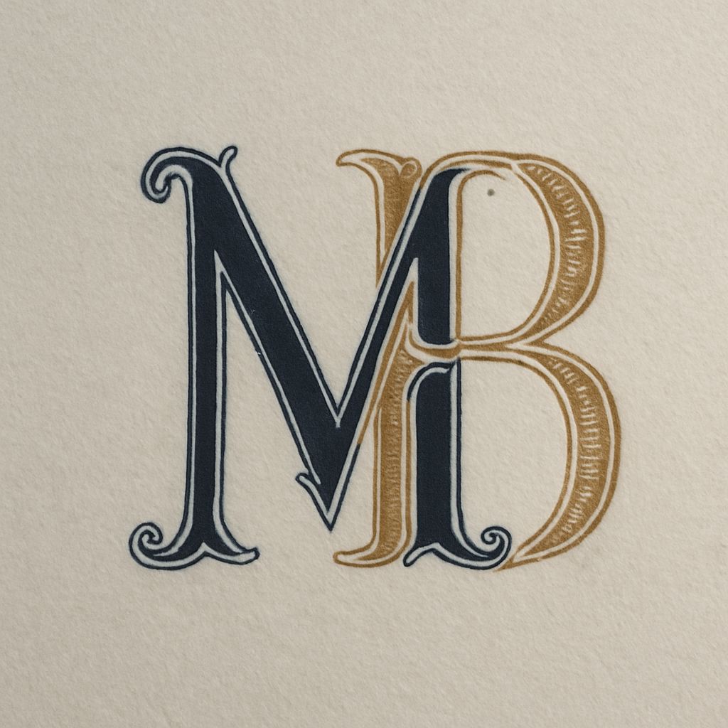
B Logos and How They Relate to M Logo Design
The B Form and Its Visual Character
B logos share some design considerations with M logos: both are bold, heavy letters with strong vertical strokes and distinctive secondary shapes. The B has two lobes (or bowls) on its right side, which create enclosed counter spaces. These counter spaces can be exploited in logo design, filled with a contrasting color, incorporated into a negative space concept, or simplified into abstract shapes that still suggest the letter.
Combining M and B in Monogram Logos
Monogram logos combining M and B appear in a range of brand contexts, from personal branding to corporate identity. The design challenge is making both letters individually legible while the combined mark reads as a single unified shape. Interlocking or overlapping the letters is a common solution, creating logos with m and b that feel intentionally crafted rather than simply placed side by side.
Practical Design Process for M Logos
Sketching Before Software
The most successful m logo projects typically begin with pencil sketches rather than digital tools. Sketching forces rapid idea generation without the friction of software and lets you explore a wide range of directions quickly. Aim for at least 20 thumbnail sketches before selecting two or three to develop further in vector software.
Testing Across Contexts
Before finalizing any m logo, test it on white and black backgrounds, at small sizes (16 pixels), at large sizes (billboard scale), and in grayscale. Metal logos need additional testing in single-color versions. Logos with m that pass all these tests are genuinely versatile; those that only work in one context will create problems during implementation.