Water Fonts, Football Fonts, and Other Specialty Typefaces Worth Knowing
When does a standard font fall short? When the context of your project demands something that carries specific personality, mood, or cultural associations. Water fonts, football fonts, programming fonts, and single-letter display fonts like letter g fonts and letter k fonts each serve specific design contexts where a generic sans-serif simply does not deliver the right communication. Understanding where these specialty typefaces come from and what they are built to do helps you select them with confidence rather than guessing.
Specialty fonts exist on a spectrum from genuinely functional category tools to purely decorative display options. Programming fonts are functional: they prioritize character distinction and readability over style. Football fonts are almost purely expressive: they carry sport, energy, and regional identity in their forms. Water fonts sit somewhere between the two, useful for themed design work where the visual metaphor of water or fluidity adds meaning to the content. Letter g fonts and letter k fonts occupy a niche display category that serves monogram and initial design work rather than long-form text.
Water Fonts: Themes and Applications
What Makes a Font Look Like Water
Water fonts use visual conventions that suggest fluidity, movement, and liquidity. Common approaches include letterforms with rounded, flowing curves that suggest the path of water, letters that appear to drip or dissolve at their endpoints, or letterforms constructed from wave patterns and ripple textures. The most effective water fonts communicate their theme through the structure of the letterforms themselves rather than relying entirely on color or texture effects added after the fact.
Best Uses for Water Fonts
Water fonts appear most appropriately in aquatic business branding (pools, surf companies, water sports), beverage packaging for water-related products, environmental and conservation campaign materials, and event design for beach or water-themed occasions. Using a water font outside these relevant contexts risks making the design feel forced. The font’s thematic content should reinforce the message of the piece, not just decorate it.
Free vs. Premium Water Font Options
Many water fonts are available free on font resource sites like DaFont, Font Space, and Creative Market. Free options vary significantly in quality; some have incomplete character sets, poor spacing, or rough outlines that create problems in production. Premium water fonts from established foundries typically have full character sets including numbers and special characters, better letter spacing, and cleaner outlines. For a one-off personal project, free options work fine. For brand or commercial use, invest in a premium option with an appropriate commercial license.
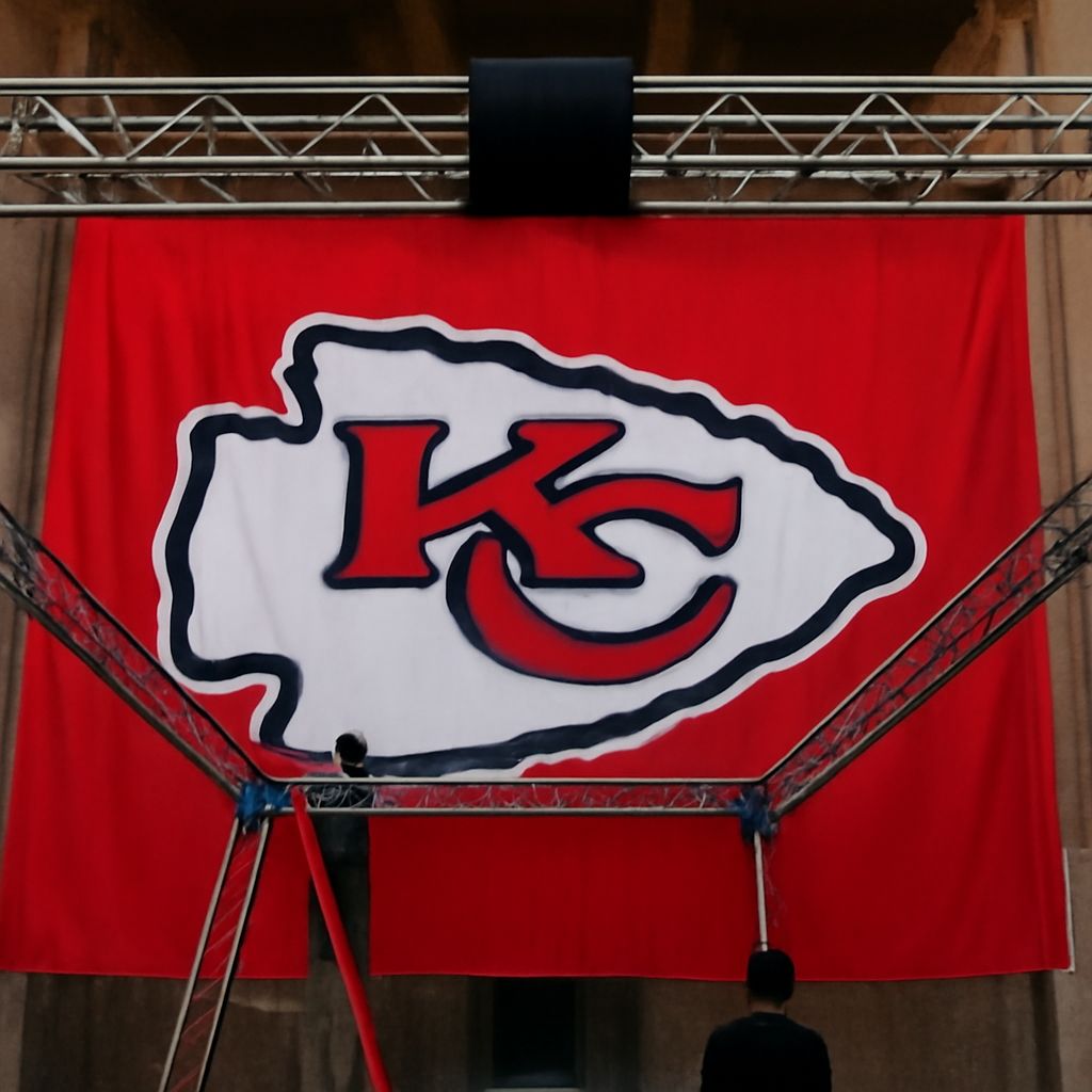
Football Fonts: Sport, Team, and Energy
The Visual Language of Football Typography
Football fonts typically use bold, condensed letterforms with strong vertical emphasis, angular cuts, and high legibility at large display sizes. These design choices reflect practical requirements: jersey numbers and names need to be readable at field distance from the stands. The aesthetic choices reflect cultural ones: bold and powerful over refined and delicate. American football fonts often use slab serifs or heavy sans-serifs with sharp angles; European football fonts sometimes incorporate more varied historical and regional design influences.
Using Football Fonts Outside Sports
Football fonts work well beyond sports contexts in any design situation where power, action, and bold visual presence are the goal. Event posters, gaming visuals, fitness and gym branding, and entertainment marketing all borrow from the football font aesthetic to signal energy and intensity. The key to using these fonts successfully outside their primary context is pairing them with design choices that support rather than conflict with their visual personality.
Authentic vs. Generic Football Fonts
Many fonts labeled as “football fonts” are generic bold condensed faces with no specific sport connection. The most authentic football fonts are based on the lettering systems of actual NFL, NCAA, or international football league jersey programs. Using these for commercial work requires checking licensing carefully, as official league typography is often trademarked. Generic alternatives that capture the aesthetic without official marks are the practical choice for most commercial projects.
Programming Fonts Revisited
Why They Are a Separate Category
Programming fonts are worth distinguishing from other specialty fonts because their purpose is functional rather than expressive. A programming font’s primary job is to make code readable, which means monospacing, clear character differentiation, and good rendering at small sizes on screen. The best programming fonts are invisible in use; you notice them only when they fail. This functional priority puts them in a different design category from water fonts or football fonts, where the font’s personality is the point.
Practical Selection Criteria
When selecting programming fonts for daily use, test your specific code and color scheme. Some fonts look better with dark themes; others work better on light backgrounds. Some developers prefer fonts with prominent ligatures; others find them distracting. The only way to know which programming fonts suit your workflow is to install two or three candidates and use them for a week each in real work conditions before deciding.
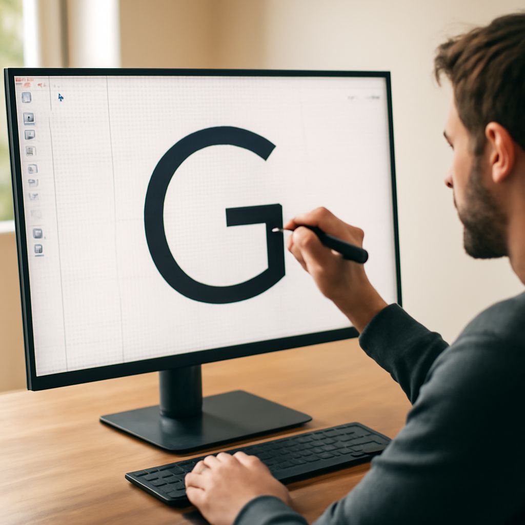
Letter G Fonts and Letter K Fonts
Display Initials for Monogram and Brand Work
Letter g fonts and letter k fonts are display typefaces optimized for single-character use in monogram, initial, or logo applications. The best letter g fonts present the G in a variety of stylized interpretations: ornate serif capital forms, script versions with elaborate flourishes, geometric sans forms, and decorative display styles. The same variety applies to letter k fonts. When choosing between options, consider where the letter will appear and at what size, since many highly decorative options lose legibility below a certain display size.
Pairing Initial Fonts with Text Fonts
If a letter g fonts or letter k fonts choice will appear alongside a text typeface, the two need to complement each other in overall visual weight and design period. A highly ornate Victorian-style capital G looks discordant next to a minimal geometric sans-serif text font. A clean modern display K pairs naturally with a humanist sans-serif text face. Pairing display and text fonts is a skill that improves with exposure to well-designed typography rather than through rules alone.