S Logo, W Logo, G Logo, and Letter L Logo: Single Letter Marks Explained
Why do single-letter logos work so well as brand marks? A single letter mark communicates identity at a glance, scales infinitely well from app icons to billboards, and leaves room for the brand’s other communications to carry the narrative weight. An S logo, a W logo, a G logo, and a letter L logo all solve the same design problem: how do you make one letter feel like a complete, ownable brand identity rather than just a letter of the alphabet? The answer lies in the specific design decisions made around proportion, style, and context. A logo water mark for a water brand and an S logo for a software company may look completely different while both succeeding on their own terms.
Single letter logos appear across every industry and at every brand scale. Tech companies, fashion houses, sports franchises, and local businesses all use letter marks. The challenge in each case is making the mark feel designed rather than typeset, which requires decisions about what kind of letterform to use, how much to modify it from a standard typeface, and how the letter’s specific geometry serves the brand’s personality.
S Logo Design
The S Curve Advantage
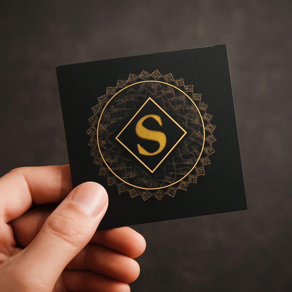
The S logo benefits from the letter’s inherently dynamic double curve. Unlike the stable verticality of an I or the angular geometry of a K, the S shape has implied motion built into its structure. This makes S logos natural fits for brands that want to communicate energy, fluidity, or momentum. Sports brands, technology companies, and financial services all use S logos, each interpreting the same letterform through a different visual language to serve their specific brand context.
S Logo Variations
S logo designs range from clean sans-serif geometric interpretations to elaborate calligraphic scripts to abstract S shapes built from non-typographic elements. The most minimal S logos reduce the letter to its essential curve, sometimes so simplified that the S reads as an abstract mark rather than an explicit letter. The most elaborate S logos use the letter as a starting point for complex illustrative treatment. Between these extremes lies a broad middle ground of S logos that balance clear letterform recognition with distinctive visual character.
W Logo Design
The W Form and Its Challenges
A W logo faces a different design challenge than S logo work: the letter is inherently wide, making it difficult to fit into square or circular formats without significant modification. Designers address this either by condensing the W, making it narrower and taller than its standard proportion, or by embracing the width and designing the frame around it. Many successful W logos use a rounded or circular badge format that accepts the wide letter and incorporates the negative space above the W’s peaks as a design feature rather than a problem.
Brand Examples and Applications
The W logo appears in media brands, sports teams, and hospitality companies. Warner Bros., Washington Nationals, and Westin Hotels all use W logos with distinct visual treatments appropriate to each brand context. The variety of these real-world W logo applications demonstrates how the same letter can carry completely different brand personalities depending on the design decisions applied to it.
G Logo Design
The G’s Enclosed Space
The G logo presents an interesting design opportunity in the letter’s unique enclosed partial space, the horizontal bar that distinguishes it from a C. This internal bar is a distinctive feature that designers can exaggerate, minimize, or use as a compositional element. Google’s use of a G logo with a colored version of its search bar color sequence turning into the letter’s horizontal extension is one of the most recognized G logo executions in the world, using the letter’s distinctive form as both brand identifier and callback to the company’s primary product.
G Logo Style Options
A G logo works in serif, sans-serif, script, and abstract forms. Serif G logos tend to read as established and authoritative. Sans-serif versions feel modern and direct. Script G logos carry elegance appropriate for luxury or fashion contexts. The enclosed form of the G also lends itself well to badge and emblem formats, where the letter sits within a circle or shield shape and the internal space of the G becomes a frame for additional graphic elements.
Letter L Logo Design
The L’s Clean Geometry
A letter L logo has straightforward geometry: a vertical stroke meeting a horizontal base. This simplicity makes the L one of the most versatile letterforms in logo design because it adapts cleanly to any weight, from hairline to ultra-bold, and reads clearly at all sizes. The right angle formed by the L’s two strokes also creates natural opportunities for geometric design concepts: nesting shapes, creating arrow directions, or suggesting corner or foundation metaphors relevant to certain industries.
Logo Water and Themed L Marks
When the brand context involves a specific theme like water, nature, or technology, a letter L logo can incorporate visual elements from that theme into the letterform itself. A logo water brand using an L might build the letter from flowing water shapes, wave forms, or blue-toned gradients that reinforce the brand’s product category. This approach of building a letter from thematic elements rather than typographic strokes produces logo marks that communicate both the letter and the brand’s product territory simultaneously.