Number Font Guide: Best Styles for Every Design Project
Have you ever finished a design only to realize the numbers look completely out of place? Choosing the wrong number font can undermine even a well-crafted layout. Whether you need sleek digits for a dashboard, whimsical numerals for party decorations, or elegant glyphs for a wedding invitation, the right choice makes an immediate difference. Cool number fonts can elevate a project from ordinary to memorable, and exploring your options before committing saves time and revision cycles later.
This guide covers the main categories of numbers font styles, explains how font numbers behave differently from letters in layout contexts, and helps you identify the best cute number fonts for projects where personality matters more than formality. You’ll leave with a clear framework for making confident typographic decisions.
Why Number Fonts Deserve Special Attention
Most people think about letterforms when choosing a typeface, but numerals have their own set of design considerations. Numbers appear in contexts where readability under stress matters most — clocks, scoreboards, financial statements, price tags, and dates. A font that works beautifully for body text may have poorly drawn numerals that look awkward or ambiguous at small sizes.
Lining vs. Old-Style Figures
Lining figures sit on the baseline and reach cap height, making them uniform in size — ideal for financial tables and technical displays. Old-style figures have varying heights, with some digits descending below the baseline, giving text a more traditional, bookish feel. Many premium typefaces include both sets, letting you choose based on context. If you’re selecting a numbers font for body copy, old-style figures often integrate more naturally.
Tabular vs. Proportional Spacing
Tabular figures have equal widths, so columns of numbers align vertically without manual adjustment. Proportional figures have widths based on the actual numeral shape — a “1” takes less space than an “8.” For any table, data visualization, or spreadsheet-style layout, always use tabular spacing. This is one technical detail that separates professional typography from amateur work when dealing with font numbers in structured layouts.
Identifying Numeral Quality
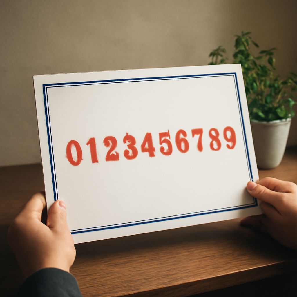
Test a font’s numerals before committing to it. Type the sequence 0–9 and look for: clear distinction between 0 and O, between 1 and lowercase l, and between 6 and 9. These are the most common problem pairs. A well-designed number font makes all ten digits instantly distinguishable at small sizes and in varied lighting.
Cool Number Fonts for Impact
When your design calls for numerals that catch attention — event posters, sports graphics, countdown timers, price callouts — you want typefaces with strong personality. Cool number fonts typically feature geometric construction, high contrast between strokes, or unusual proportions that draw the eye.
Geometric and Display Options
Typefaces like Bebas Neue, Impact, and Futura Display have numerals that command space. These work exceptionally well for large-format applications where the numbers themselves are the visual centerpiece. Bebas Neue’s digits are particularly clean, with no ambiguity and excellent legibility at both large and small sizes.
Retro and Vintage Styles
Retro-inspired cool number fonts draw from mid-century design, neon sign lettering, and sports jersey traditions. These fonts often feature inline details, rounded edges, or slight distress textures that add character without sacrificing legibility. They work well for brands, menus, and packaging that want a sense of history and warmth.
Cute Number Fonts for Playful Projects
Not every design needs authority — sometimes warmth and charm are the goal. Cute number fonts feature rounded letterforms, bubbly proportions, and sometimes hand-lettered irregularity that makes them feel personal and approachable.
For children’s materials, party invitations, social media graphics, and craft projects, cute number fonts like Nunito, Baloo, and Poppins deliver friendly numerals that match their equally inviting letterforms. When choosing among these options, look for fonts where the numerals match the overall personality of the typeface — some fonts design beautiful letters but give less attention to the numeral set.
Matching Number Fonts to Context
The best numbers font is ultimately the one that fits your specific project context and audience. Here’s a quick framework for making that decision:
- Finance and data: Use tabular lining figures in a clean sans-serif or transitional serif.
- Editorial and books: Old-style proportional figures in a classic serif blend into body text naturally.
- Posters and advertising: Display cool number fonts with high contrast or bold geometry.
- Kids and crafts: Rounded cute number fonts with open counters and friendly proportions.
- Branding and logos: Custom-drawn numerals or typefaces with strong, distinctive digit shapes.
Next Steps
Start by auditing the number-heavy sections of your current design work — price lists, dates, tables, and callouts. Identify where your current number font choices feel mismatched or weak. Then use a font testing tool like Google Fonts or Adobe Fonts to preview alternatives with real numbers from your content. Pair font numbers testing with full paragraph tests so you see how the numeral style integrates with your body text. Over time, building a personal library of go-to numbers font choices for different project types makes every new design decision faster and more confident.