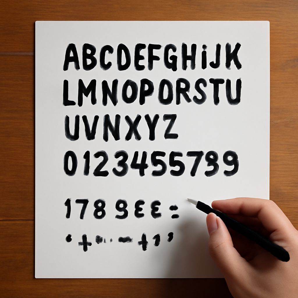
Numbers in Different Fonts: Fancy, Stylish, and Decorative Numeral Guide
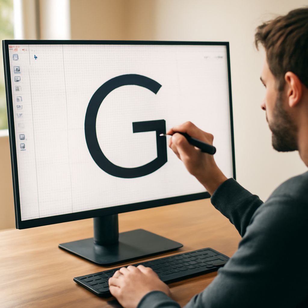
Have you looked at the same set of digits rendered in ten different typefaces and realized they feel completely different from each other? Numbers in different fonts carry emotional and contextual information that shapes how viewers interpret the values those numbers represent. The same price displayed in a fancy number fonts style reads as premium; in a bold, friendly rounded font it reads as approachable and affordable. Understanding how fancy number font options differ from utilitarian ones and how to choose among fancy numbers font styles for specific purposes gives you a significant advantage in design, branding, and visual communication work. Stylish number fonts extend this range further into the territory of personality-driven typography.
This guide covers the main categories of decorative and display numeral typefaces, what distinguishes each, and how to match your choice to the project context effectively.
Why Number Style Matters More Than You Think
Typography research consistently shows that numeral style influences perceived value and quality. Numbers presented in high-contrast, refined typefaces — the kind used in luxury brand pricing and fine dining menus — trigger associations with exclusivity and premium quality. The same numbers in a blocky, casual font read as friendly and democratic. Neither is objectively better; each communicates something specific about the brand or context around the numbers.
When you work with numbers in different fonts deliberately — testing how the same value reads across multiple typeface options — you develop an intuitive sense for this relationship that improves every design decision you make involving numerical content.
Fancy Number Fonts: Elegance and Refinement
Fancy number fonts typically feature one or more of these qualities: high contrast between thick and thin strokes, fine hairline serifs or delicate terminals, extended proportions with generous x-height, and often decorative swash alternatives for display use. These qualities signal craft, tradition, and premium positioning.
Typefaces like Bodoni, Didot, and their modern digital equivalents lead the fancy number fonts category. Their numerals have the same elegant contrast as their letterforms — dramatic thick downstrokes paired with nearly invisible hairline horizontals. For formal invitations, luxury product packaging, and high-end editorial contexts, these are the numeral styles that reinforce the premium message most effectively.
Fancy Numbers Font Options for Specific Contexts
Not all fancy numbers font choices suit every elevated context. Understanding the sub-categories helps you match precisely:
- Wedding and formal event: Script-adjacent typefaces with flowing numeral forms, like IM Fell English or Cormorant Garamond.
- Fashion and cosmetics: Ultra-high-contrast modern serifs where the contrast is the dominant visual statement.
- Fine dining and hospitality: Transitional serifs with refined numerals that read well at menu-scale text sizes.
- Luxury goods and jewelry: Display typefaces with distinctive swash variants or custom numeral designs that function as part of the brand identity.
Each of these fancy numbers font sub-categories creates a slightly different emotional register that supports its specific industry context.
Stylish Number Fonts Across Different Design Traditions
Stylish number fonts extend beyond the formal luxury category into contexts where personality matters as much as refinement. Mid-century geometric typefaces like Futura produce numerals with clean, architectural forms. Art Deco revival fonts create numerals with decorative embellishment and period character. Retro sports jersey fonts deliver bold, readable digits with a specific cultural association. Understanding which tradition each stylish number fonts option draws from helps you evaluate whether it fits your project.
Practical Testing Before Final Selection
Before finalizing any choice from the fancy number font category for a real project, test it under actual use conditions. Render the specific numbers your project requires — prices, dates, statistics — in your candidate typefaces at the intended display size and context. Print or display at actual scale. Evaluate legibility, emotional register, and how the numerals relate to the surrounding typography. The numeral that looks best in a type specimen may not be the best choice in your specific layout context with your specific content.
Building a personal library of tested, reliable stylish number fonts sorted by project type reduces selection time on future projects significantly.