Band Logos: Rock Band Logos, Rock Logos, and Design Analysis
What do the Rolling Stones lips, Led Zeppelin’s four symbols, and the Ramones presidential seal have in common beyond being attached to legendary music? They are examples of band logos that crossed from promotional graphics into cultural icons — images recognized by people who have never heard the albums they represent. The design principles behind successful rock band logos are worth studying regardless of your connection to the music, because they demonstrate how visual identity handles the specific challenge of representing personality and attitude rather than products or services. The best rock logos communicate before you read a single word, and understanding how they do that makes you a better designer in any field.
This guide covers the design strategies behind successful rock bands logos, the visual language that distinguishes different genres within rock, and practical lessons that apply beyond music branding. All the best bands logos in the genre offer lessons worth learning.
What Makes Rock Band Logo Design Different
Corporate and institutional logos must project stability, trustworthiness, and professionalism. Band logos face different requirements: they must project a specific attitude, signal genre membership, work on merchandise at every scale from a button to a stage banner, and remain recognizable in poor reproduction conditions — think photocopied flyers and silk-screened t-shirts with imperfect ink coverage.
These requirements push rock band graphic design toward bold, high-contrast imagery, strong outlines, and forms that remain readable when reduced, reversed, or printed on dark backgrounds. The design constraints of the medium shaped the aesthetic, and understanding those constraints explains why rock band logos look the way they do.
Classic Rock Band Logo Strategies
Looking across the most successful rock logos from the past six decades, several recurring design strategies emerge:
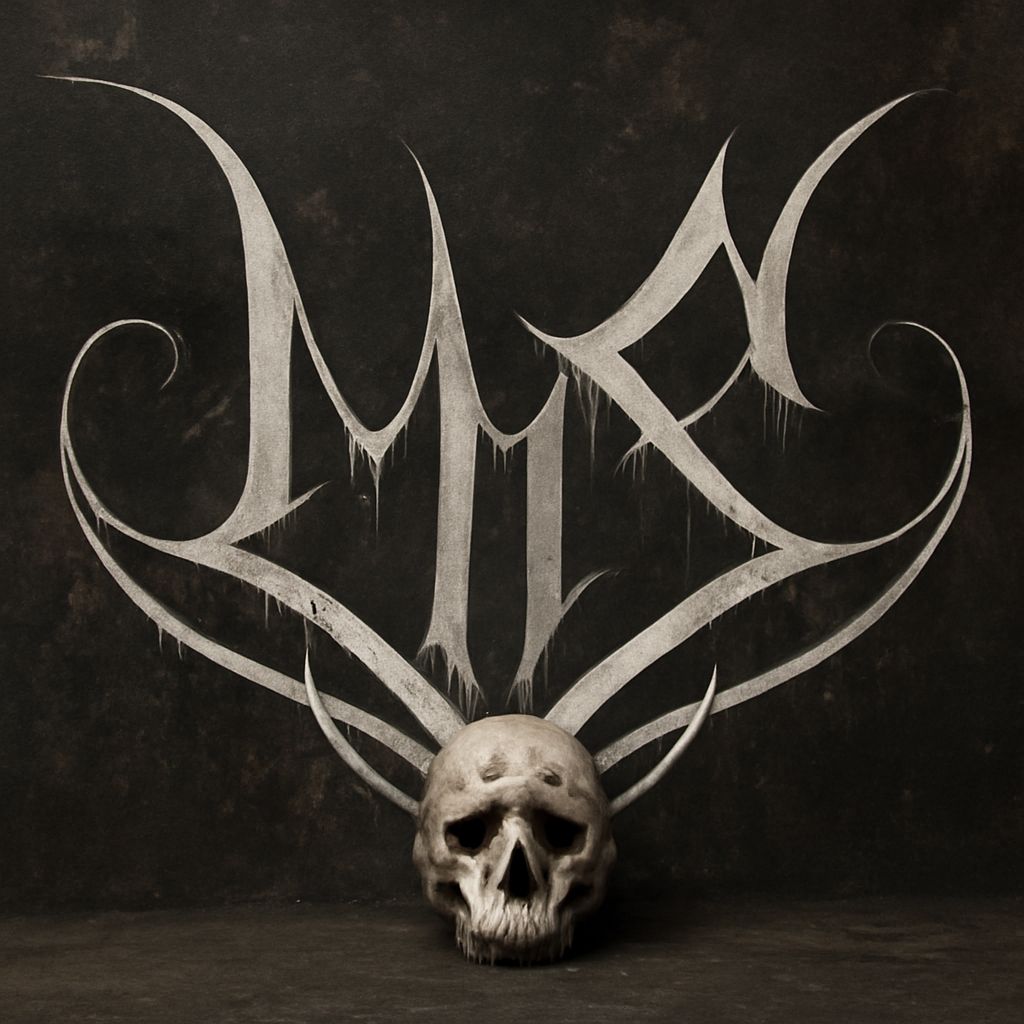
- Custom lettering: Band name rendered in a typeface designed specifically for that act, like AC/DC’s lightning-bolt lettering or the Grateful Dead’s lightning skull. These custom bands logos become inseparable from the band’s identity because no other entity uses that exact lettering.
- Symbol-based marks: A standalone image that represents the band without text — the Rolling Stones lips, the Doors’ window. These work because symbols scale infinitely and require no specific language to communicate.
- Wordmarks with graphic integration: Text and image combined so the letters themselves become pictorial, like Metallica’s jagged forms that suggest sharp metal.
- Emblem and seal formats: Circular or badge-shaped compositions that reference heraldry, institutional authority, or brotherhood — common in punk and metal where the sense of an in-group matters.
Each of these strategies reflects a deliberate choice about what the brand needs to communicate and how it will be used across merchandise, stage sets, and advertising.
Genre Signals in Rock Logo Design
Within rock, visual language distinguishes subgenres with remarkable specificity. Heavy metal rock band logos favor angular, sharp forms, black and red palettes, and imagery from horror, mythology, and occult tradition. Punk logos favor hand-lettered imperfection, photocopied aesthetic, and explicit rejection of polish. Classic rock logos from the 1970s often used rich, detailed illustration — the kind of imagery that filled album covers in that era of vinyl and elaborate packaging. Indie rock branding tends toward minimalism and restraint that signals artistic seriousness over commercial ambition.
Reading these genre signals helps you understand your audience before you design. A rock bands logos for a doom metal act should not look like a pop punk flyer, even if both bands play electric guitars. The visual language has to match the sonic one.
Lessons for Logo Design Beyond Music
The bands logos tradition offers lessons applicable to any visual identity project. The requirement to work across extreme scale ranges — from a half-inch pin to a 30-foot stage backdrop — is the same challenge faced by any brand that appears in multiple media. The need to communicate attitude and genre membership before any conscious reading is the same challenge faced by brands targeting specific lifestyle groups. The constraint of working in one or two colors for cost-effective merchandise production is the same constraint faced by small businesses with limited print budgets.
Study the evolution of a band’s visual identity across their career — how AC/DC, The Who, or Metallica’s rock logos changed between their early independent releases and their stadium era — and you see the same evolution from rawness to refinement that successful commercial brands undergo. The trajectory is instructive regardless of your specific industry.