Letter I Fonts, Initial Fonts, and How to Write Different Fonts Guide
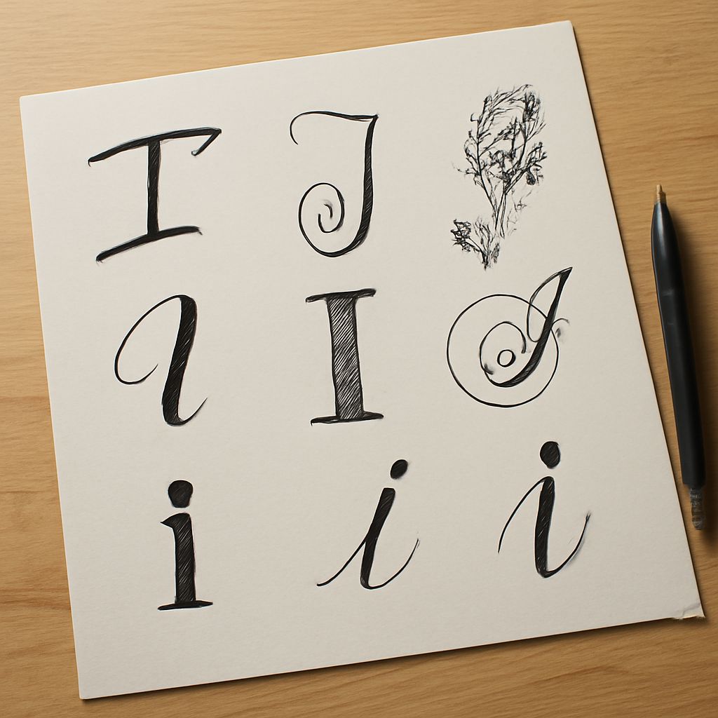
What makes the letter I such a distinctive typographic challenge? In isolation, I is the simplest letter in the Latin alphabet — just a vertical stroke. Yet how that vertical stroke is treated — whether it has serifs, a hairline form, a decorative head and foot, or elaborate calligraphic flourishes — does more to distinguish typefaces from each other than almost any other character, precisely because its simplicity amplifies every stylistic choice. Letter i fonts with serif treatments look completely different from the same typeface’s sans-serif counterpart for this reason. Initial fonts take the single letter to its decorative extreme, treating drop caps and chapter initials as ornamental works in their own right. How to write different fonts is a practical question for lettering artists, calligraphers, and designers who want to work across multiple type traditions. Understanding the initial font category specifically, and the broader category of initials font design, connects typographic history to contemporary design practice.
This guide covers all these dimensions of single-letter and initial typography with practical guidance for designers and lettering artists.
Letter I Fonts: The Minimal Form and Its Variations
Letter i fonts in the serif tradition typically have a horizontal serif at the top and bottom — the “head” and “foot” serifs — that distinguish the capital I clearly from other vertical strokes and prevent the ambiguity with the lowercase l and the numeral 1 that plagues sans-serif designs. This serif treatment is one reason formal serif typefaces remain the standard for legal and formal document typography, where ambiguity between these similar-looking characters could create problems.
Sans-serif letter i fonts handle this challenge differently. Some, like Gill Sans, add arms to the capital I — small horizontal extensions that serve the same disambiguation function as serifs while maintaining the sans-serif visual identity. Others, like Helvetica and Univers, use a plain vertical stroke with no arms, accepting the ambiguity as a design trade-off for visual cleanliness. This makes certain all-caps text in pure sans-serif typefaces difficult to read — the sequence “ILL” in Helvetica is particularly problematic.
Initial Fonts: Drop Caps and Decorative Chapter Openers
Initial fonts are typefaces or individual characters designed for use as drop caps and chapter opening initials in book typography, manuscript illumination, and decorative print design. The tradition extends from medieval manuscripts where illuminated initials were decorated with gold leaf, intricate knotwork, and miniature scenes, through the woodcut decorated initials of early printing, into the ornamental type design tradition of the 19th and 20th centuries.
Contemporary initial fonts range from historicist revivals of Victorian decorative borders and flourishes to modern designs that incorporate geometric patterns, floral elements, or abstract ornamentation. When choosing an initial font for a specific project, the decoration style should be consistent with the overall typographic design of the publication — a medieval-inspired initial in a clean modernist layout creates jarring incongruity rather than elegant contrast.
How to Write Different Fonts by Hand
How to write different fonts by hand involves understanding the structural logic of each typeface family and developing the specific techniques each style requires. Lettering artists who master multiple font styles do so by studying the geometric or calligraphic origins of each family and practicing the generating strokes before attempting complete alphabets.
For hand lettering that accurately represents specific font categories: Serif styles require consistent stroke contrast — deliberate thick-thin variation — and clean horizontal serifs. Sans-serif styles require consistent stroke width with no taper or variation. Script styles require smooth, connected strokes with appropriate pressure variation for thick and thin transitions. Block letter styles require consistent letter widths, equal counter spaces, and corners that are truly square rather than slightly rounded. Each of these style families has different technique requirements that benefit from deliberate isolated practice before integration.
Initials Font Traditions and Applications
The initials font tradition appears across many contexts beyond book typography: monogram design (personal initials combined into decorative marks), stationery and formal correspondence (embossed or printed initials as a personal brand mark), organizational identity (architectural carved stone initials, heraldic crests), and jewelry and personal objects (engraved initials as identification and decoration). Each context has its own visual conventions and scale requirements that shape which initials font solutions work best.
The most successful initial font designs work at multiple scales — they must be recognizable and decorative as a large display element while remaining legible and functional when reproduced at small dimensions. This scale requirement is one of the design constraints that most differentiates quality initial typeface design from merely decorative letterform work that fails to maintain legibility as scale decreases. Testing your letter i fonts and initial letter choices at both large and small reproduction sizes is essential before finalizing any design that will be used across multiple contexts.