N Logo Design: How Brands Use the Letter N to Build Recognition
Why do so many major companies choose an n logo as their primary mark? The letter N has a visual structure that works exceptionally well in logo applications. Its two vertical strokes connected by a diagonal give it strong geometric integrity, and it scales cleanly from billboard to app icon without losing legibility. If you’re studying logos that start with n or designing your own identity, understanding what makes this letterform so effective is the right place to begin.
This guide covers the design principles behind logos with n, the visual strategies that distinguish a strong letter n logo from a generic one, the spectrum of n logo design approaches across industries, and practical advice for building a mark that works across every context where your brand needs to appear.
What Makes the Letter N Work in Logo Design
The letter N has inherent visual balance. Its two upright strokes create vertical stability, while the diagonal connector adds dynamic movement. This combination of stability and motion makes an n logo feel grounded but not static. Many designers prefer this letterform for brands that want to communicate reliability with a sense of forward momentum.
Among logos with n, you’ll notice that the diagonal stroke is often the site of the most creative variation. Designers thicken it, thin it, break it, curve it, or replace it entirely with a different shape to differentiate their mark. The two verticals stay recognizable as N while the diagonal becomes the signature element that sets one letter n logo apart from another.
Industries That Favor N-Based Marks
Technology companies gravitate toward logos that start with n because the letterform reads as modern and efficient in clean, geometric treatments. Netflix’s red N is one of the most recognized marks in any industry, demonstrating how powerful a single letter mark can be when executed with absolute consistency. Entertainment, networking, and navigation brands also cluster around this letterform because N carries those conceptual associations naturally.
Outside tech, you’ll find logos with n across finance, healthcare, and manufacturing. The letter works in serif treatments for brands that want to communicate tradition and stability, and in sans-serif or geometric treatments for brands projecting innovation.
Key Approaches to N Logo Design
Wordmark-derived marks take the full brand name and reduce it to initials, using the N as an abbreviation of the full identity. Standalone lettermarks treat the N as a complete graphic object, often with geometric abstraction or negative space manipulation. Combination marks pair the letter with a wordmark or icon to give the brand flexibility across different contexts.
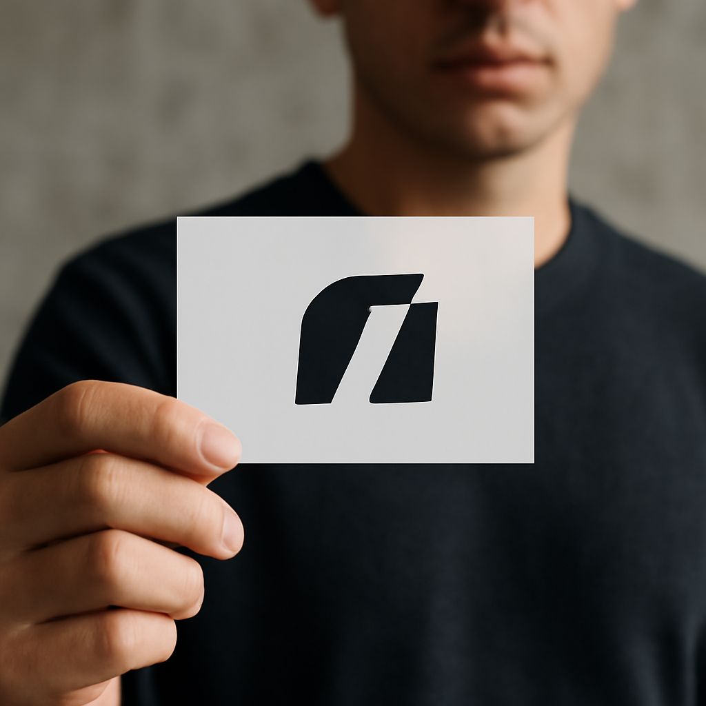
In n logo design, negative space treatments are particularly effective. Hiding a secondary shape, an arrow, a person, a path, within the white space of the letter creates depth and rewards close inspection. This approach works especially well for brands where the underlying concept has a natural visual equivalent.
Color and Typography in Letter N Logos
Color choice in a letter n logo communicates before the letterform even registers. Deep blues and greens suggest stability and growth. Reds and oranges signal energy and urgency. Neutrals like black, white, and grey let the geometry do the work without color distraction. Many successful logos that start with n use single-color marks precisely because the letterform is strong enough to carry the full identity without chromatic support.
Typography matters even in a single-letter mark. The weight, width, and geometric character of the N you choose should match the personality of the brand. A condensed, heavy N reads differently than a geometric, perfectly proportioned N. Test your letter across multiple typefaces and custom modifications before settling on the final form.
Scalability and Versatility Testing
Any strong n logo design must work at every size. Test your mark at favicon scale, sixteen by sixteen pixels, and at billboard scale before finalizing it. Details that read beautifully at large sizes often collapse into visual noise at small sizes. Negative space cuts that feel clever in a large mockup can close up and become unreadable when the mark shrinks to app icon dimensions.
Also test your logos with n in single color, reversed on dark backgrounds, and in grayscale. A mark that only works in full color is a mark that creates production problems across the life of the brand. The most durable letter n logo designs work in any context without modification.