Band Logo Design: Creator Tools, Designer Tips, and Flat Style Principles
What separates a memorable band logo design from one that gets forgotten the moment you close the tab? Great music identity isn’t just about picking a font and calling it done. It’s about creating a mark that holds up on a sticker, a drum head, a t-shirt, and a streaming platform thumbnail simultaneously. If you’re comparing boat logo design principles to what works in music branding, you’ll notice both fields share the same fundamentals: clear silhouettes, strong contrast, and marks that communicate genre or character at a glance.
This guide walks you through how to use a band logo creator effectively, what to look for in a band logo designer, and why flat logo design principles are often the smartest choice for bands building their visual identity from the ground up.
What Makes a Band Logo Work
Genre Signaling Through Visual Language
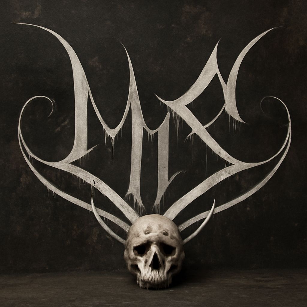
Your band logo design needs to tell a stranger what kind of music you make before they hear a note. Metal bands use jagged letterforms, interlocking spikes, and dense black fills. Indie folk acts favor hand-lettered marks with organic irregularity. Electronic producers lean into geometric precision and minimal color palettes. Each of these visual languages emerged organically from the genre’s culture and aesthetic values.
When you study boat logo design or athletic branding, you see the same principle at work: the visual vocabulary must match the world the brand lives in. For a band, that world is your genre, your scene, and your specific audience’s expectations.
Scalability Across Merchandise and Digital
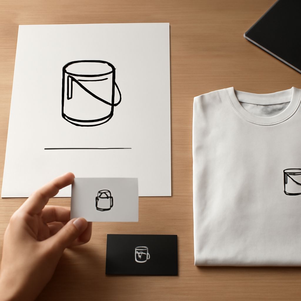
A band logo has to work in more formats than almost any other type of logo. It needs to be legible embroidered on a cap, screen-printed on a black t-shirt, displayed at three inches on a phone screen, and blown up behind a stage at full concert size. Any design that only works in ideal conditions isn’t ready for real-world use. Test your mark in all these contexts before committing.
Using a Band Logo Creator
When Creator Tools Make Sense
A band logo creator is a practical starting point when your budget is limited or when you need a placeholder while you save up for professional help. Tools like Canva, Looka, or Wix Logo Maker let you build a rough concept quickly. The limitation is that these platforms work from templates, meaning your mark will share visual DNA with hundreds of other users’ output.
Use a band logo creator to explore directions, not to finalize your identity. Generate five to ten variations, identify what resonates, and use those insights to brief a human designer. This workflow saves time and gives a band logo designer clearer direction from the start.
Customizing Creator Output
If you do go with creator-generated artwork, customize aggressively. Change letterforms, adjust spacing, modify colors, and redraw any elements that look generic. The more you push a template away from its default state, the more the final mark belongs to you.
Working with a Band Logo Designer
A professional band logo designer brings genre knowledge, typography skill, and technical production expertise that automated tools can’t replicate. When briefing a designer, share music influences, visual references you admire, formats where the logo will appear, and any elements that are non-negotiable. The clearer your brief, the less revision rounds you’ll need.
Review portfolio work in your genre. A designer who excels at corporate identity may not understand the visual language of doom metal or bedroom pop. Genre-specific experience matters in band logo design because the conventions are specific and intentional.
Flat Logo Design for Bands
Flat logo design strips away gradients, shadows, and dimensional effects in favor of solid colors and clean shapes. This approach produces marks that reproduce reliably in every format, from single-color screen printing to full-color digital display. For bands, this is enormously practical. Screen printing on merchandise is one of the primary revenue sources for working artists, and flat logo design is ideal for that process.
Flat design also ages better than styles that rely on current visual trends. A flat logo design from ten years ago looks intentionally minimal today. A heavily rendered, three-dimensional logo from the same period can look dated. For a band that hopes to be active for decades, timelessness in the mark is worth prioritizing from day one.
Pro tips recap: Start with genre research before touching any design tool. Use a band logo creator to explore, not finalize. Brief your band logo designer with specific references and format requirements. Default to flat logo design for maximum versatility across merchandise, digital, and print.