Block Letter Font Guide: Formal Fonts, Best Fonts for Writing, and Personal Letter Typography
How do you choose between a block letter font and a formal font when the context demands clarity and professionalism? The distinction matters more than most people realize. A block letter font communicates directness, strength, and legibility. A formal font communicates tradition, authority, and social register. Both serve important functions, but using one when the other is called for produces miscommunication before the reader processes a single word of your content.
This guide covers when a block letter font is the right choice, what makes the best fonts for writing different from display options, how a formal letter font differs from a formal font used in other contexts, and how to choose the best font for personal letters when your goal is to communicate warmth alongside clarity.
Understanding Block Letter Font Characteristics
What Defines the Style
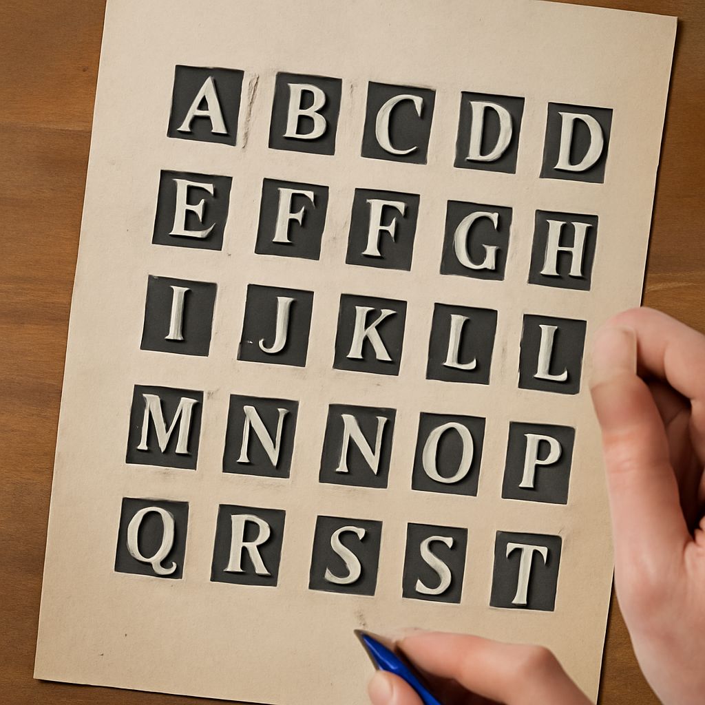
A block letter font uses letters with uniform stroke weights, squared or rounded terminals, and minimal or absent serifs. The visual result is bold, geometric, and immediately legible at a distance. This makes block letter font designs ideal for signage, headlines, labels, and anywhere that readability at a glance takes priority over elegance or tradition. The clean structure of a block letter font also makes it well-suited for screen display, where thin serif details can disappear at smaller sizes.
Block letter font styles range from purely geometric, where every letter is constructed from circles and rectangles, to humanist, where the geometric structure is softened by subtle variations derived from hand lettering. Geometric block letter fonts feel modern and neutral. Humanist block letter fonts feel warmer and more approachable while retaining the clarity advantage of the block letter structure.
When to Use Block Letter Fonts
The right contexts for a block letter font include packaging, posters, environmental signage, digital interfaces, and brand communications where the primary goal is maximum communication efficiency. They work less well in contexts that depend on emotional warmth or cultural tradition, such as formal invitations, academic communications, or professional correspondence where a formal letter font would be the more appropriate choice.
Formal Font Selection for Professional Contexts
What Formal Means in Typography
A formal font communicates through its references to historical typographic traditions. Serif typefaces developed from Roman inscriptions and manuscript letterforms carry centuries of association with authority, education, and formal communication. When you use a formal font in professional correspondence, you activate these cultural associations in the reader’s mind before they read a word.
The best formal font for professional use balances legibility with the appropriate level of traditional character. Garamond, Palatino, and Times New Roman are the most recognized formal fonts for print correspondence. For digital communications, Georgia was designed specifically to maintain the formal quality of print serifs while performing well on screen.
Formal Letter Font vs. Display Formal Fonts
A formal letter font intended for body text must prioritize readability at small sizes across multiple paragraphs. Display formal fonts, designed for headlines and titles, often have features that work beautifully at large sizes but become illegible at text sizes. When choosing a formal letter font for correspondence, always test it at your intended print or display size rather than judging it from large specimen samples.
Best Fonts for Writing: What Actually Works
The best fonts for writing share specific characteristics that reduce reader fatigue and maintain comprehension across long text. These include moderate x-height for comfortable reading rhythm, clear distinction between potentially confusable characters like lowercase l, uppercase I, and the number 1, sufficient letter spacing to prevent crowding, and stroke contrast calibrated for the reading medium. For print, fonts with subtle stroke variation read beautifully. For screen, fonts with more uniform strokes prevent aliasing issues at standard display resolutions.
The best fonts for writing in professional contexts fall into three reliable categories: old-style serif fonts like Garamond for formal print work, transitional serifs like Times New Roman for academic and formal digital documents, and humanist sans-serif fonts like Georgia or Merriweather for extended digital reading. Each performs differently across media, so matching the font to the specific output medium is as important as the typographic quality itself.
Best Font for Personal Letters
The best font for personal letters sits between formal and casual. You want readability and a sense of personal investment without the stiffness of corporate communications. Fonts in the transitional serif category often work well for personal letter typography because they have enough warmth to feel human and enough structure to feel considered. If you hand-write letters and then type for legibility reasons, a font with slightly variable stroke weights that suggests a human hand, without crossing into novelty territory, is the best font for personal letters for most contexts.
Some designers opt for a clean sans-serif as the best font for personal letters when the goal is friendly informality. Gill Sans, Frutiger, or Myriad all have enough warmth in their letterforms to feel personal rather than corporate while maintaining excellent readability across all sizes.
Next steps: Download three candidates for your next writing project and test each at the actual size and medium you’ll use. Print a full paragraph in each and read it in context before making a final selection. Typography decisions always work better when evaluated in their intended environment rather than in isolation.