Frank Ocean Font, Dots Font, Stone Age Font, and CSS Font Effects Explained
What makes a frank ocean font recognizable, and why does a dots font feel so different from a stone age font? Typography is full of niche styles tied to specific aesthetics, subcultures, or historical periods, and understanding how they work helps you use them with more intention. Whether you’re designing a name tag font for an event or applying css font effects to a web layout, knowing what gives each style its character is the starting point.
This guide covers four distinct font categories: frank ocean font aesthetics, the visual logic of a dots font, what a stone age font actually represents, and how css font effects let you apply typographic styling without a custom typeface.
Frank Ocean Font and Minimalist Music Typography
The Visual Aesthetic
The frank ocean font style associated with his releases is characterized by clean, lowercase, condensed sans-serif letterforms with high letter-spacing and very minimal visual hierarchy. The overall effect is cool, introspective, and slightly anonymous, which matches the emotional register of the music. The typography doesn’t announce itself; it sits quietly as part of a larger visual system.
When designers reference a frank ocean font style, they usually mean a combination of factors: light or regular weight, lowercase preference, generous tracking, and a modern grotesque or geometric sans-serif family. Fonts like Helvetica Neue Light, Futura Light, or custom grotesque designs fit this territory well.
Applying the Style
To achieve a frank ocean font feel in your own work, choose a single typeface family and use only one or two weights. Avoid decorative elements. Set body text at a size that feels almost uncomfortably small, then add letter-spacing to compensate. The combination of small size and high tracking produces that airy, restrained quality that defines the aesthetic.
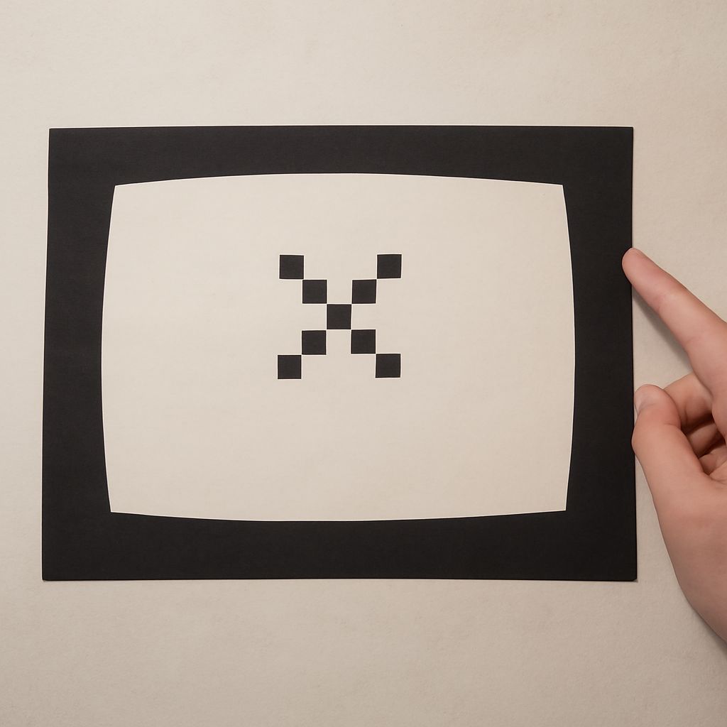
Dots Font: Pixel and Matrix Typography
A dots font constructs letterforms entirely from circular dots arranged on a grid. The visual source is the LED matrix display, the ticker board, or the early pixel grid of computer screens. A dots font reads as technological, retro, and slightly impersonal, making it a common choice for tech branding, music visualizer aesthetics, and digital art contexts.
The key design variable in a dots font is the dot density. A coarse dots font with large dots and wide spacing reads as more retro and lo-fi; a fine dots font with small dots packed tightly reads as more modern and precise. Both versions maintain the same fundamental character but serve different tonal registers. A dots font at a small point size can lose legibility quickly, so test your chosen dot spacing at the actual display size before committing.
Stone Age Font: Primitive and Carved Letterforms
A stone age font mimics letterforms that appear to be carved or scratched into rough stone surfaces. The visual characteristics are irregular stroke edges, rough texture within the letterforms, and a slightly unstable baseline that suggests material rather than typographic precision. The effect is ancient, primitive, and physically grounded.
A well-designed stone age font maintains legibility despite its rough aesthetic. The underlying letterform proportions stay conventional enough to read clearly; only the surface texture and edge quality depart from standard type conventions. A stone age font with illegible letterforms has prioritized texture over communication, which is usually the wrong trade-off unless pure decoration is the goal.
Name Tag Font: Legibility and Friendliness
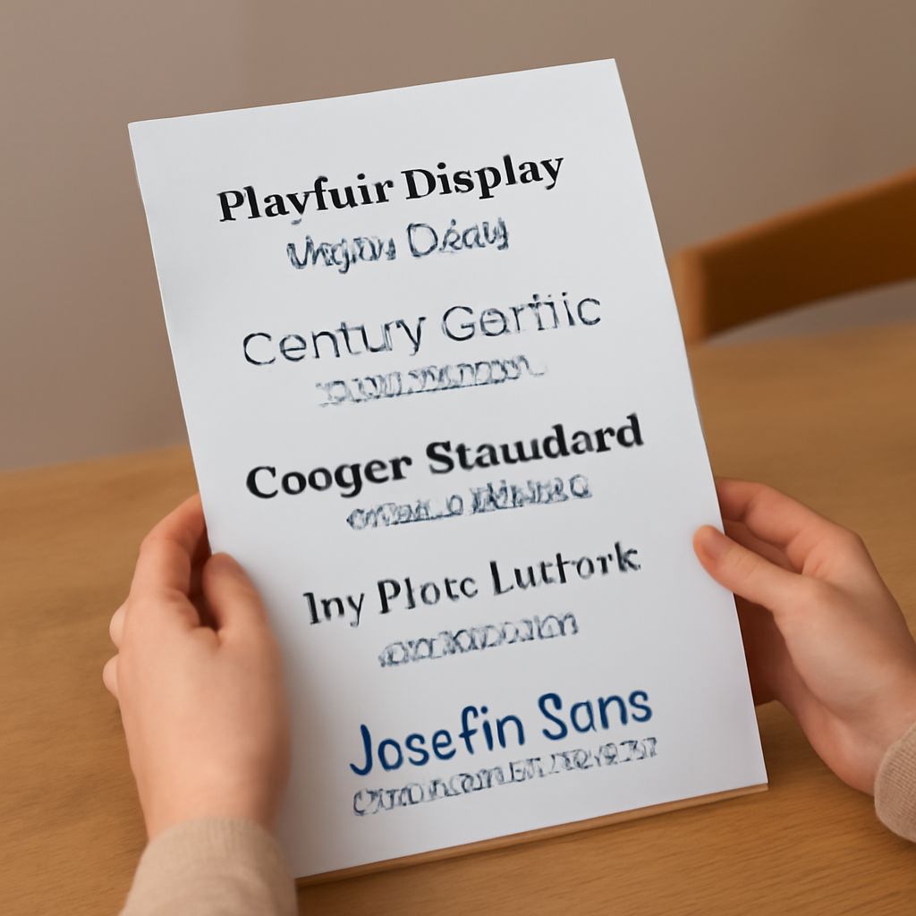
A name tag font needs to accomplish one thing above all else: be readable at arm’s length by someone who has just met you. This practical requirement pushes name tag font choices toward clear, open, medium-weight letterforms without decorative complexity. Rounded sans-serifs like Nunito or Poppins are popular choices. Condensed fonts are risky because they sacrifice horizontal space that helps legibility at distance.
For printed name tags, test your chosen name tag font at the actual print size before producing a large run. A font that looks readable on screen at 100% zoom may become difficult to parse at 24-point on a four-inch badge. Err toward slightly larger type and simpler letter forms rather than a clever font that requires effort to read.
CSS Font Effects and Web Typography Styling
CSS font effects let you modify the visual appearance of type on the web without installing a custom font. The main properties available are text-shadow, which adds drop shadows or glow effects; letter-spacing and word-spacing, which control the spacing between characters and words; text-stroke from the -webkit-text-stroke property, which adds an outline to letterforms; and text-fill-color, which can create gradient or transparent fill effects inside letterforms.
Using css font effects well requires restraint. The same restraint that applies to typeface selection applies here: one well-chosen effect is stronger than three competing ones. A subtle text-shadow on a large display heading adds depth without distraction. Combining text-shadow with a custom fill gradient and a stroke outline usually produces visual noise rather than sophistication. Test your css font effects in dark mode as well as light mode, since shadow directions and contrast ratios behave differently against dark backgrounds.