Watercolor Paints: Everything You Need to Know to Get Started
Are you wondering which watercolor paints will actually serve you well as a beginner — or whether it’s worth upgrading your kit after years of working with student-grade colors? Choosing paint is one of the most consequential decisions in a watercolor practice. Good pigments lift cleanly, layer predictably, and hold their vibrancy long after the paper dries. The wrong ones muddy fast and fade under light. This guide gives you the practical knowledge to shop smart, work effectively, and enjoy the process.
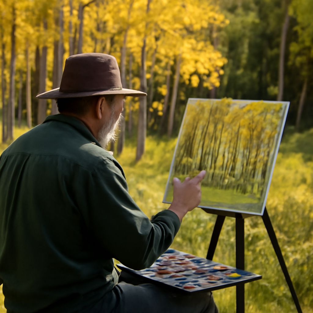
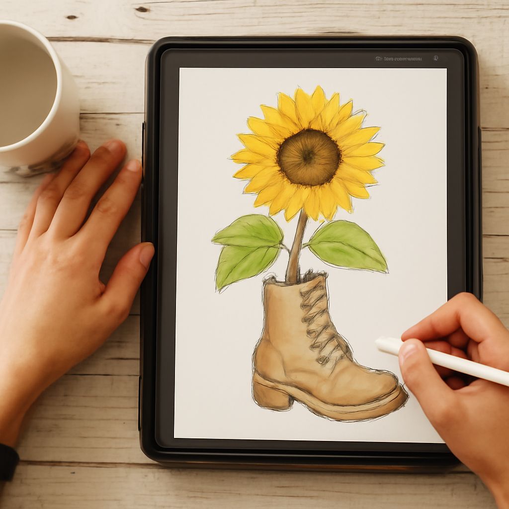
You’ll also find ideas for pairing your painting sessions with watercolor quotes that inspire a creative mindset, tips for tackling unusual subjects like a watercolor goat or a watercolor glass study, and guidance for anyone exploring techniques through watercolor online platforms and communities. Whether you prefer painting at a physical desk or learning digitally, this covers the essentials.
Choosing Your Watercolor Paints
The biggest split in watercolor paints is student grade versus artist grade. Student-grade paints use lower pigment concentrations and more filler, which keeps costs down but produces colors that are less vibrant, harder to lift, and less lightfast. Artist-grade paints contain higher pigment loads — often single-pigment formulations — that mix cleanly and last decades without significant fading.
For most beginners, a small set of high-quality artist-grade paints in 10 to 12 colors outperforms a large set of student-grade pigments. Brands like Winsor & Newton, Daniel Smith, and Schmincke all offer reliable artist-grade lines. If budget is a concern, many artists start with a single brand’s introductory set and expand from there as they identify the colors they reach for most often.
Pigment Properties Worth Understanding
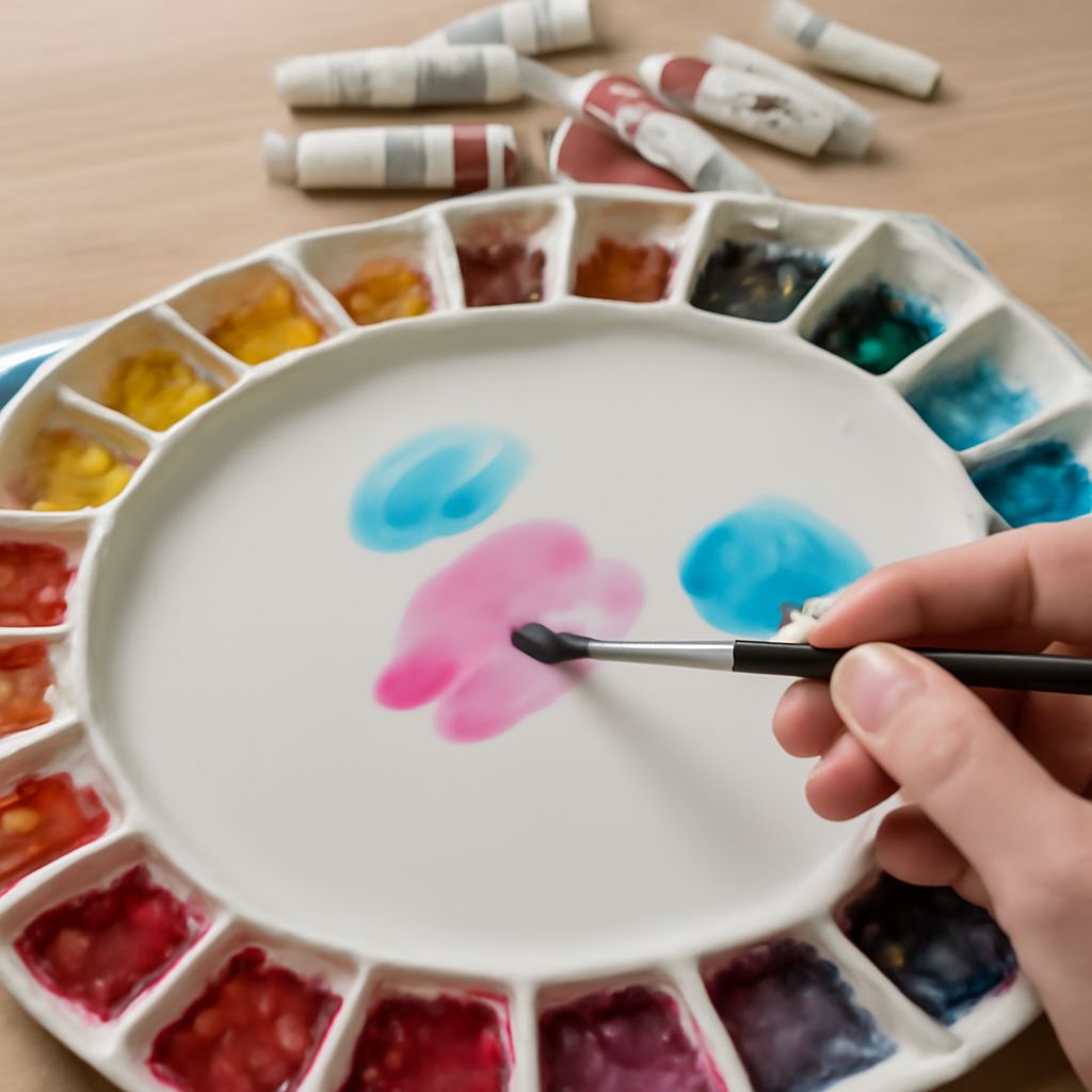
Every tube or pan of watercolor has a pigment code — something like PB29 for ultramarine blue or PY150 for a warm yellow. Single-pigment colors (one pigment code) mix cleaner than convenience mixtures that blend multiple pigments into a single hue. When you mix two single-pigment colors, you get predictable results. When you mix pre-mixed pigments, you risk muddy or unexpected outcomes.
Transparency is another key property. Transparent pigments — phthalo blue, quinacridone rose, aureolin — let light pass through to the white paper beneath, creating luminosity. Opaque pigments like cadmium yellow or cerulean blue reflect light from the paint surface itself, producing a different visual quality. Both are useful, but knowing which you’re working with helps you plan your layers strategically.
Painting Unusual Subjects: Goat and Glass Studies
A watercolor goat is a fantastic subject for practicing texture and loose mark-making. Goat fur varies from wiry and coarse to silky fine depending on breed, giving you multiple approaches to explore. Work wet-on-wet for the soft body mass, then drop in darker values while the paper is still damp for the fur’s natural variation. Let dry, then add calligraphic marks with a rigger brush for individual hairs in the foreground.
Contrast a watercolor goat‘s organic texture with a precision subject like a watercolor glass study. Glass requires restraint — you’re painting the absence of color as much as color itself. Reserve your whites from the start, either by masking fluid or careful negative painting. The refracted light inside a glass object creates abstract shapes that don’t look like glass until they come together. Trust the process and avoid overworking. A watercolor glass succeeds when you stop before you think you’re finished.
Learning Watercolor Online
The watercolor online learning landscape has grown dramatically. Platforms like Skillshare, Domestika, and YouTube host thousands of hours of instruction ranging from absolute beginner fundamentals to advanced color theory and wet-on-wet techniques. The advantage of watercolor online instruction is pace — you can pause, rewind, and practice a single technique repeatedly before moving forward.
Online communities on Reddit (r/Watercolor), Instagram, and dedicated Discord servers let you share work-in-progress pieces and get feedback from other practitioners. Posting your work publicly, even imperfect pieces, accelerates learning faster than practicing in isolation. The community aspect of online learning is often underrated by beginners who assume they need to wait until their work is “good enough” to share.
Inspiration: Watercolor Quotes to Keep You Painting
Many artists collect watercolor quotes to stay motivated through the inevitable frustrating sessions. One frequently shared sentiment captures the medium well: watercolor is the art of controlled accident. You set conditions, apply paint, and then the water does something unpredictable — and your job is to respond rather than resist. Working with the medium’s nature rather than against it is the core lesson that every watercolor practitioner eventually internalizes.
Watercolor quotes also serve a practical purpose in the studio: posted where you can see them during a difficult session, they shift your mindset from outcome-focused to process-focused. The goal isn’t a perfect painting. The goal is learning something from every sheet of paper you touch with a brush.
Building a Consistent Practice
Consistency matters more than duration. Twenty minutes of focused practice five days a week builds skill faster than a four-hour marathon session on weekends. Keep your palette pre-loaded with your core colors, your water containers clean, and your paper ready so that starting a session takes less than two minutes. Remove friction from the beginning of each session and you’ll paint more often. The more you paint, the faster your understanding of how your specific paints behave on your preferred paper develops — and that understanding is where real creative freedom begins.