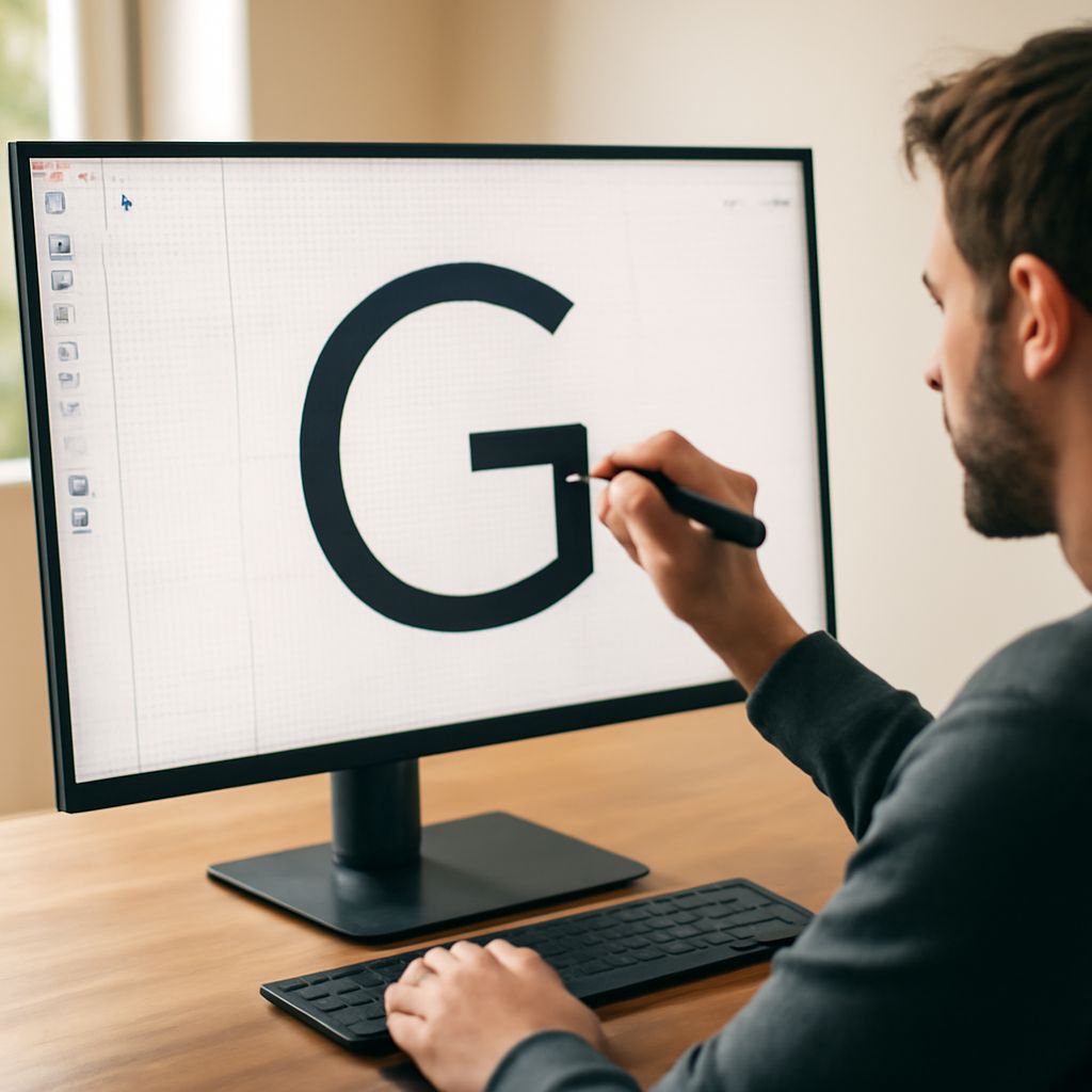
Block Embroidery Font: A Complete Guide to Bold Stitch Lettering
What makes a block embroidery font the go-to choice for monograms, uniforms, and bold decorative projects? The answer is simple: legibility and structure. Block letters hold their shape at nearly any size, making them reliable across everything from tiny hat patches to wide banner pieces. Whether you’re comparing a classic bean stitch embroidery font for outline work, sizing up a varsity embroidery font for team gear, or deciding between a square block font and a sports block font for athletic branding, this guide walks you through every consideration.
You’ll understand how different stitch types affect how letters read at a distance, how digitizing settings shape stitch density and pull compensation, and how to select the right block style for your specific project. Embroidery lettering rewards attention to detail — and block styles are where precision and visual impact meet most clearly.
Understanding Block Letter Styles in Embroidery
What Defines a Block Embroidery Font
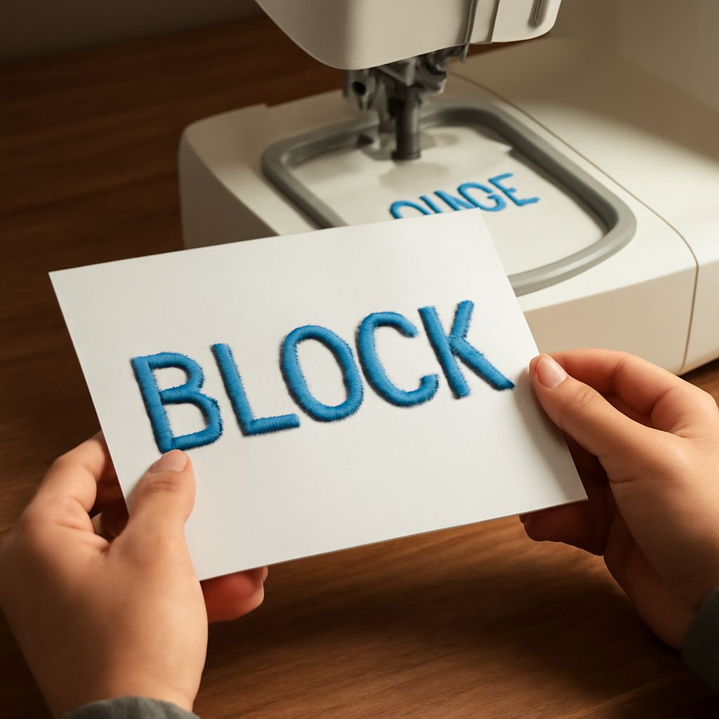
A block embroidery font is characterized by uniform stroke width, minimal or no serifs, and clear rectangular forms. Letters are typically digitized with satin or fill stitches that produce a solid, dense appearance. This structure makes block fonts highly readable on dark fabrics and at small sizes where script fonts become illegible.
The key digitizing challenge with block letters is underlay stitching. Without proper underlay, fabric push and pull distorts the letter shapes — especially on stretchy materials like polo shirts and athletic wear. A well-digitized block font includes column underlay and edge-run underlay to stabilize the fabric before the top stitches land.
Bean Stitch and Outline Variations
A bean stitch embroidery font uses a triple-pass stitch pattern that creates a thick, rope-like outline around each letter. This stitch travels forward twice and back once, building up thread density without a satin-fill interior. The result is a bold but lighter-weight letter — useful when you want the look of a block letter without heavy thread density on thin or delicate fabrics.
Bean stitch fonts work particularly well on fleece and terry cloth where satin stitches can sink into the fabric loops and lose definition. The raised outline holds its form even on textured surfaces, keeping your lettering crisp and readable.
Varsity and Sports Block Variations
The varsity embroidery font adds a layer of visual interest to standard block lettering through inline details, contrasting fill zones, or slightly extended serifs that reference the classic collegiate aesthetic. These fonts digitize with multiple color stops, letting you use team colors in creative ways within a single letter.
A sports block font prioritizes maximum impact — thick strokes, straight edges, and sometimes a slight condensed width that fits more characters across a nameplate or chest placement. Both varsity and sports block styles use satin stitches for the main fill and often include a satin border for added definition.
Choosing Between Square Block and Decorative Block Styles
When to Use a Square Block Font
A square block font takes the block aesthetic to its most geometric extreme. Strokes are perfectly uniform in width, corners are sharp right angles, and the overall look is grid-like. This style reads as technical, modern, and precise — well suited for corporate logos, industrial brands, or any project where you want a structured, no-frills aesthetic.
Square block letters are also among the easiest fonts to scale down while maintaining readability. Because the letter forms rely on geometry rather than organic curves, they stay clean at sizes as small as 5mm letter height when properly digitized. This makes them a frequent choice for left chest placements where size is limited but legibility matters.
Balancing Style with Stitch Count
One practical consideration when choosing between font styles is total stitch count. A fully filled block letter at 1-inch height might run 1,500 to 3,000 stitches depending on letter width. Multiply that across a 10-character name and you’re looking at 15,000 to 30,000 stitches for a single placement. That affects production time and thread consumption.
Bean stitch variations typically run 40 to 60 percent fewer stitches than filled counterparts. For high-volume production runs where speed matters, a bean stitch embroidery font can be the more practical choice without sacrificing the bold block appearance your customer expects.
Digitizing and Production Tips
Pull Compensation and Density Settings
Every fabric stretches differently under the embroidery hoop, and block fonts are especially sensitive to pull distortion because their straight edges make any deviation obvious. Set pull compensation between 0.3mm and 0.6mm depending on fabric weight — lighter fabrics need more compensation because they distort more under needle penetration.
Stitch density for satin columns in a block embroidery font typically sits between 0.35mm and 0.45mm. Too tight and the stitches pile up and break needles; too loose and the fabric shows through. Test on the actual production fabric before committing to a full run.
Color Sequence and Thread Choice
When working with a varsity embroidery font or any multi-color block style, sequence your color stops to minimize thread trims and jump stitches. Digitize the base fill first, then the outline or highlight color. Use 40-weight polyester thread for most athletic applications — it’s colorfast, has high tensile strength, and holds up to industrial washing better than rayon.
For decorative projects where sheen matters more than durability, 40-weight rayon in a sports block font delivers a vivid, slightly glossy finish that photographs well on social media product shots. Know your end use before you choose your thread.
Final Considerations for Block Font Projects
Choosing the right block letter style comes down to three things: fabric type, production volume, and the visual tone your project needs. A square block font signals precision and modernity; a varsity or sports block variant signals energy and team identity. Test every new font file on your target fabric before production. Check letter spacing, stitch density, and how the font reads at the actual production size — not just on screen. Block letters earn their reputation for reliability when they’re digitized and set up with care.