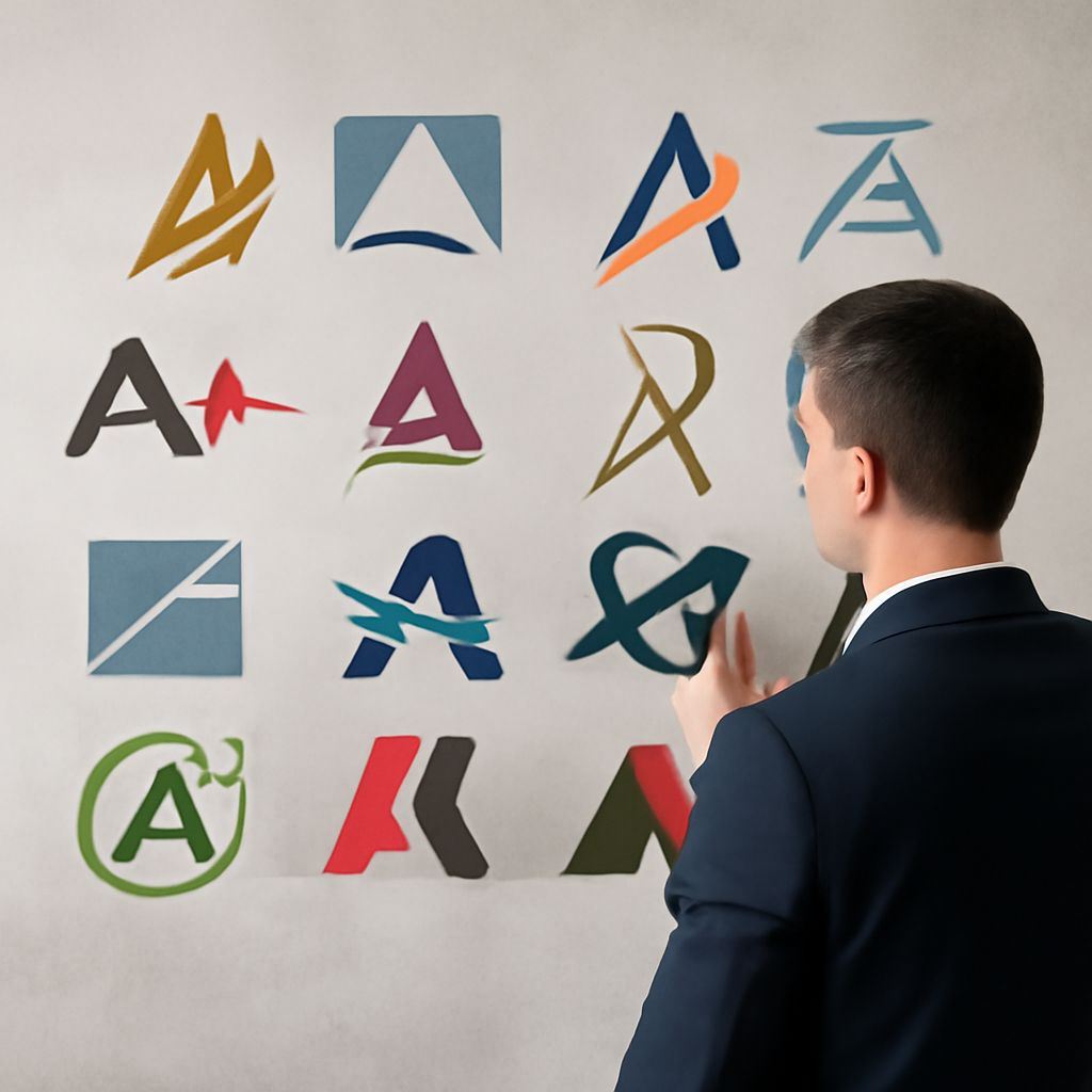
A Logos: Design Principles and Inspiration for Letter A Logos
Why do so many brands choose a logos as their visual foundation? The letter A carries strong connotations — apex, authority, achievement — and its geometric structure offers designers enormous flexibility. A simple logo with a at its core can range from a sharp angular mark to a flowing script monogram, depending entirely on how the letterform is interpreted. Whether you’re exploring options for a personal brand, a startup, or a sports team, understanding the full range of letter a logos gives you a clearer sense of what’s possible before you commit to a direction.
This guide covers the design principles behind effective logos with letter a, the different stylistic approaches designers take, and how to develop a cool letter a logo that holds up across applications from business cards to billboards. You’ll walk away with the vocabulary to brief a designer effectively and the criteria to evaluate what they bring back.
Why the Letter A Works So Well in Logo Design
Geometric Strength and Versatility
A logos work for a fundamental geometric reason: the letter A is a triangle with a crossbar. Triangles are among the most visually stable shapes in design — they convey strength, direction, and focus. The apex of the A draws the eye upward, creating an aspirational visual dynamic that many brands specifically want to communicate. This is why industries ranging from aerospace to education regularly gravitate toward letter A marks.
The triangle geometry also gives designers a natural framework for variation. The crossbar can be moved, removed, emphasized, or transformed into a design element of its own. The two legs can be widened for a modern look or narrowed for an elegant, condensed mark. Each of these decisions changes the personality of the logo without abandoning the recognizability of the letter.
Cultural Associations with the Letter A
A logo with a benefits from the letter’s position as the first in the alphabet — a subconscious signal of being first, primary, or foundational. Many companies specifically choose A-initial names for alphabetical directory placement and SEO advantage, making the letter A mark a practical as well as aesthetic choice.
The letter A also appears naturally in words that carry positive brand associations: Advance, Apex, Authentic, Award. When your brand name starts with A, a lettermark logo makes the connection between identity and value instantly legible.
Design Approaches for Letter A Logos
Geometric and Minimalist A Marks
The most common approach to letter a logos in contemporary design is the geometric reduction — stripping the letterform to its most essential shapes. Remove the serifs, simplify the crossbar to a single horizontal element, and what remains is clean, modern, and highly scalable. Airbnb’s “Bélo” symbol, while not a literal A, demonstrates how far an A-derived geometric shape can be abstracted while remaining recognizable.
For startups and tech brands, geometric A marks communicate precision and forward-thinking. The sharp angles read as confident and contemporary. For professional services, the same geometry can be softened with rounded terminals while maintaining the clarity that makes letter a logos so functional across digital and print contexts.
Wordmarks and Monograms with A
Logos with letter a can also appear as part of a wordmark — where the entire brand name is typeset in a custom or modified typeface — or as a standalone monogram. Monogram approaches work particularly well for personal brands, law firms, consulting practices, and luxury goods. A custom-drawn A monogram communicates craftsmanship and exclusivity that a standard wordmark cannot achieve.
The key decision in monogram design is whether the A is drawn to stand alone or to integrate with secondary initials. A two-letter monogram (AB, AC, etc.) creates additional geometric possibilities — the two forms can interlock, share strokes, or create negative-space shapes that reward close inspection.
Developing a Cool Letter A Logo
What separates a forgettable lettermark from a cool letter a logo is usually one strong design idea executed with precision. The strongest letter A logos make a single surprising choice — an unexpected crossbar treatment, a negative space reveal, a color split that creates depth — and then exercise restraint everywhere else. Trying to build too many clever elements into a single lettermark usually produces visual noise rather than memorability.
Look at examples from athletics, fashion, and technology to see how different industries interpret the same letterform. The athletics sector tends toward bold, angular, condensed a logos; fashion prefers elongated, refined forms; technology tends toward geometric simplicity. Understanding the category conventions helps you decide whether to work within them or deliberately break them.
Technical Considerations for A Logo Applications
Before finalizing any logo with a design, test it at the sizes and in the contexts where it will actually appear. A logo that looks great at full page scale often loses its defining details when reduced to favicon size or embroidered on a cap. Check that all interior negative spaces remain open at small sizes and that fine details don’t fill in or blur when reproduced at low resolution.
Color is the other critical variable. Test your A logo in full color, single color (black), reversed out of a dark background, and in grayscale. A strong design holds up in all four conditions. If the logo loses its impact when reduced to one color, the design is relying on color rather than form — a weakness that will surface at the worst possible moment in production.
Pro Tips Recap
Build your A logo concept around a single clear design idea rather than multiple clever elements. Test at real production sizes — favicon, embroidery, billboard — before finalizing. Confirm that the mark works in single color and reversed, not just in the designed full-color version. The best cool letter a logo designs age well precisely because they committed to clarity over complexity from the start.