Santa Hat Cartoon: Drawing Hats from Holiday Icons to Baseball and Cowboy Styles
What makes a santa hat cartoon so immediately readable as a cultural symbol even in the most simplified drawing style? The combination of a specific shape (the drooping cone with white trim and pompom), a specific color (red), and decades of cultural reinforcement creates a visual shorthand that any child recognizes. A good cartoon santa hat communicates holiday immediately with minimal marks. This same principle — that a well-designed hat silhouette carries enormous character information — applies across multiple illustration contexts, from a baseball hat drawing that signals casual American identity to a cowboy hat logo that communicates Western heritage in a single mark. The broader study of hat illustration also opens up questions about cartoon modern design aesthetics and how contemporary illustration styles handle iconic visual symbols.
This guide covers the technical approach to drawing different hat types convincingly, explores what makes each hat’s silhouette so information-rich, and shows how hat imagery functions in both holiday illustration and year-round character design and logo work.
Drawing the Santa Hat: Structure and Simplification
The Anatomy of a Santa Hat Cartoon
A santa hat cartoon consists of three basic elements: the cone body, the white trim band at the base, and the white pompom at the tip. The cone doesn’t sit upright — it droops to one side, and the degree of droop affects the hat’s character significantly. A hat that droops dramatically reads as comic and exaggerated; one that droops gently reads as classic and warm. The direction of droop often signals the character’s personality in context.
When drawing a cartoon santa hat, start with the trim band as your anchor. It’s a flattened ellipse sitting on the head or character. From there, the cone rises and droops to one side, with the pompom at the end weighted by gravity. The trim band has slight thickness — it’s not a flat line but a dimensional band of fabric — and the pompom is a fluffy sphere rather than a tight ball. These three dimensional details separate a convincing cartoon hat from a flat, generic one.
Variations and Character Expressions
The same cartoon santa hat structure adapts to dozens of character contexts through scale, proportion, and secondary detail changes. A tiny hat perched at a jaunty angle on a character’s head reads as playful and slightly irreverent. An oversized hat pulled down over a character’s ears reads as cozy and slightly overwhelmed. The hat’s condition — pristine versus slightly crumpled versus comically tattered — adds another layer of character information. These variations are the vocabulary of hat illustration in character design.
Baseball Hat Drawing: Proportion and Perspective
A baseball hat drawing requires careful attention to the bill’s perspective. The curved bill changes its apparent shape dramatically depending on the viewing angle: from the front, it reads as a narrow crescent; from the side, it appears as a long horizontal protrusion; from above, the full circular form becomes visible. Getting this perspective logic right is the central challenge of baseball hat drawing and the skill that separates convincing sports character designs from flat, awkward ones.
The hat’s crown structure also matters. A properly drawn cap has a subtle dome shape with construction seams radiating from the top button, slight depth from front panel to back, and an adjustable closure at the rear. Even when simplified for cartoon use, some indication of these structural elements prevents the hat from reading as a flat disc floating on the character’s head.
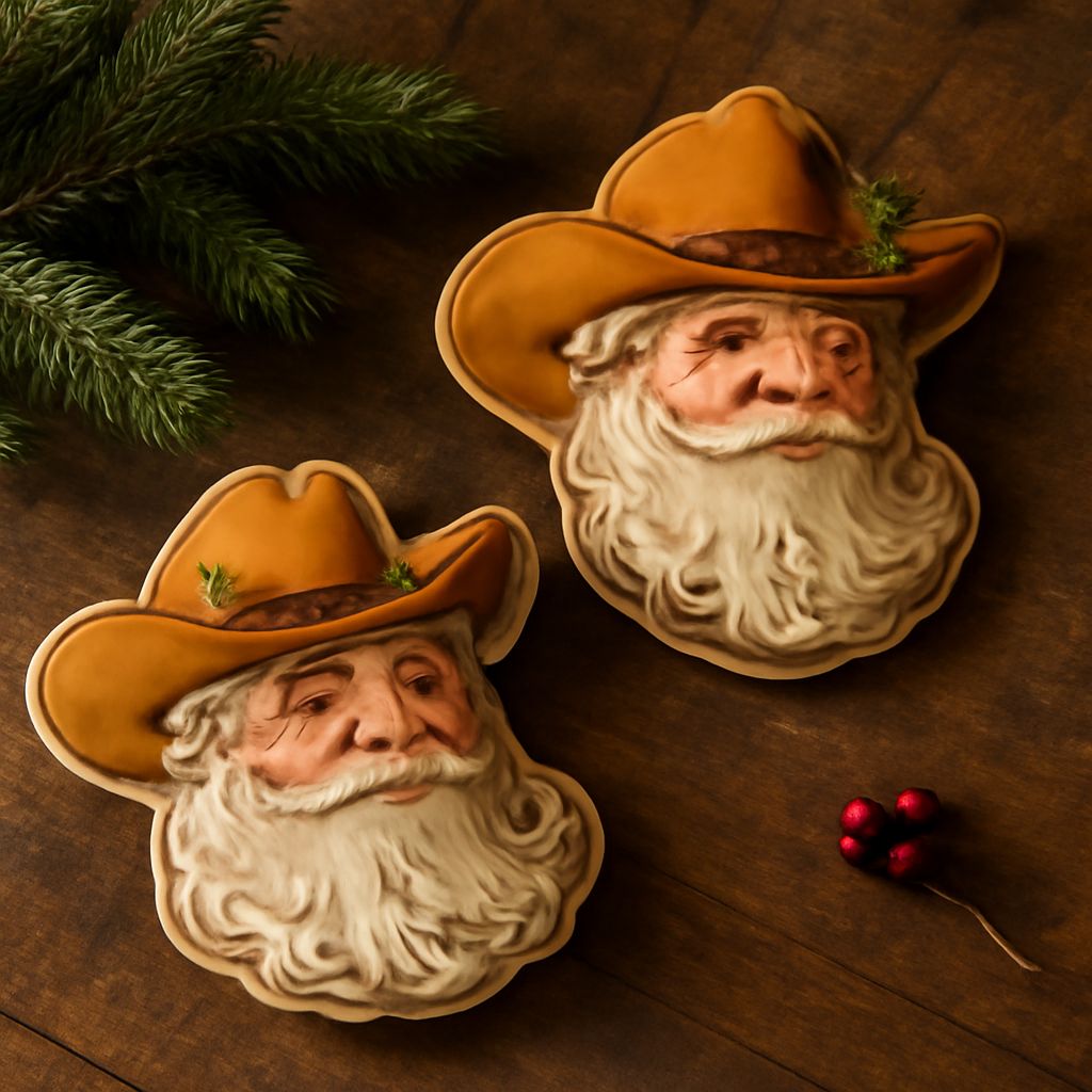
Cowboy Hat Logo: Silhouette as Identity
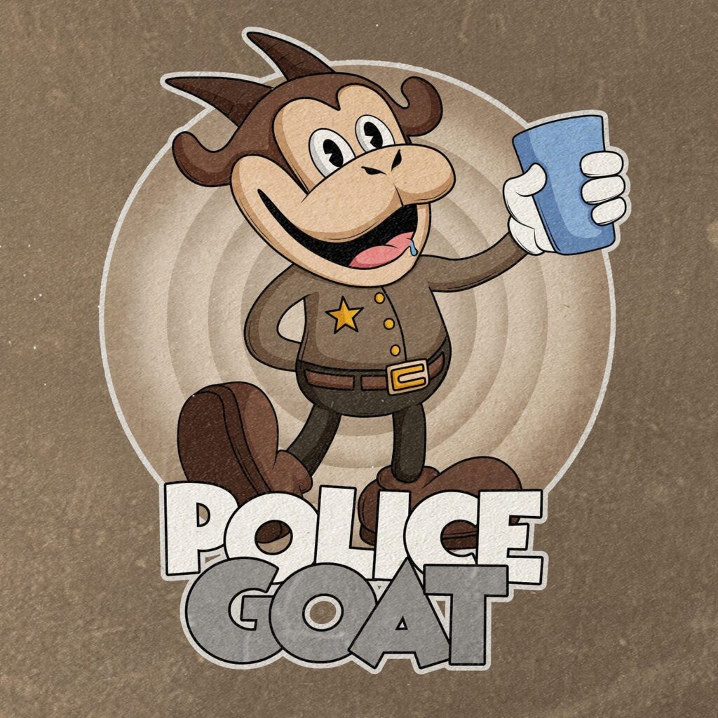
A cowboy hat logo demonstrates how effectively a single hat silhouette can communicate complete cultural identity. The cowboy hat’s distinctive profile — wide brim, pinched crown, slight forward tilt — is among the most recognizable hat silhouettes globally. A well-designed cowboy hat logo works as a standalone mark without any accompanying text, which is the highest test of logomark effectiveness.
When designing a hat-based logo of any kind, the brim-to-crown ratio and the crown’s exact profile shape are the critical decisions. Slight changes in these proportions shift the hat from one cultural category to another: a wide brim with a rounded crown reads Mexican sombrero; a narrow brim with a flat crown reads Stetson rancher. Precision in these shapes is what makes a cowboy hat logo read correctly rather than ambiguously.
Cartoon Modern Aesthetics and Hat Illustration
Cartoon modern illustration style — the clean lines, intentional color limitation, and geometric character design of contemporary animation and digital illustration — treats iconic symbols like hats with the same visual economy as any other element. In cartoon modern design, a santa hat might be two colors and five lines rather than a detailed rendering; a baseball cap might be suggested entirely by silhouette. The reduction doesn’t sacrifice recognition — it concentrates it. Studying how cartoon modern artists handle these cultural symbols reveals how much visual information can be eliminated while maintaining complete communicative effectiveness.