Marquee Letter Font: Theater Signage Styles from Classic to Contemporary
What gives a marquee letter font its unmistakable sense of spectacle and anticipation? The combination of bold geometric letterforms, often surrounded by implied or actual light bulbs, carries the cultural memory of Broadway theaters, vintage movie houses, and carnival midways. A quality marquee sign font instantly communicates entertainment, glamour, and the promise of something worth seeing. Whether you’re designing retro-themed event graphics, a theatrical poster, a bar identity, or a festive social media campaign, the visual language of marquee typography is among the most evocative in the display type lexicon. The theater marquee font tradition draws on both Art Deco design principles and the practical needs of large-format illuminated signage, while more expressive options like mark my words font and daddy’s little monster font push the marquee aesthetic in more personal and subversive directions.
This guide covers the design characteristics that define marquee typography, explores different style directions within the broad category, and gives you practical guidance on choosing and using these fonts effectively in your own projects.
The Design Language of Marquee Letter Fonts
Visual Characteristics of Authentic Marquee Typography
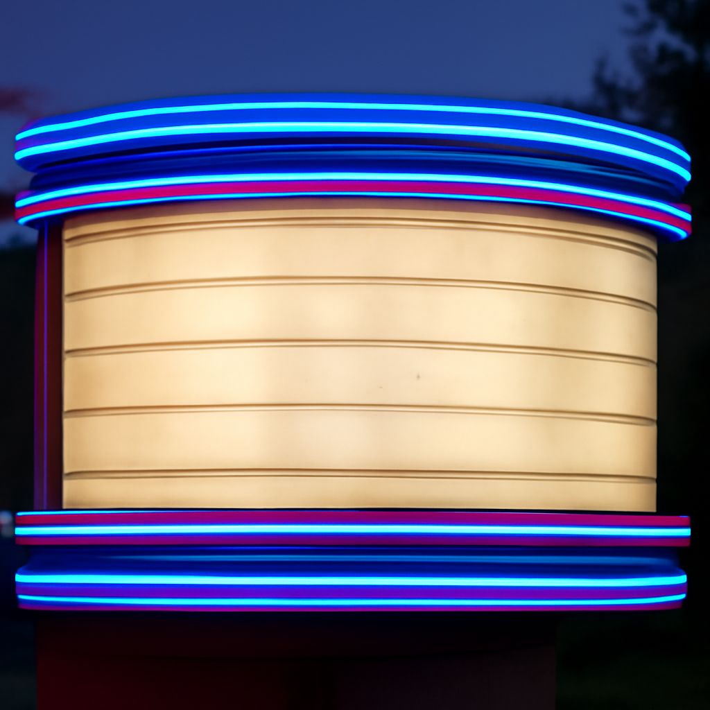
A classic marquee letter font has several distinctive characteristics derived from the historical constraints of large-scale theater signage. Letters are typically large, bold, and highly legible at distance — the original marquee signs needed to be read from a moving car or across a city block. Letterforms are often geometric, influenced by Art Deco’s preference for clean angular shapes and strong vertical emphasis. Many marquee letter font designs incorporate implied light elements: dots, circles, or outlined letterforms that suggest the bulb-studded frames of historic marquee signs.
The best contemporary implementations of the marquee aesthetic balance historical authenticity with digital usability. The font needs to work at small screen sizes as well as at billboard scale, which means the historical details that made sense for physical neon or incandescent bulb signs need to be reinterpreted for current applications. This tension between historical reference and contemporary function is where the most interesting marquee font design happens.
Theater Marquee Font: Specific Stylistic Conventions
A theater marquee font specifically references the theatrical context with uppercase-dominant letterforms (marquee signs were almost always all-caps), strong weight contrast within the letter, and often a slight forward lean that conveys urgency and excitement. The spacing in a theater marquee font is typically generous — theatrical marquees needed clear letter separation to be legible when individual bulbs created visual noise around each letter.
Contemporary theater marquee font options range from scrupulously authentic Art Deco revivals to modern interpretations that use the marquee’s visual energy in more abstract ways. The most authentic vintage reproductions include multiple alternates and ligatures that replicate the handlettering variations seen in actual historic theater signage.
Marquee Sign Font Variations and Applications
From Classic to Contemporary Marquee Styles
The marquee sign font category has expanded significantly beyond its theatrical origins. Retro diner and soda fountain aesthetics use a warmer, slightly more casual version of marquee lettering with rounded terminals. Carnival and fairground applications push the letter toward more exaggerated, asymmetrical forms with explicit light-bulb dot patterns integrated into the letterforms themselves. Luxury and fashion applications strip the marquee aesthetic down to its most minimal expression — bold geometric letters without the light-bulb references — retaining the visual authority without the nostalgic specificity.
Mark My Words Font and Alternative Expressive Directions
Moving away from the traditional marquee template, fonts like mark my words font take the bold, attention-commanding energy of marquee display type and redirect it toward hand-lettered, emphatic, personal expression. A mark my words font style communicates directness and confidence without the historical theatrical reference — it’s the aesthetic of protest signs, motivational lettering, and personal brand identity for creatives who want impact without nostalgia.
The daddy’s little monster font occupies another expressive direction entirely — taking the bold letterform DNA of marquee typography and distorting, fragmenting, or recombining it to suggest something transgressive, playful, or subversive. A daddy’s little monster font approach is useful for Halloween-themed design, villain character branding, alternative entertainment graphics, and any project where the visual goal is deliberate disruption of expectations rather than nostalgic celebration.
Choosing the Right Marquee Font for Your Project
The key to selecting from the broad marquee letter font category is identifying the specific emotional register your project needs. Theatrical nostalgia and entertainment glamour call for authentic Art Deco-influenced options. Warm, accessible fun calls for rounded, lighter-weight marquee variants. Bold personal expression calls for hand-lettered emphatic styles. Subversive or Halloween contexts call for distorted or fragmented interpretations. Once you’ve identified the register, test your final candidates at the actual sizes where they’ll be used — marquee fonts are display types that often behave very differently at 12pt than at 72pt, and many of their distinctive characteristics only read clearly at display sizes.